
Details
- Publication date
- Author(s)
Volume 2, 2026
Natural Resources Canada
General Information Product 145e
© His Majesty the King in Right of Canada, as represented by the Minister of Natural Resources, 2026
Permanent link: https://doi.org/10.4095/331156
For information regarding reproduction rights, contact Natural Resources Canada at copyright-droitdauteur@nrcan-rncan.gc.ca.
Recommended Citation:
Natural Resources Canada (2026). Case Studies on Climate Change in Flood Mapping Volume 2.
Executive Summary
The objective of this document is to help practitioners design and carry out a climate change assessment for flood hazard mapping and to highlight work that has been performed by flood mapping practitioners across the country to incorporate climate change into flood hazard studies. The document provides a flexible framework for assessing and incorporating climate impacts into flood hazard mapping, even when new information is constantly becoming available.
The guide draws on related documents in Federal Flood Mapping Guidelines Series, on-going research and expertise at Environment and Climate Change Canada (ECCC) and in the Flood Hazard Identification and Mapping Program (FHIMP), and the experience of flood mapping experts across Canada. Practitioners are encouraged to apply and adapt the assessment framework according to the purpose of their project, local factors influencing flood hazards, and available data for the area.
Section 1 introduces different types of uncertainty and their relevance to climate change, and describes how an adaptive approach to understanding flood hazards can help us prepare our communities to be more resilient in the long term.
Section 2 presents the assessment framework, one that practitioners can adjust to suit unique local conditions. The framework is comprised of four guiding principles and a five-step, actionable process. The section also provides examples, scenarios, and special considerations for practitioners to be aware of when designing their own assessments.
Section 3 presents case studies that illustrate different approaches to climate assessments and recent developments in local practices across Canada.
Appendix A presents relevant resources related to flood mapping in Canada.
Table of Contents
- Executive Summary
- Table of contents
- Acknowledgements
- 1.0 Introduction
- 2.0 The Assessment Framework
- 3.0 Case Studies
- 3.1 Nahanni Butte: Flood Hazard Mapping
- 3.2 Comox Valley Regional District: Coastal Flood Hazard Mapping
- 3.3 Cowichan Lake: Shoreline and Lake Level Flood Mapping
- 3.4 Kootenay Boundary: Flood Mapping
- 3.5 Nisg̱a’a Nation: River Basin Flood Hazard Mapping
- 3.6 Rat Creek: Riverine Flood Mapping
- 3.7 Conservation Halton: Local Waterbody Flood Hazard Mapping
- 3.8 Durham Region: Riverine Crossings and Roads Flood Hazard Mapping
- 3.9 Mimico Creek: Erosion-Related Flood Mapping
- 3.10 Gaspereau Primary Watershed: Municipal Flood Line Mapping
- 3.11 Nova Scotia Sissiboo-Bear Rivers: Primary Watershed Flood Line Mapping
- 3.12 Prince Edward Island: Pluvial Flood Mapping Project
- 3.13 Newfoundland and Labrador: Climate Change Flood Risk Mapping Study
- 4.0 References
- Appendix A: Recommended Resources
List of figures
- Figure 1: Flood mapping framework.
- Figure 2: Guiding principles for the climate assessment.
- Figure 3: The risk triangle, where risk is a product of hazard, exposure and vulnerability (UNDRR, 2015). Hazard is referred to as “dynamic hazard” due to the changing flood hazard from climate change.
- Figure 4: Conceptual model of impacts of climate change on peak flow in a forested plains river system.
- Figure 5: Conceptual model of impacts of climate change on peak flow on a mountainous watershed experiencing rain-on-snow.
- Figure 6: Conceptual model of impacts of climate change on a large lake system.
- Figure 7: Flood frequency analysis results for 30-year block analyses on one climate model trace for the Lillooet River near Pemberton, BC. RP = Return Period. Data source: Pacific Climate Impacts Consortium.
- Figure 8: Non-stationary flood frequency analysis results on one climate model trace for the Lillooet River near Pemberton, BC. RP = Return Period. Data source: Pacific Climate Impacts Consortium.
- Figure 9: Flow chart of a workflow of climate and hydrologic model informed flood hazard assessment. Adapted from Associated Engineering (2021b).
- Figure 10: Case study locations.
- Figure 11: Nahanni Butte project location.
- Figure 12: Sensitivity analysis results for cool/wet climate conditions (South Nahanni River).
- Figure 13: Sensitivity analysis results for cool/wet climate conditions (Liard River).
- Figure 14: Comox Valley Regional District project location.
- Figure 15: Coastal area analysis.
- Figure 16: River analysis process.
- Figure 17: Example of a regulatory flood map from the CVRD (FL = Flood Level).
- Figure 18: Cowichan Lake project location.
- Figure 19: Cowichan Lake and Cowichan River watersheds.
- Figure 20: Average modelled seasonal inflow to Cowichan Lake for past and future climate.
- Figure 21: Sample of simulated lake levels for existing weir and proposed raised weir.
- Figure 22: Project horizontal change in natural boundary location with proposed weir upgrades.
- Figure 23: Kootenay Boundary project location.
- Figure 24: Kettle River watershed and Rock Creek to Midway study reach.
- Figure 25: Hydrologic regime of the Kettle River at Ferry (08NN013).
- Figure 26: Change in annual peak flow (daily average flow) over time from the Raven hydrologic model developed in AE (2021) for the Kettle River near Ferry (WSC 08NN013) shown as a two-dimensional histogram.
- Figure 27: Change in day of year of peak flow over time from the Raven hydrologic model developed in AE (2021) for the Kettle River near Ferry (08NN013) shown as a two-dimensional histogram.
- Figure 28: Nisg̱a’a Nation project location.
- Figure 29: Nass River Basin boundary.
- Figure 30: Monthly annual precipitation for the historical, mid-century, and end-of-century periods.
- Figure 31: Monthly SWE by elevation band for the historical, mid-century, and end-of-century conditions.
- Figure 32: Plot of annual peak for the historic, mid-century and end-of-century periods, showing a transition from spring freshest-dominated peaks historically to winter peaks in the future.
- Figure 33: Rat Creek project location.
- Figure 34: Location of Rat Creek gauge, west-southwest of Drayton Valley, Alberta.
- Figure 35: Rise of Rat Creek stage before loss of transmission.
- Figure 36: Flood frequency analysis.
- Figure 37: Conceptual model depicting the direction of change of factors that contribute to peak flows in the Rat Creek gauge watershed.
- Figure 38: Change in annual maximum flow over several return periods (Dibike et al., 2019).
- Figure 39: Inundated area due to a 100-year event (left), inundated area due to a 20% climate change adjusted 100-year event (middle), and inundated area due to 580 m3/s flow (right).
- Figure 40: Conservation Halton project location.
- Figure 41: Study area and sub-watersheds.
- Figure 42: Durham Region project location.
- Figure 43: Crossings in Frenchman's Bay watershed for existing climate conditions.
- Figure 44: Crossings in Frenchman's Bay watershed for existing and future climate conditions.
- Figure 45: Mimico Creek project location.
- Figure 46: Five-year streamflow volume by month, three GHG scenarios, and two timeframes.
- Figure 47: Change in Ontario summer average temperatures for four RCPs, 1981 through 2100.
- Figure 48: Mimico Creek simulated streamflow peaks for design and historical storms..
- Figure 49: Gaspereau Primary Watershed project location.
- Figure 50: Nova Scotia Sissiboo-Bear Rivers project location.
- Figure 51: Sissiboo-Bear study area.
- Figure 52: Flood lines at Haight Brook, Digby Neck, along Highway 217 under current conditions. [5% blue, 1% red AEP.]
- Figure 53: Current conditions 1% AEP riverine flood depth mapping at Weymouth.
- Figure 54: Current conditions 1% riverine flood velocity mapping at Weymouth.
- Figure 55: Current conditions 1% AEP riverine flood hazard mapping at Bear River (m x m/s).
- Figure 56: Prince Edward Island project location.
- Figure 57: An example of culvert representation in Charlottetown and testing results showing water passing through the culverts.
- Figure 58: A comparison of the 100-year return period pluvial flood maps along with the highway in Summerside under the same current climate condition between the island-wide model and the municipal model.
- Figure 59: A comparison of the 100-year return period pluvial flood maps of downtown Charlottetown under the same future climate condition between the island-wide model and the municipal model.
- Figure 60: Newfoundland and Labrador project location.
- Figure 61: Projected sea level rise for Placentia.
- Figure 62: Projected sea level rise for the Carbonear area.
List of tables
- Table 1: The assessment framework: Summary of steps and tasks.
- Table 2: Climate Change Scenarios.
- Table 3: Selected Climate Change Scenarios for Flood Hazard Mapping
- Table 4: Summary of Potential Shoreline Impacts.
- Table 5: Climate Change Adjustments to Design Flow Estimates: Kettle River near Ferry.
- Table 6: Summary of Scenarios Used to Produce Flood Maps.
- Table 7: Current Conditions 1% Riverine Flood Velocity Mapping at Weymouth.
- Table 8: Eight Scenarios for Design of Rainfall Events
Acknowledgements
The Federal Flood Mapping Guidelines Series has been developed under the leadership of the Flood Mapping Committee, a partnership between Public Safety Canada (PSC), Natural Resources Canada (NRCan), Environment and Climate Change Canada (ECCC), National Research Council of Canada (NRC), Defence Research and Development Canada, Department of National Defence, Infrastructure Canada, Indigenous Services Canada, and Crown-Indigenous Relations and Northern Affairs Canada. A Technical Working Group on Flood Mapping formed in 2015 and comprised of parties from federal, provincial, and territorial jurisdictions, as well as the private sector and academia, has also contributed valuable input to the development of the Federal Flood Mapping Guidelines Series documents. Provincial and territorial government representatives also provided essential feedback for this publication.
The documents in the Federal Flood Mapping Guidelines Series are intended as a resource to support municipal, provincial, and territorial agencies and Indigenous communities working on flood hazard mapping. It is acknowledged that flood management in Canada is regulated at the provincial and territorial level of government, and that provinces and territories reserve the right to create their own guidelines specific to their jurisdictions.
Along with the authors at ECCC and Scribe Technical, useful comments on this guideline were provided by the Flood Hazard Identification and Mapping Program (FHIMP) Provincial and Territorial Partners, staff at NRCan and Public Safety Canada, and the consulting engineers who contributed to the case studies section.
Notice
Disclaimer of Liability
This technical documentation has been published by His Majesty the King in right of Canada, as represented by Natural Resources Canada (NRCan). No warranties or representations, express or implied, statutory or otherwise shall apply or are being made by NRCan in respect of the documentation, its effectiveness, accuracy, or completeness. NRCan does not assume any liability or responsibility for any damages or losses, direct or indirect, incurred or suffered as a result of the use made of the documentation, including lost profits, loss of revenue or earnings or claims by third parties. In no event will NRCan be liable for any loss of any kind resulting from any errors, inaccuracies, or omissions in this documentation. NRCan shall have no obligation, duty, or liability whatsoever in contract, tort or otherwise, including negligence.
Additional Information
For more information about this document, please contact the Canada Centre for Mapping and Earth Observation of Natural Resources Canada: geoinfo@nrcan-rncan.gc.ca.
Context
A community achieves an elevated level of resilience when its risks are proactively managed, it is adequately prepared for known and potential disaster events, and it demonstrates an ability to recover after such events have taken place. To become resilient, a community’s mitigation planners must first understand risks and ensure their capacity to manage those risks.
Floods are commonly occurring natural hazards in Canada and account for the largest portion of disaster recovery costs on an annual basis. Mitigating flood risks is key to increasing the resilience of affected communities. By proactively investing in flood risk mitigation activities, a community may improve its future growth and prosperity, reducing the risk of significant disaster recovery costs, productivity losses, economic losses, destruction of non-monetary cultural assets, environmental damage, injuries, and deaths.
Flooding is the temporary inundation by water of normally dry land, and it can occur in coastal and lake areas, along rivers, from stream blockages including ice jams, from failure of engineering works including dams, from extreme rainfall, rapid snow/ice/glacier melt or poor drainage characteristics, high groundwater levels, and other sources. Flood mapping that accurately delineates flood hazards, including those impacted by future conditions due to anticipated development or projected changes in climate, serves as the precondition for mitigation activities and is therefore the first step to increasing community resilience with regard to flooding. Establishing a national approach to flood mapping will facilitate a common national best practice and increase the sharing and use of flood hazard information. Considering the costs of damages and the vulnerabilities of infrastructure to the probability of the hazards provides an estimate of the flood risks, thereby improving the foundation from which further flood risk mitigation efforts can be initiated.
Federal Flood Mapping Framework
The Flood Mapping Framework consists of all the components of the flood mitigation process, from flood hazard identification to the implementation of flood mitigation efforts. Figure 1 illustrates the relationship between these different components.
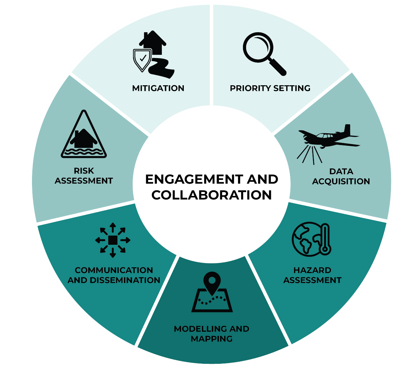
Figure 1: Flood mapping framework.
Text Version
A circular infographic composed of a ring divided into seven segments arranged in a ring around a central circle. The central circle contains the text “engagement & collaboration.”
The segments of the ring represent the activities that make up the flood mapping process, and each connects back to engagement and collaboration at the centre.
The segments are each labelled with both text and an icon. The labels are:
- Priority Setting, shown with a magnifying glass
- Data Acquisition, shown with an airplane collecting data
- Hazard Assessment, shown with a globe and thermometer
- Modelling and Mapping, shown with a map and a map pin
- Communication and Dissemination, shown with a square with arrows radiating outward
- Risk Assessment, shown with a hazard warning triangle
- Mitigation, shown with an icon of a house and shield near a river.
Federal Flood Mapping Guidelines Series
The following documents are intended to inform individuals and organizations involved with flood management in Canada:
- Federal Flood Mapping Framework
- Federal Guidelines for Flood Hazard Identification and Priority Setting
- Federal Airborne Lidar Data Acquisition Guideline
- Case Studies on Climate Change in Flood Mapping
- Federal Hydrologic and Hydraulic Procedures for Flood Hazard Delineation
- Coastal Flood Hazard Assessment for Risk-Based Analysis on Canada’s Marine Coasts
- Federal Geomatics Guidelines for Flood Mapping
- Federal Guidelines for Flood Risk Assessment
- Federal Flood Damage Estimation Guidelines for Buildings and Infrastructure
- Federal Land Use Guide for Flood Risk Areas
- Bibliography of Best Practices and References for Flood Mitigation
Guideline Summaries
1. Federal Flood Mapping Framework
This document provides background and context on flood mapping in Canada, describes a vision and principles for flood guidance, and introduces the Federal Flood Mapping Guidelines Series. It provides a summary of each of the documents in the Series and explains how each document fits into the overall framework, including its role in the flood mapping cycle.
2. Federal Guidelines for Flood Hazard Identification and Priority Setting
This document outlines methods for determining where to conduct flood hazard mapping and how to prioritize flood hazard mapping projects.
3. Federal Airborne Lidar Data Acquisition Guideline
This document is a resource for the acquisition of base elevation data from airborne lidar data undertaken across Canada. This guideline provides technical specifications to federal, provincial, and territorial departments, as well as individuals and organizations in Canada requiring information to understand and plan for airborne lidar data acquisition.
4. Case Studies on Climate Change in Flood Mapping
This collection of documents describes projects from across Canada where climate change was incorporated into the flood mapping process. It provides a framework for designing a climate assessment and examples for practitioners to draw upon and learn from others’ experiences and complements the climate change-related information and resources included in the Federal Hydrologic and Hydraulic Procedures for Flood Hazard Delineation document.
5. Federal Hydrologic and Hydraulic Procedures for Flood Hazard Delineation
This document provides guidance to municipal, provincial, and territorial agencies and Indigenous communities working to produce flood hazard maps. It provides technical information on the types of river and lake flooding, general practices, procedures for hydrologic and hydraulic analyses, procedures for incorporating climate change, and reporting best practices.
6. Coastal Flood Hazard Assessment for Risk-Based Analysis on Canada’s Marine Coasts
This document provides guidance on methodologies for coastal flood hazard assessments using risk-based approaches.
7. Federal Geomatics Guidelines for Flood Mapping
This document contains information on the different types of flood maps and outlines the technical specifications to consider when acquiring, managing, and disseminating these maps and their associated geospatial data.
8. Federal Guidelines for Flood Risk Assessment
This document provides technical guidance on conducting flood risk assessments in Canada.
9. Federal Flood Damage Estimation Guidelines for Buildings and Infrastructure
This document provides guidance on how to evaluate potential economic losses, with a focus on buildings and infrastructure, incurred as a result of flooding.
10. Federal Land Use Guide for Flood Risk Areas
This document provides guidance to the professionals leading and supporting risk-based processes and methodologies for the purpose of land use planning in flood-prone areas.
11. Bibliography of Best Practices and References for Flood Mitigation
This document contains lists of Canadian and international references and case studies pertaining to hydrology and hydraulics, climate change, risk assessment, and flood mapping. The purpose of this document is to provide a consolidated list of reference materials intended as further resources for practitioners involved in flood mapping.
List of Acronyms
- AEP
- Annual exceedance probability
- AOI
- Area of Interest
- CMIP
- Coupled Model Intercomparison Project
- DFAA
- Disaster Financial Assistance Arrangements
- ECCC
- Environment and Climate Change Canada
- ESM
- Earth Systems Model
- FFA
- Flood Frequency Analysis
- FHIMP
- Flood Hazard Identification and Mapping Program
- GEV
- Generalized Extreme Value
- GHG
- Green House Gas
- HEC-RAS
- Hydrologic Engineering Center’s River Analysis System
- IDF
- Intensity-Duration-Frequency
- IPCC
- Intergovernmental Panel on Climate Change
- NDMP
- National Disaster Mitigation Program
- NHS
- National Hydrological Services
- NRC
- National Research Council
- NRCan
- Natural Resources Canada
- PSC
- Public Safety Canada
- RCM
- Regional Climate Model
- RFFA
- Regional Flood Frequency Analysis
- RP
- Return Period
- RRP
- Risk reduction potential
- UNESCO
- United Nations Educational, Scientific, and Cultural Organization
- WSC
- Water Survey of Canada
1.0 Introduction
Climate change is caused by ever-increasing levels of CO2 (and other greenhouse gasses) in the atmosphere since the industrial revolution, leading to globally increased temperatures and more extreme weather events. Climate change is already affecting Canadian life and will continue to do so into the future, even with major and immediate global cuts in CO2 emissions (Calvin et al., 2023). One notable effect is an increase in damage from natural hazards, including the frequency and severity of floods (Public Safety Canada, 2018).
The Government of Canada’s Flood Hazard Identification and Mapping Program (FHIMP) is one response to this issue. Predicting and mapping potential changes in flood hazards into the future will help make flood maps produced under the FHIMP more effective for map users and relevant for a longer time. Provincial and Territorial Governments, city planners, emergency managers, and more can use these maps to better prepare for the future through visualizing how people and infrastructure may be impacted by flooding through the rest of the 21st century.
While the value of making flood hazard maps that account for climate change impacts is clear, the methods are not. In Canada, hydrology, and therefore flooding, is governed by complex, nonlinear interactions between the atmosphere, land, and the cryosphere. Outputs from Earth Systems Models (ESMs) provide valuable information about the earth’s future climate, but not direct information on flooding. Post processing of ESM data, or inputting climate data into a hydrologic model is often necessary to learn about future changes in flooding.
Additionally, an understanding of the processes that cause flooding in a particular area and the potential impacts on these processes from climate change is necessary to predict future flood hazard. For example—when flooding is caused by snow accumulation and melt, flood hazards will not always increase as temperatures increase. A lack of snow on the ground may cancel out increases in snowmelt rate, and the risk of flooding may actually decrease. In some cases, a tipping point may occur where a flood hazard has been increasing for years and then begins to decrease. Further, the impact of the size of a watershed has implications for flood hazards, two nearby rivers can have vastly different drainage basins and therefore experience very different hydroclimatic conditions.
Beyond the physical considerations, there are statistical issues that complicate our ability to understand flood hazards. Climate change has decreased our ability to rely on past observations to understand current and future flooding. In simple terms, one can no longer assume that the past represents the future. In statistical terms, this is a “loss of stationarity” (Milly et al., 2008). Traditional flood frequency analysis depends on this assumption of stationarity as a basis for developing design flows that feed into a hydraulic model and then into a flood hazard map. When this assumption is no longer valid, new tools and techniques are neededFootnote 1. This document illustrates some of these available tools, and the Case Studies Section shows how various tools and techniques have been applied across Canada.
1.1 Purpose
The purpose of this guide is to assist practitioners with designing and conducting a climate assessment for flood mapping. As part of the Federal Flood Mapping Guidelines Series, this guide is focused on flood hazard mapping in Canada; however, it also may be useful for a broad range of water-related projects where flood hazard is a concern.
The term “practitioners”, in this case, refers to hydrotechnical and civil engineers, geoscientists, and hydrologists. It is not expected that practitioners have advanced climatological knowledge (for example, an understanding of the inner workings of ESMs or types of climate/weather model downscaling). However, this type of knowledge may be necessary in some cases, and this guide will assist practitioners in recognizing where it is necessary.
In the case of flood hazard mapping and other flood-related hydrotechnical projects, “climate impacts on a project” typically refers to the impacts of climate change on the hydrologic conditions that lead to flooding. As most flood hazard studies rely on design flows or water levels (for example, the 1:200 year or 0.5% annual exceedance probability), the guide focuses on approaches for estimating changes in these design flows and levels from the present day into the future.
1.2 Climate Change and Deep Uncertainty
The Federal Hydrologic and Hydraulic Procedures for Flood Hazard Delineation (Natural Resources Canada, 2025b) classifies uncertainty into four types.
- Natural or intrinsic uncertainty: arising from the inherent randomness of natural processes, which is variable over time and space. This natural uncertainty is difficult to reduce and quantify as the data is irreproducible.
- Data uncertainties: from measurement errors, instrumentation errors, inconsistencies and non-homogeneity of the data, data handling, and inadequate representativeness of data over time and space. This data uncertainty may be reduced with better or increased measurements.
- Calculation uncertainty: from the inability of a mathematical technique or model to accurately represent the true physical behaviour of the natural world, since the technique or model is poorly or incompletely specified, or the phenomena modelled has instabilities and non-linearities not reflected in the modelling approaches.
- Parameter uncertainties: from inaccurately assessed parameter values in the test or calibration data, due to limited numbers of observations, and statistical imprecision.
Uncertainty about the future climate of our planet contains, to some extent, all these types of uncertainty. Marchau, et al (2019) describes this as “deep uncertainty”. While the path that we are currently on is clear, it is not possible to know the specific efforts that society will make (or not make) to reduce greenhouse gases (GHGs) over the next century. This is the reason that outputs from climate models are usually described as “scenarios” rather than “forecasts.” Climatologists across the globe have developed a range of possible futures that society may take, and the GHG emissions that they result in. A suite of independently developed ESMs (also with world-wide development) then uses the GHG emission scenarios as input to predict how the climate will respond. The combination of GHG scenarios and ESMs produces an “ensemble” of climate scenarios. This ensemble of model outputs is useful for exploring what our future might look like, but it is not yet possible to make probabilistic predictions on which of these scenarios are most likely to occur.
Further, it is possible that completely unanticipated events will happen before 2100. Marchau (2019) referred to these as “black swans”. In the case of climate change this means events that cannot be predicted before they happen but have significant impact on the global climate. Past events fitting the black swan description include the industrial revolution, supervolcanoes, and asteroid impacts. Our limited ability to predict black swan events and the future actions of society that affect the earth’s climate make climate change a deep uncertainty problem. Even with more knowledge, there are still many plausible futures, many of which have not yet been envisioned.
Fortunately, the deep uncertainty of climate change does not mean there is nothing that can be done to prepare for the future. An agile, flexible approach is needed to prepare ourselves and our communities to be more flood resilient in the future; that is, an “adaptive” approach to mapping flood hazards:
- Accept future uncertainty and be willing to make changes: Realize that it is not possible to know the future perfectly. Some things we think we know now will turn out to be wrong, but this is ok. By planning for uncertainty, we can be prepared to pivot.
- Regularly reassess: Climate impacts on flood hazards cannot be assessed once and then never again. Reassessment on a regular cycle (for example, every 5–10 years or when a major event happens) will help us determine if any course correction is needed.
For further information on adaptive approaches to flood hazards (not limited to mapping), see Ebbwater (2023).
1.3 How to Use This Guide
This guide presents practitioners with a climate change assessment approach that is adaptable to unique local conditions. The assessment framework presented in Section 2 is designed to be adapted according to the purpose of a project, the availability of information, and practitioners’ skillsets and knowledge. Section 2 presents four guiding four principles and provides an actionable process in five steps. It also provides examples, scenarios, and special considerations for practitioners to be aware of when designing their own assessments.
This guide also highlights successful work by flood mapping practitioners from across Canada. The case studies presented in Section 3 illustrate the varied approaches to climate assessments and recent developments in local practices in 13 jurisdictions across the country.
2.0 The Assessment Framework
In this section
This section provides a description of the recommended assessment framework for practitioners who want to integrate climate change considerations into engineering-scale flood hazard mapping. It presents:
- Four guiding principles to steer all stages of development (Section 2.1)
- Five assessment steps, with examples and scenarios (Section 2.2)
- Special considerations to take into account when making recommendations (Section 2.3).
2.1 Guiding Principles
The four guiding principles (Figure 2) described in this section are intended to help practitioners
- plan a climate assessment that is appropriate to the project, and
- make appropriate recommendations in the context of deep uncertainty around climate change.
Each principle may apply to more than one stage of the process. Practitioners should remain aware of the principles throughout.

Figure 2: Guiding principles for the climate assessment.
Text Version
A diagram that showcases four key principles depicted with related icons and corresponding text. The elements of the diagram are arranged vertically, and the text appears to the right of each icon. These are the guiding principles listed:
- Proportionality: Represented by an icon of a sun.
- Start Conservative and Refine: Represented by a downward-pointing arrow.
- Focus on Key Vulnerabilities: Represented by a broken heart symbol.
- Multiple Lines of Evidence: Represented by an abacus icon.
The principles are visually framed on the left by a blue box labelled “Guiding Principles.”
Proportionality
The climate assessment should be proportionate to the hydrotechnical project. Not every project requires the same level of effort, due to both time and budget, and because the risks of over- or under-predicting climate impacts on flooding can be different depending on the project (see “Focus on key vulnerabilities” for more on risk).
In practice: A good rule of thumb for a proportionate assessment is that the approximate percentage of effort spent on a climate assessment should remain approximately constant for a range of project sizes. For example—spending a year developing a hydrologic model and producing an ensemble of hydrologic model outputs may be appropriate when developing a flood map for a densely populated city. However, this is excessive when performing a climate assessment for sizing a culvert on a forestry road. In that case, a simpler literature review and conceptual understanding (performed over a few days) is more appropriate.
The proportionate risk should also be considered, as the risk of being incorrect can vary widely. For example—if the risk of under-predicting climate impacts could present a substantial risk to lives and property, this should be an obvious indication that spending more time (including a higher percentage of total project budget) on the climate assessment, or simply recommending very conservative (large) increases in expected flooding for the future, is appropriate. See the “Focus on key vulnerabilities” principle for more on risk.
Start conservative and refine
A simplistic climate assessment should tend toward conservative recommendations (for example, larger anticipated increases in design flows), while a detailed climate assessment should describe why it is acceptable to decrease these recommendations. Starting with conservative recommendations and refining from there also helps tailor a climate assessment (and the resulting recommendations) to a specific project.
In practice: In some cases, it could be easier, and ultimately less effort, to simply prepare for large increases in peak flows by over-predicting climate effects. For example—in an undeveloped area, assuming a large increase in peak flows and mapping a very conservative (i.e., large) floodplain to limit development may be an appropriate method. Future development would be safely kept outside of this floodplain.
Conversely, in the case of a large urban area that is already inhabited, many lives would be impacted if flood hazard maps vastly over-predict the hazard. It is likely useful to spend a substantial amount of time justifying smaller (or no) increases in expected flooding in an area by 2100. Further, the costs of building protective infrastructure or moving people under this scenario would outweigh the cost or time of a detailed climate assessment on the changing flood hazard.
Focus on key vulnerabilities
Focusing on key vulnerabilities reminds practitioners to keep risk in mind. Maintaining a risk-based perspective is valuable, given that flood hazard is a key contributor to flood risk, alongside exposure and vulnerability (Figure 3).

Figure 3: The risk triangle, where risk is a product of hazard, exposure and vulnerability (UNDRR, 2015). Hazard is referred to as “dynamic hazard” due to the changing flood hazard from climate change.
Text Version
A triangle-shaped conceptual model for assessing risk, with three interdependent elements: hazard, exposure, and vulnerability. The outer triangle is divided into three sides, each labelled with one of these elements, signifying their significance in determining risk. The inner triangle, at the centre of the diagram, is labelled “Risk,” emphasizing that risk results from the combined interaction of hazard, exposure, and vulnerability.
Though hazard is meant to be an independent side of the risk triangle, it is inappropriate to disregard risk when working in a situation with deep uncertainty. Because a range of potential futures could occur, practitioners must focus recommendations on the exposure and key vulnerabilities of the specific project. This means thinking about outcomes and working backward to identify the plausibility of very consequential outcomes that might occur in the future. This approach is often referred to as a “bottom up” approach (Kucharski et al., 2024). Considering this, at least conceptually, is a useful complement to the more standard approach of starting at the present and forecasting the future (“top down” approach).
In practice: Typically, flood preparedness is based on an assumption that floods occur at a specific time of year, during a “flood season.” In Western Canada, this often means during the spring snowmelt freshet. In other parts of the country, this might mean during the summer thunderstorm season. If floods start occurring outside the anticipated flood season, this may be more consequential than a fractional increase in the size of a flood that still occurs during the standard flood season. All the standard preparedness systems in place (for example, more staff on call, dams drawn down to hold flood waters) would not be available. It may be that a project location is more vulnerable to changes in the timing of flooding than it is to changes in the magnitude. A detailed understanding of the location and flood processes is necessary to understand this kind of vulnerability.
Establish multiple lines of evidence
Ideally, a climate assessment uses multiple approaches to lead to an appropriate recommendation. Whenever possible, a practitioner should assess climate impacts on a project in different ways (for example, literature review, conceptual model, assessment of hydrologic model output), which would individually and together point to the same recommendations. This increases confidence and lends credibility to the recommendations.
Multiple methods may not always point to the same results. Along with putting more weight towards more advanced approaches (for example, trusting hydrologic model output over simple transfer from an Intensity-Duration-Frequency rainfall curve), practitioners should consider the three prior principles and consider: “What is the downside of being wrong?” Being wrong, in this context, means either being overly conservative, or not conservative enough. A sensitivity analysis, where different climate change predictions are mapped to see the difference in flood inundation, is a useful approach to visualize the real impacts on the flood map.
In practice: This approach is also applied numerically and usually described as a “model ensemble” (for example, see the Coupled Model Intercomparison Project (CMIP) used in Intergovernmental Panel on Climate Change (IPCC) reports). Independently developed climate models are evaluated as an ensemble, and the ensemble of results is used to produce overarching recommendations.
2.2 The Assessment Process
This section is intended to assist practitioners with developing an understanding of the potential impacts of climate change on their hydrotechnical project. The recommended approach can be adapted to suit unique local and project-specific conditions. The four principles outlined in the prior section should be considered throughout the five-step process outlined in Table 1. Specific cases when they are relevant are pointed out in each section.
| Step | Main Tasks |
|---|---|
| 1. Project description |
|
| 2. Background review |
|
| 3. Conceptual model |
|
| 4. Analysis |
|
| 5. Recommendation |
|
2.2.1 Project description
Summary of main tasks:
- Define the area of interest
- Describe the purpose and objectives of the project
- Describe the watershed(s)
- Describe the flood-generating processes
Overview
Developing a complete project description is the crucial first step in the assessment process. This allows practitioners to organize their understanding of flooding at the site and provides evidence that the flood hazard assessment team has sufficient background knowledge to effectively assess climate impacts on the area of interest (AOI).
i) Define and describe the area of interest
The project description should include a thorough written discussion of AOI. The AOI is the area in which the project is undertaken, and by extension, the area for which the flood hazards need to be identified. For a flood mapping project, this may include a town or city, or it may more specifically include certain reaches of a river or stretches of a shoreline. A high-level description of the project risks (vulnerable people, assets, infrastructure, etc.) should be included in the AOI description.
ii) Describe the purpose and objectives of the project
The reason that the project is being undertaken may be to create regulatory flood maps, to define flood conveyance structures or protections, or a host of other reasons. It is likely that the purpose, as well as the objectives and AOI, have largely been defined by the project client rather than the consultant practitioner. The practitioner should have a succinct statement of purpose and AOI that defines the underlying reasons for the project, and keep them in mind throughout the climate assessment. The project purpose should also include a definition of the risks of over- or under-estimation of the impact of climate change on flooding for the project. Laying these risks out helps to shape the appropriate analysis.
iii) Describe the watershed(s)
The scale of the particular watershed(s) affecting the AOI is a critical factor in understanding the flood processes. In large river systems, the weather and climate impacts at the AOI may play only a minor role in site-specific flooding, as the upstream conditions in the watershed’s headwaters (or other runoff-generating regions) are the dominant influence on downstream flooding.
For example—if creating flood maps near Saskatoon (SK), the hydrology of the South Saskatchewan River would have very different flood processes than local creeks that flow into the river or nearby sloughs.
Along with scale, the physiography of the watershed (elevation, river morphology, etc.), along with the climate, vegetation, and landcover of the watershed all can have an impact on peak flow processes and should be understood and described.
iv) Describe the flood-generating processes
It is expected that the practitioner has (or will obtain) an understanding of the processes that cause flooding in the AOI. The project description should include a thorough discussion of the mechanisms by which flooding can occur at the site. Understanding the flood mechanisms that affect the AOI is essential for creating accurate models (conceptual or numerical), identifying flood hazards, and developing effective flood-prevention measures.
Canada is a large country with a diverse climate and terrain; there is a wide range of flood-generating processes that can be experienced throughout. For a primer on flood types in Canada, refer to Watt et al. (1989) and Chapter 6 of Canada’s Changing Climate. Examples of flood processes that can be experienced include the following:
- Severe rainfall can result in rapid surface runoff, overwhelming drainage systems and causing flooding separate from the standard waterway (referred to as pluvial flooding).
- Coastal areas and regions near large water bodies face the threat of storm surges and high lake levels during extreme weather events, leading to flooding of shorelines and adjacent areas.
- Coastal flooding due to sea-level rise.
- In colder regions, a sudden temperature rise can trigger rapid snowmelt (either during the spring freshet or mid-winter), elevating river flows and contributing to flooding.
- Ice jams in rivers can create temporary barriers that obstruct water flow, causing upstream flooding.
- Prolonged periods of rain or snowmelt can lead to elevated groundwater levels, saturating the soil and causing surface flooding when the land's water retention capacity is exceeded.
2.2.2 Background review
Summary of main tasks:
- Conduct a literature review
- Collaborate with local experts, as needed
- Identify available data
Overview
Conducting the background review involves undertaking a literature review, collaborating with local experts and residents to strengthen the understanding of the study area, and identifying available hydroclimatic data.
i) Conduct a literature review
It is important to examine any work that has already been done in the AOI, which can vary significantly by region. For well-studied major rivers, such as the Fraser River (BC) or the Red River (MB), numerous published journal articles and engineering studies are likely to be available. However, this may not be the case for smaller or less studied watersheds.
Relevant literature may include:
- Scientific or engineering journal articles
- Reports by engineering firms
- Provincial or federal information papers
- Newspaper or news magazine articles
- University research (graduate theses, etc.)
- Past flood projects documented in the FHIMP historical flood events data layer
Research should emphasize learning about the dominant flood processes (examples in prior section) that have caused past flooding. There may be more than one process at the same location that has caused floods; in these cases, all flood generating processes should be assessed.
ii) Collaborate with local experts, as needed
While journal articles and studies are valuable, they may not be directly applicable to a particular AOI. Incorporating local knowledge (i.e., from experts in the area or long-time residents) can strengthen the understanding of the study area and is crucial where little to no existing data and research are available.
iii) Identify available data
Hydroclimate observations, including weather and streamflow data, are fundamental for understanding a region's current conditions. Climate projections are also important to anticipate future changes, and existing hydrologic models can provide a valuable starting point. Rainfall intensity projections, often available from various data sources, are useful for understanding potential flood risks.
In addition to these hydroclimatic factors, other future changes in the watershed must be considered (for example, urban development, forest harvesting, and riverine or coastal erosion). While not always possible to quantify, they can significantly impact the watershed and should be acknowledged to provide a comprehensive understanding of the evolving environmental context area of the area. Depending on the project location, geomorphic factors may be impacted by climate change and should be considered. For further information on geomorphic considerations in flood mapping see Natural Resources Canada (2025b).
For key data see:
- Historical climate data: Historical Climate Data Portal
- Water level and flow data: Water Level and Flow Portal
- Climate projections: ClimateData.ca
- Rainfall intensity projections: ClimateData.ca
- Hydroclimatic model output:
2.2.3 Conceptual model
Summary of main tasks:
- Sketch out the understanding of the system
- Use the conceptual model to inform the analysis
Overview
The third step in the assessment process involves developing a conceptual model of how climate change is expected to impact the AOI.
i) Sketch out the understanding of the system
A conceptual model allows practitioners to compile and map out all potential forces of change at a high level. The purpose is to develop a baseline qualitative understanding of flood generating processes and climate impacts on these processes. It serves as a foundational step that guides the quantitative analysis to follow. Most commonly, the conceptual model is drawn out in a flowchart-like diagram that shows inputs and outputs to the AOI, such as weather, snow, wind, river flows, and illustrates the most important ways that the flood generating processes work at present and may change in the future. The understanding of this system and ability to sketch the conceptual model are developed in steps 1 and 2 of the climate assessment.
ii) Use the conceptual model to inform the analysis
If a conceptual model indicates a relatively straightforward system, then a simplified quantitative analysis may suffice. Conversely, a complex conceptual model indicates that a multifaceted analysis is likely needed to explore the interactions and relative impacts of the different processes affecting the system.
The baseline understanding from the conceptual model can also serve as a “reality check” for the subsequent quantitative analysis, enabling the identification and investigation of unexpected results from the analysis. If the general understanding derived from the conceptual model and the results of the quantitative analysis are inconsistent, practitioners may not have considered certain potential climate impacts in the conceptual model, or the quantitative analysis may not fully capture the most critical climate impacts on the AOI. In either case, a discrepancy indicates that some reassessment of the process is needed.
Conceptual models are intended to guide practitioners in decision-making and recommendations. Practitioners should develop their model as is most appropriate to their specific project and not limit themselves to any one particular approach (see Case Study 3.6). Further, a conceptual model does not need to be static. Practitioners should be revising and updating their “mental model” of flooding on a system as they learn more, more information is collected, and as climate change proceeds forward.
This section provides examples of simple conceptual models for three locations:
- a forested plains river system,
- a mountainous watershed experiencing rain-on-snow, and
- a large lake system.
Note that the illustrations in these examples were polished with the assistance of a professional designer; however, this is not necessary in practice. The practitioner developing the model should use whatever method they feel is most effective to sketch out their conceptual model of the AOI.
Conceptual Model 1: Forested Plains River System
In a forested plains river system, such as the Benchlands region in Alberta (Alberta Geological Survey, 2021), climate change is expected to increase both air temperature and precipitation (Shrestha et al., 2017).
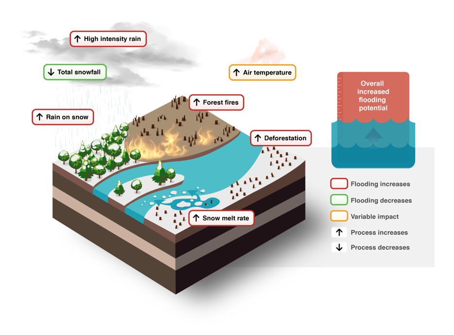
Figure 4: Conceptual model of impacts of climate change on peak flow in a forested plains river system.
Text Version
Conceptual infographic that explains factors contributing to changes in flooding potential due to environmental and climatic changes. The image is a stylized cross-section of a landscape including clouds, rain, snow, rivers, forests, forest fires, and deforestation, designed to highlight hydrological processes and their connections to changes in the watershed.
The cross-section of the landscape layers reveals soil, water, and vegetation layers.
The landscape displays text paired with arrows. The text identifies processes that affect the peak flow in the watershed. The arrows indicate whether climate change is expected to alter the process, leading to either an increase in peak flow indicated by an upward arrow or a decrease in peak flow indicated by a downward arrow.
The increase in high intensity rain in a red box is represented by a dark cloud and heavy rain.
The decrease in total snowfall in a green box reflects a lower snow accumulation.
The increase in rain on snow in a red box is illustrated by rain falling on snow-covered areas.
The increase in forest fires in a red box is highlighted by a burning forest area.
The increase in snow melt rate in a red box is represented by snow melting and flowing into a river.
The increase in air temperature in a yellow box indicated is illustrated by a reddish fog.
The increase in deforestation in a red box is illustrated by land cleared with tree stumps.
The right side of the image shows an infographic of a rectangular container partially filled with blue water. Above the waterline, a reddish-orange section contains the white text: “Overall increased flooding potential.” The water surface is illustrated with wave shapes, and a faint upward-pointing arrow is visible beneath the water, suggesting rising water levels. A vertical ruler-like scale appears along the left edge of the container. The graphic conveys an increase in flood risk or likelihood of flooding due to climate change.
A summary of the different categories can be found on the far right, along with:
- A red box indicating flooding increases.
- A green box indicating flooding decreases.
- A yellow box indicating variable impact.
Black arrows indicating process increases when pointing upwards and process decreases when pointing downwards.
Precipitation that traditionally fell as snow is likely to shift to rainfall. While the exact effect (and timing of that effect) on streamflow remains uncertain, changes in the frequency and magnitude of large events are expected. Additionally, rain-on-snow events may become more frequent, particularly during the early stages of warming, when a substantial snowpack still exists (Dibike et al., 2019). With an increase in temperature, an increase in atmospheric evaporative demand is expected to occur (Pike et al., 2010), which will reduce water availability in the watershed during hot periods of the year. Moreover, the potential loss of tree cover in the basin, due to forest fires and deforestation, could reduce rainfall interception from trees, resulting in increased runoff entering the stream (Nasirzadehdizaji & Akyuz, 2022).
The conceptual model points towards the total system having an overall likelihood of increased flooding due to climate change. If it is necessary to turn this qualitative understanding into quantitative numbers, hydrologic modelling is necessary.
Conceptual Model 2: Mountainous Watershed Experiencing Rain-on-Snow
A conceptual model of climate impacts on a mountainous watershed experiencing potential atmospheric river flooding (for example, in the Coast Mountains of British Columbia) is shown in Figure 5.
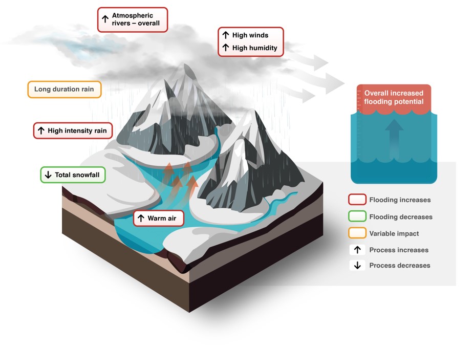
Figure 5: Conceptual model of impacts of climate change on peak flow on a mountainous watershed experiencing rain-on-snow.
Text Version
Conceptual infographic that explains factors contributing to changes in flooding potential due to climate change. The image is a stylized cross-section of a landscape including mountains, snow, rivers, clouds, and rain, designed to highlight hydrological processes and their connections to changes in the watershed.
The cross-section of the landscape layers reveals snow, soil, and water layers.
The landscape displays text paired with arrows. The text identifies processes that affect the peak flow in the watershed. The arrows indicate whether climate change is expected to alter the process, leading to either an increase in peak flow indicated by an upward arrow or a decrease in peak flow indicated by a downward arrow.
The increase in atmospheric rivers overall in a red box is represented by clouds and precipitation.
The increase in high winds and high humidity in a red box is next to grey clouds, precipitation and large semitransparent grey arrows.
Under the clouds, adjacent to the rain, there is a yellow box titled long duration rain.
The increase in high-intensity rain in a red box is located below the precipitation.
The total snowfall decrease in a green box is located adjacent to a snow-covered terrain.
Near the base of the mountains, orange arrows point upwards from the valley floor and are associated with the label increase of warm air in a red box.
The right side of the image shows an infographic of a rectangular container partially filled with blue water. Above the waterline, a reddish-orange section contains the white text: “Overall increased flooding potential.” The water surface is illustrated with wave shapes, and a faint upward-pointing arrow is visible beneath the water, suggesting rising water levels. A vertical ruler-like scale appears along the left edge of the container. The graphic conveys an increase in flood risk or likelihood of flooding due to climate change.
A summary of the different categories can be found on the far right, along with:
- A red box indicating flooding increases.
- A green box indicating flooding decreases.
- A yellow box indicating variable impact.
- Black arrows indicating process increases when pointing upwards and process decreases when pointing downwards.
High-intensity rainfall events are expected to become more frequent (Kharin et al., 2007), resulting in more runoff entering the streams. Additionally, atmospheric rivers are expected to bring significantly increased rainfall to mountainous regions (Rhoades et al., 2020). An increase in air temperatures will reduce average annual snowfall throughout the watershed, especially at higher elevations; this precipitation is instead expected to occur as rainfall (Musselman et al., 2018). This effect is expected to result in increased instances of rain-on-snow events.
These impacts are expected to increase the overall likelihood for large peak flow events and flooding. The impacts of long-duration rainfall, high humidity, and high winds on peak flows in the watershed remain unclear but could contribute to further hydrological variability. The total system has an overall likelihood of increased flooding due to climate change and qualitatively indicates a more severe increase than in Figure 4. Further, a shift from mostly snowfall related flooding to primarily rainfall related flood may be possible may be possible if snowfall decreases to near zero.
Conceptual Model 3: Large Lake System
Climate change is expected to intensify wind patterns (Eichelberger et al., 2008), leading to increase wave effects on lakes (Figure 6).
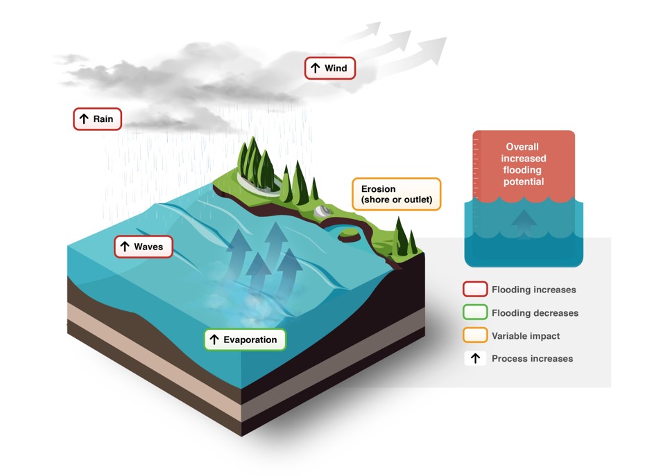
Figure 6: Conceptual model of impacts of climate change on a large lake system.
Text Version
A conceptual infographic that explains factors contributing to changes in flooding potential due to climate change. The image is a stylized cross-section of a landscape including a lake, a shoreline, shoreline erosion, trees and vegetation, clouds, rain, and evaporation over the lake. The image is designed to highlight hydrological processes and their connections to changes in the watershed.
The cross-section of the landscape layers reveals soil, water, and vegetation layers.
The landscape displays text paired with arrows. The text identifies processes that affect the peak flow in the watershed. The arrows indicate whether climate change is expected to alter the process, leading to either an increase in peak flow indicated by an upward arrow or a decrease in peak flow indicated by a downward arrow.
The increase in rain in a red box is located between clouds and precipitation.
The increase in winds in a red box is next to grey clouds, precipitation and large semitransparent grey arrows.
The increase in waves in a red box is over the water.
The increase in evaporation in a green box is over the water, next to small semitransparent grey clouds and large semitransparent bleu arrows.
The increase in waves in a red box is over the water.
Beside the vegetation, adjacent to the shore, there is a yellow box titled erosion (shore or outlet).
The right side of the image shows an infographic of a rectangular container partially filled with blue water. Above the waterline, a reddish-orange section contains the white text: “Overall increased flooding potential.” The water surface is illustrated with wave shapes, and a faint upward-pointing arrow is visible beneath the water, suggesting rising water levels. A vertical ruler-like scale appears along the left edge of the container. The graphic conveys an increase in flood risk or likelihood of flooding due to climate change.
A summary of the different categories can be found on the far right, along with:
- A red box indicating flooding increases.
- A green box indicating flooding decreases.
- A yellow box indicating variable impact.
- Black arrows pointing upwards indicating process increases.
This is expected to increase storm surges, bringing water higher up on the shores, which could increase impacts on shorelines and lead to flooding of any present infrastructure, and may result in erosion of the shore. With increasing wind, evaporation will also increase on the lake (Woolway et al., 2020), which will potentially lower water levels and slightly reduce flood risks. However, the increase in storm surges is expected to outweigh the increase in evaporation, resulting in an overall likelihood of increased flooding potential (Seglenieks & Temgoua, 2022).
2.2.4 Analysis
Summary of main tasks:
- Design an analysis proportionate to the project
- Analysis Options
The analysis step in the assessment begins by ensuring the analysis is proportional to the project, compiling historical climate and flow data. Then, the practitioner moves to actually conducting analyses of climate and hydrologic models, and if necessary, developing and using a model (for example, Case Studies 3.5 and Case Studies3.9).
There is already a large body of literature on the technical aspects of climate model output, climate downscaling, and hydrologic model linkage to climate model outputs. For a technical primer on climate change and flood hazards in Canada, see Khaliq (2019).
i) Design an analysis proportionate to the project
While the first three steps in the climate assessment framework are consistent across all project sizes, the level of effort required for the analysis may vary widely. This is due to basic logistical concerns such as the time or budget available to do the work, but also the specific needs of the project and the information that is available. The technical analysis undertaken can thus vary widely, from applying design flow changes obtained through the literature review at the simple end to developing and operating a custom hydrologic/climate model at the complex end, and every option in between.
As discussed in Section 2.1, it is recommended to follow the guiding principle of starting conservative and refining from there. This means that in some cases it may be easier to make simple yet conservative assumptions about climate impacts on flooding; that is, to assume a large increase in peak flows or water levels at the AOI and plan accordingly. In other situations, where over-estimating climate impacts is undesirable, it is worth more effort and time to close in on a more specific, and potentially less drastic, recommendation for changes in the design flood magnitude (or level).
It is likely obvious that a climate assessment would be very different when assessing the flood hazard for a city of one million people than when designing culverts for a single forestry road. There is a substantially greater number of people put at risk for the former, and thus a much greater total effort to be put into the project. The larger a project is, and the greater impact it may have, the greater the importance of the principal of multiple lines of evidence. Using more than one analysis approach lends credibility to any conclusions or recommendations drawn from the analysis.
ii) Analysis options
Our recommended technical analyses for climate impacts on flood hazards can generally be broken into three categories:
- Direct transfer of climate model output to flood impacts
- Use of available model outputs
- Purpose-built model for the area of interest
Because there are no observations for the future, analysis of climate impacts on flooding primarily revolves around the use and assessment of models. Models can include earth systems models and regional climate models (ESMs and RCMs), but also hydrologic models, routing models for lake levels, and wave and storm surge models for lakeshores.
An ideal situation is that local hydrologic (or the appropriate flood hazard) model output, which has been run with climate model output, is already available for a project’s specific location. This is the case for some areas of Canada: several regional climate modelling centres have hydrologic model output that end users can download and post-process for their AOI.
When these model outputs are unavailable, or not of appropriate level of detail for an AOI, other approaches must be taken. Whether those approaches are simpler or more complex depends on the needs, budget, and risks of the project (see Section 2.1).
This section provides a conceptual description of three of the most common analysis categories.
Option A: Direct transfer of climate model output to flood impacts
In some situations, it may be appropriate to directly apply numbers from ESMs or RCMs to estimate changes in flooding. This category of assessment is only applicable in cases where the variables available in ESMs or RCMs are directly correlated with potential changes in flooding, and where a single flood hazard type exists (see the conceptual model developed in Step 3 of the assessment process). Appropriate uses of this option include:
- Using projected changes in Intensity-Duration-Frequency (IDF) curves to directly infer changes in peak flows. This is potentially applicable in small urban catchments where peak flows and runoff are directly (or nearly directly) correlated. Practitioners can also direct IDF curve changes into stormwater calculation methods, such as the rational method or into simplified event-based hydrologic models. The ECCC recommended method for climate impacts on IDF curves is described by the Canadian Centre for Climate Services.
- Using sea level rise estimates directly for a coastal location (see Case Study 3.1).
- Application of future changes in wind speed directly to a wave run-up/storm surge calculation. Refer to the Coastal Flood Hazard Assessment for Risk-Based Analysis on Canada’s Marine Coasts (Section 5.6) for further reading.
This direct transfer approach is inappropriate in cases where nonlinear relationships between climate variables and flooding exist, or when multiple flood hazards affect the same area of interest (an understanding developed while making a conceptual model). This is the situation in many parts of Canada, where cold region hydrology and an abundance of surface freshwater complicate flood generation processes. Snow accumulation and melt, with further complication through rain-on-snow, create nonlinear responses of flooding to climate change. River-ice-related processes can complicate flood response even further. Additionally, frozen ground and permafrost, and areas with multiple flood hazards, such as the confluence of two rivers, or where a river meets a lake, add further complications to a process.
Option B: Use of available model outputs
Where Option A is inappropriate, use of a model is necessary. The appropriate model is not always the same; it may include hydrological models, river ice models, and hydraulic or hydrodynamic models that are driven with downscaled output from ESMs. The technical aspects of these models are beyond the scope of this guideline, but have been covered elsewhere (Khaliq, 2019). Practitioners should use the conceptual model of climate impacts on flooding to identify when these complex interactions exist and use the background research (Step 2 of the assessment process) to determine if model results already exist for the AOI, or if applicable model results from a similar site nearby can be applied to the AOI.
Questions that practitioners should ask when determining if it is appropriate to use output from a model developed by others for their AOI include:
- Does the model represent all the flood hazards identified in the conceptual model?
- If the model was not directly developed for the AOI, does the area that it was developed for:
- Experience very similar flood hazards?
- Experience a very similar climate?
- Have a very similar geographic scale?
- Did the model use a full and recent sample of climate model and carbon scenario outputs (different ESMs and shared socioeconomic pathways)? This is referred to as ensemble output, where multiple time series are produced, covering the same period.
The availability of climate-projected hydrologic model outputs is variable across Canada and is expanding rapidly. The appropriateness of these available models should still be assessed for the project at hand. Hydrologic (or other) models are not always fit for the same purposes; assessing the relevance to flood studies before use is necessary. Potential sources that practitioners can investigate include:
- Pacific Climate Impacts Consortium;
- PAVICS;
- Hydroclimatic Atlas of Southern Quebec;
- Research model outputs from academic research in hydrology and hydraulics in the AOI; and
- Data-sharing agreements between hydrotechnical consultants working in the same region.
These sources are continually expanding, including model outputs from Environment and Climate Change Canada and initiatives started in the Federal Hazard Identification and Mapping Program (FHIMP) and through Canada’s National Adaptation Strategy.
If an appropriate model output is available for the AOI, there is still substantial post-processing required to apply the model results to a project. In the case of using climate-driven hydrologic model output to adjust for future design flows on a river, the following steps are usually necessary:
- Calculate the present-day design flows from streamflow observations (for example, from WSCFootnote 2 data). See NRCan (2025b) for further information.
- Extract maximum streamflow (annual or other) from the ensemble of model outputs, separately by ESM and carbon scenario, at the AOI.
- Perform a frequency analysis on ensemble climate model outputs, on each separate time series, to assess change from present to future periods. The frequency analysis on model output can be done by:
- A comparison of shorter “pseudo-stationary” periods: for example, a frequency analysis calculated on 30-year periods of record (Figure 7). Rolling frequency analyses (for example, on a rolling X-year window) have also been proposed (Kharin & Zwiers, 2005). Or;
- Non-stationary frequency analysis: Several approaches are possible. Figure 8 shows results for one approach using the year as a covariate for the generalized extreme value (GEV) distribution’s location and scale parameters, via the “extRemes” package (Gilleland & Katz, 2016) for the statistical software R. Other approaches include that by Vidrio-Sahagún et al. (2023, 2024) (with free and open source software), Villarini et al. (2009), and El Adlouni et al. (2007).
- Summarize the changes from the present to the future periods for all future ensembles. Consider changes from the present day to the end of the model outputs (such as 2100 with the current generation of ESMs) but also consider changes that happen in the intermediate periods, such as decadal changes.
- Apply the changes in the modelled frequency analyses to the design flows calculated with observations. This step is necessary as it is unlikely that the model output completely matches the observations in the overlapping present-day period. There are two options:
- Bias correcting the model output to match the observations prior to the FFA. This would be done prior to the calculation in Step 3.
- In a simpler approach, the calculated percent change of modelled design flows (present to future) can be applied to the observed design flows.
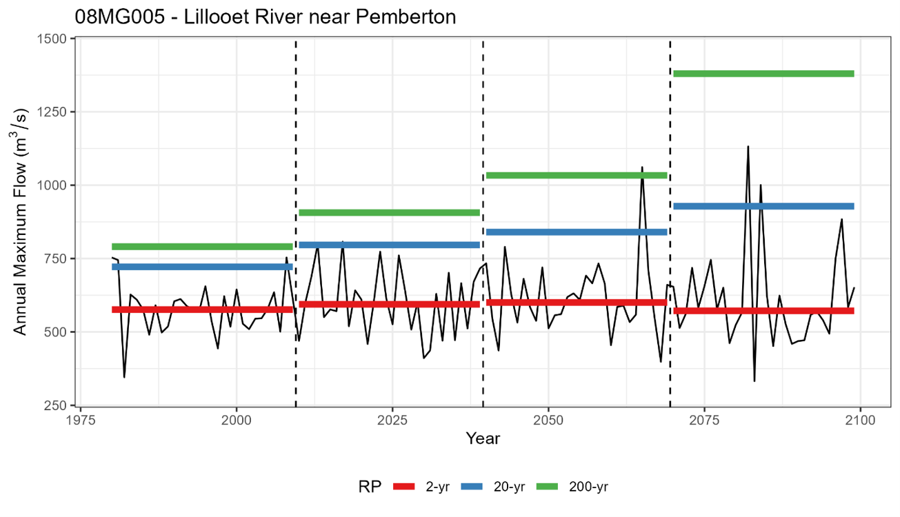
Figure 7: Flood frequency analysis results for 30-year block analyses on one climate model trace for the Lillooet River near Pemberton, BC. RP = Return Period. Data source: Pacific Climate Impacts Consortium.
Text Version
This graph depicts the flood frequency analysis for 30-year block analysis on one climate model trace for the Lillooet River near Pemberton, British Columbia. The maximum annual flow in cubic metres per second is shown on the y-axis while the year is shown on the x-axis. The figure presents a time series of the annual maximum flow in black from 1980 to 2100. The x-axis is divided into 4 time periods with the return period flows for each time period shown as a solid horizontal line in red for 2-year event, blue for the 20-year event, and green for the 200-year event.
The graph is divided into four segments: 1980 to 2010, 2010 to 2040, 2040 to 2070, and 2070 to 2100, separated by vertical dashed lines.
The final segment extends to 2100, indicating long-term climate projections.
2-year return period in red: Represents frequent flood events, showing a relatively stable baseline around 600 cubic metres per second throughout the period, with minor fluctuations.
20-year return period in blue: Indicates less frequent flood events, with an overall upwards trend in flows from about 750 cubic metres per second in the period from 1975 to 2010 to approximately 900 cubic metres per second in the period from 2070 to 2100.
200-year return period in green: Indicates much less frequent flood events, with an overall upwards trend in flows starting at approximately 750 cubic metres per second in the period from 1975 to 2100 and increasing to approximately 1,400 cubic metres per second by the period of 2070 to 2100.
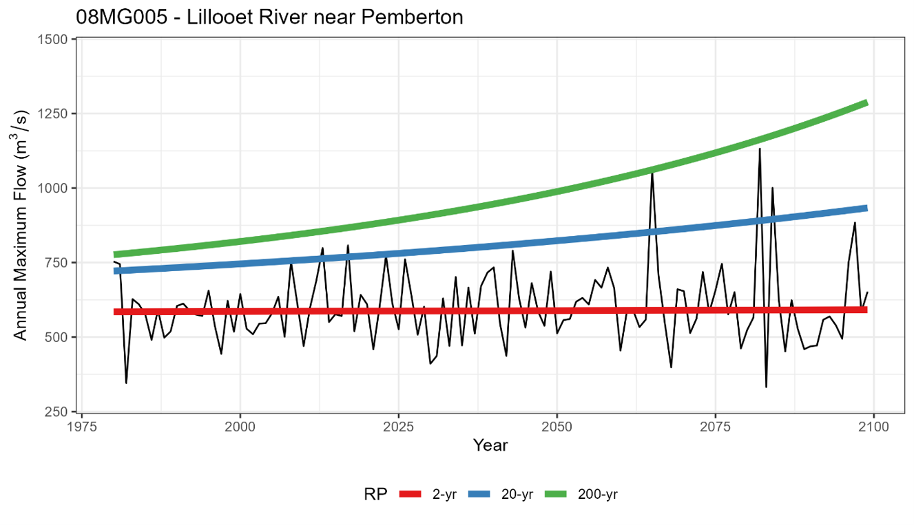
Figure 8: Non-stationary flood frequency analysis results on one climate model trace for the Lillooet River near Pemberton, BC. RP = Return Period. Data source: Pacific Climate Impacts Consortium.
Text Version
A non-stationary flood frequency analysis on one climate model trace for the Lillooet River near Pemberton, British Columbia. The maximum annual flow in cubic metres per second is shown on the y-axis while the year is shown on the x-axis. The figure presents a time series of the annual maximum flow in black from 1980 to 2100. The 2-year return period flow time series is shown in red, the 20-year return period flow time series is shown in blue, and the 200-year return period time series is shown in green.
2-year return period in red: shows a near-horizontal line at about 600 cubic metres per second.
20-year return period in blue: shows a steadily rising line from approximately 750 cubic metres per second in 1980 to approximately 950 cubic metres per second by 2100.
200-year return period in green: shows an exponentially rising line starting at approximately 750 cubic metres per second in 1980 and rising to 1,300 cubic metres per second by 2100.
Option C: Purpose-built model for the area of interest
While the availability of hydroclimatic model output in Canada is increasing, there are still many situations where there is no available model output, or the available model output is inappropriate for a particular project. The course of action taken in these cases should be guided by the principle of designing an assessment proportionate to the project (see Section 2.1).
For small-scale projects, the best approach may be to combine the literature review and qualitative understanding to recommend changes that account for climate change impacts on flooding, with a mind toward over-preparing. NRCan (2025b), Chapter 8, provides some options for simplified storm surge estimation methods in lake flooding situations. However, in very large projects, over-designing is less feasible, and it is more appropriate to design and build a model specifically for the project.
Where a purpose-built model is necessary, planning is required from the initial project scoping phase. Technical expertise in hydrologic modelling, climatology, ice effects, wave effects, and other specialized fields must be available for the project, and the budget and schedule must be increased accordingly.
The detail and expertise required to develop a purpose-built hydrologic model is beyond the scope of this guideline. Following the example in Option 2 (above), the steps for developing a customized hydroclimate model to account for climate impacts on flooding in a riverine system are:
- Configure an appropriate hydrologic model for the watershed of interest.
- Calibrate the model for the historical period using observations (for example, weather and hydrometric data).
- Downscale (or obtain downscaled) ESM output so that it statistically matches historical weather observations in the historical period.
- Run the calibrated model using the downscaled climate model outputs.
- Post-process the model output in the same manner as in Option 2 (above).
For this “maximum” analysis level, Figure 9 illustrates where and how custom hydrologic model development and climate scenario modelling can integrate into the full workflow of flood hazard mapping.
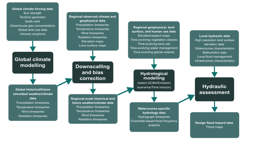
Figure 9: Flow chart of a workflow of climate and hydrologic model informed flood hazard assessment. Adapted from Associated Engineering (2021b).
Text Version
The image is a dark-themed workflow diagram illustrating a multi-stage modelling framework that links global climate modelling to local flood hazard assessment. The diagram is organized from left to right, with teal-coloured rectangular boxes connected by arrows that show the flow of information between modelling components.
Overall Structure
The workflow contains four major modelling stages:
Global climate modelling
Downscaling and bias correction
Hydrological modelling
Hydraulic assessment.
Each stage receives increasingly localized data and produces outputs that become inputs for the next stage. The arrows indicate a progression from global-scale climate information toward detailed flood hazard mapping.
Global Climate Modelling
On the top left, the input data box is titled: “Global climate forcing data.” The listed inputs are Sun strength, Tectonic geometry, Earth orbit, Greenhouse gas concentrations, Global land use data, and Volcanic eruptions.
A downward arrow connects this box to the next dark teal box labelled “Global climate modelling.”
A second downward arrow leads to an output data box titled “Global historical/future simulated weather/climate data.” It contained the variables: Precipitation timeseries, Temperature timeseries, Wind timeseries, and Radiation timeseries.
An arrow points rightward toward the next modelling stage.
Downscaling and Bias Correction
On the second top left, the input data box is titled “Regional observed climate and geophysical data.” The listed inputs are Precipitation timeseries, Temperature timeseries, Wind timeseries, Radiation timeseries, Elevation maps, and Land surface maps.
A downward arrow connects this box to the next box labelled “Downscaling and bias correction.”
A second downward arrow leads to an output data box titled “Regional-scale historical and future weather/climate data.” It contained the variables: Precipitation timeseries, Temperature timeseries, Wind timeseries, and Radiation timeseries.
An arrow points rightward toward the next modelling stage.
Hydrological Modelling
On the right upper middle, the input data box is titled “Regional geophysical, land surface, and human use data.” The listed inputs are Elevation/aspect maps, Time-evolving vegetation classes, Time-evolving land use, Time-evolving water management, and Time-evolving glacier extents.
A downward arrow connects this box to the next box labelled “Hydrological modelling” with an additional note beneath the title: “(select GCMs/Emission scenarios/Time horizon)”.
A second downward arrow leads to an output data box titled “Watercourse-specific hydrology data.” It contained the variables: Hydrograph timeseries, and Ensemble-based flood frequency analysis.
An arrow points rightward toward the next modelling stage.
Hydraulic Assessment
On the far upper right, the input data box is titled “Local hydraulic data.” The listed inputs are High resolution land surface elevation data, Watercourse characteristics, Bathymetric data, and Local flood management infrastructure characteristics.
A downward arrow connects this box to the next box labelled “Hydraulic assessment.”
A second downward arrow leads to an output data box titled “Design flood hazard data.”
Below the hydraulic assessment box is the final product: Flood maps.
The layout progresses from global-scale climate drivers on the left to local flood hazard maps on the right.
Not recommended: extrapolation
An approach for quantitative climate analysis that is not recommended is trend analysis of observations. Though a trend assessment is a worthwhile part of assessing data used for generating present-day design flows, there are multiple reasons why it is inappropriate to extrapolate these trends into the future:
- The principle of a loss of stationarity due to climate change also applies to trends. Just because a trend has occurred in the past does not mean one can assume this trend will continue.
- There are many nonlinear and threshold-based processes that relate to climate impacts and flood hazards. Extrapolation of a historical trend in flood hazard into the future discounts all these complex interactions.
- It is easy to mistake natural variability for climate change. There are many reasons that hydrometric data may exhibit a trend, such as fluvial geomorphologic factors affecting the stream channel, land use change, water management changes, and shorter-term climate variability (for example, Pacific Decadal Oscillation, El Niño Southern Oscillation).
- Many hydrometric station records are too short to provide trend analysis results with suitable confidence to conclude that the trend is caused by climate change impacts. Figure 7 illustrates how a 30-year record is often considered short enough to be called “pseudo-stationary” and analyzed as though it were a stationary record. Yet, most WSC gauges have a published peak flow record shorter than 30 years. In the 16 Jan, 2026 version of HYDAT, the median instantaneous annual peak flow record length of WSC gauges (active or discontinued) was only 20 years.
2.2.5 Recommendation
Summary of main tasks
- Synthesize Prior Steps
- Provide climate-informed safety factor as a value or range
Overview
Step 5 involves synthesizing Steps 1 through 4 and providing the result as a value or range of how climate change will impact peak flows in the AOI. Special considerations for this step are provided in Section 2.3.
i) Synthesize prior steps
The recommendations phase is a synthesis of the four prior steps to provide a best approach for design flow (or water level) estimation for the particular AOI. Practitioners should use all the results to make a recommendation that is most appropriate, given the understanding of climate impacts and the needs of the study.
ii) Provide climate-informed safety factor as a value or range
This final step is primarily where the key principles of assessment should be considered, particularly Principle 3 (focusing on key vulnerabilities) and Principle 4 (establishing multiple lines of evidence), to provide the result as a value or range of how climate change will impact peak flows in the AOI. For example— “it is recommended to increase the 200-year design flow by XX% to account for increased flood hazard due to climate change”.
Ideally, through Steps 3 and 4 (the conceptual model and analysis), the practitioner has explored a few different ways of considering climate impacts on the AOI (for example, the conceptual model was informed by a literature review and the assessment incorporated climate and hydrologic model outputs). Optimally, these approaches all point to similar future outcomes for the project site. If this is the case, recommendations for how design flows or levels should be adjusted into the future should be fairly straightforward.
Where various analyses are not in agreement, focusing on key vulnerabilities becomes essential. In these situations, the recommendations should focus on results and outcomes that are most critical to the specific project, and results are best presented as a range.
If one analysis points to stable flood hazard and another points to increasing flood hazard, and they are equally trustworthy methods, the conservative engineering approach would be to recommend planning for increased flood hazard. There is usually less disadvantage to planning for increasing floods that do not happen than there is for the opposite. There may be, however, a limit to being conservative in recommendations, for example, when major changes to a populated floodplain are implicated. In those cases, further analysis (either through new models or an independent assessment) may be warranted.
2.3 Special Considerations
The following special considerations should be considered, especially in Steps 4 and 5 of the assessment process.
A. Maximum climate impacts on flooding before 2100 or decreasing peak flows:
Recommendations for changes in design flows or lake levels should always be based on the highest hazard between the present day and the end of the analysis. Practitioners may assume that this highest hazard occurs in the last year of a climate projection (2100 in most casesFootnote 3), but this is not always the case.
Projects with detailed analyses of model output may show that flood hazard is expected to increase for some decades and then taper off. This can be the case in snowmelt-dominant systems, where increases in melt rate increase flood hazard for some time, but are eventually overwhelmed by decreases in snowpack. The recommendation should be based on the time with the highest hazard. We have to live through 2050 to get to 2100, so if the flood hazard is higher in 2050, this should be the design recommendation.
Further, flood hazard may decline for some watercourses in Canada. For example—a watershed that will experience a complete disappearance of snow would no longer experience a spring freshet. If all other processes are staying the same, the recommendation could be for “no change” to design flows to account for climate. However, practitioners should consider Principles 2 and 4. The burden of evidence is higher for a smaller climate change adjustment, and that multiple lines of evidence should point to the “no change” conclusion.
A decrease to design flows for climate change should never be recommended; we still need to prepare for a flood today.
B. Changes in the dominant flood type:
Change in the dominant flood type or season is a particularly difficult situation to anticipate. For example—rather than a monotonic increase in spring flood hazard, the flood hazard may change from a spring freshet flood to a winter rainstorm flood. This type of change likely requires thoughtful and sophisticated physics-based hydrological modelling and a detailed conceptual understanding of the system.
Along with the difficulties in prediction, this type of change presents substantial logistical difficulties. Municipalities and other governments prepare for flooding based on knowing the approximate time of year when it can occur. If the typical flood season changes, a reorganization of the flood response is required and will be more difficult to deal with if not planned for ahead of time (see Case Study 3.4). This means that a modelled 15% increase in the 200-year flood, for example, is substantially more problematic if it is also expected that it could happen in a different season. In these cases, recommendations should go beyond numbers to also describe how the timing of flooding could change as well.
C. The worst carbon scenarios do not always result in the worst flooding
It is typically assumed that the worst carbon scenarios (i.e., most warming) will result in the most severe increases in flooding. While this is usually the case, it may not always be true. When “mild” climate scenarios result in a decrease in snowpack, but “severe” carbon scenarios result in a complete loss of snowpack over a watershed, hydrologic modelling may indicate greater flood hazard for the moderate scenario. This possibility should be considered during the conceptual model phase and evaluated (via assessment of multiple carbon scenarios) during the analysis whenever possible.
2.4 Conclusion
The assessment process described in this section is intended to guide, rather than prescribe, how practitioners can integrate climate change considerations into local flood hazard mapping projects. Practitioners are encouraged to make adjustments according to the purpose of their project, the availability of information, and their skillsets and knowledge.
The case studies presented in Section 3.0 illustrate recent approaches to climate assessments and recent developments in local practices across the country.
3.0 Case Studies
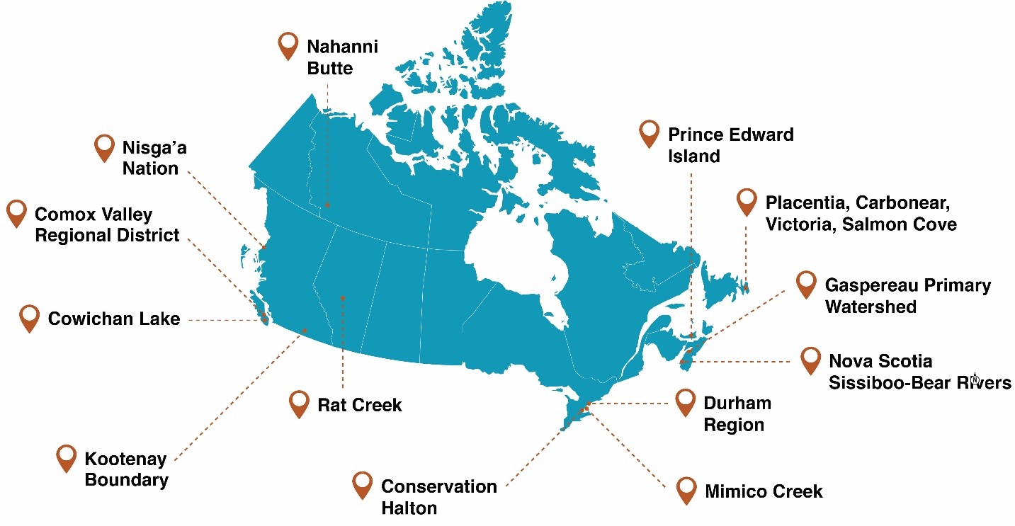
Figure 10: Case study locations.
Text Version
A map of Canada showing the locations of multiple case-study sites locations distributed across the country. The map presented the Canada in a bright teal colour. Provincial and territorial boundaries are faintly outlined in white. Brown map-pin icons and dashed brown leader lines connect labels outside the map to their corresponding locations.
The map pins in Western Canada are:
Comox Valley Regional District, and Cowichan Lake both located on the west coast of British Columbia, on Vancouver Island.
Nisga’a Nation, located in northwestern British Columbia.
Kootenay Boundary, located in southeastern British Columbia.
Rat Creek, located in southern Alberta.
The map pins in Northern Canada are:
Nahanni Butte, located in the Northwest Territories.
The map pins in Central Canada are:
Conservation Halton, Mimico Creek, and Durham Region located in southern Ontario.
The map pins in Atlantic Canada are:
Prince Edward Island, located above Nova Scotia.
Gaspereau Primary Watershed, located in Nova Scotia.
Nova Scotia Sissiboo-Bear Rivers, located in southwestern Nova Scotia.
Placentia, Carbonear, Victoria, Salmon Cove, located in Newfoundland and Labrador.
In this section
- 3.1 Nahanni Butte: Flood Hazard Mapping
- 3.2 Comox Valley Regional District: Coastal Flood Hazard Mapping
- 3.3 Cowichan Lake: Shoreline and Lake Level Flood Mapping
- 3.4 Kootenay Boundary: Flood Mapping
- 3.5 Nisg̱a’a Nation: River Basin Flood Hazard Mapping
- 3.6 Rat Creek: Riverine Flood Mapping
- 3.7 Conservation Halton: Local Waterbody Flood Hazard Mapping
- 3.8 Durham Region: Riverine Crossings and Roads Flood Hazard Mapping
- 3.9 Mimico Creek: Erosion-Related Flood Mapping
- 3.10 Gaspereau Primary Watershed: Municipal Flood Line Mapping
- 3.11 Nova Scotia Sissiboo-Bear Rivers: Primary Watershed Flood Line Mapping
- 3.12 Prince Edward Island: Pluvial Flood Mapping Project
- 3.13 Newfoundland and Labrador: Climate Change Flood Risk Mapping Study
The climate assessment framework in the prior section described why a one-size-fits all approach to climate assessment of flooding is not feasible. The assessment must be tailored to the project. The case studies in this section reflect engineering developments in incorporation of climate impacts into flood hazard assessments across Canada. Practitioners from across Canada contributed their approaches, solutions, and experiences to this guide.Footnote 4 Though they were carried out before release of the climate assessment framework, the contributed case studies cover a variety of communities and their unique flood hazards, a range of mapping products and methodologies, and a diversity of outcomes.
3.1 Nahanni Butte: Flood Hazard Mapping
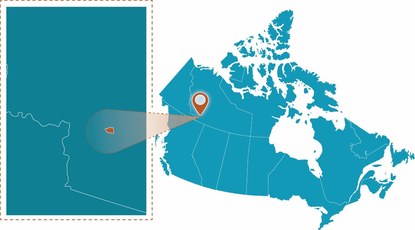
Figure 11: Nahanni Butte project location.
Text Version
A map showing the study area within Canada on the right side and a zoomed-in inset enclosed within a brown dashed rectangular border on the left side. The graphic uses a teal-coloured map of Canada. A brown map pin marks the site, while a brown spotlight effect and brown dashed outline connect the inset to its location on the national map.
Project Profile
- Client: Nahanni Butte Dene Band and Government of Northwest Territories
- Project Lead: Dillon Consulting and Heron Hydrologic
- Funding Partner: Climate Change Preparedness in the North and Flood Hazard Identification and Mapping Program (FHIMP)
- Completion Date: Summer 2025
- Portion for Climate Assessment: ~ 15% of total budget
- Nearest Community: Nahanni Butte Dene Band
- Waterbodies: Liard River, South Nahanni Butte
Community Profile
Nahanni Butte, traditionally Nahɂą Dehé Dene Band, is a small, remote Indigenous community in the southwest corner of the Northwest Territories (NT). The community is located in the Dehcho region, downstream of the Nahanni National Park Reserve, a UNESCO World Heritage Site.
Nahanni Butte is situated on a relatively flat river terrace on the south bank of the South Nahanni River, near its confluence with the Liard River. The total drainage area contributing to the community is approximately 264,900 km2. Within this, the South Nahanni River watershed (36,000 km2), is a key tributary. The watershed is a mountainous and forested basin in the Mackenzie Mountains, with the community itself on the eastern edge of the mountains.
Local flood hazards
The community is susceptible to open-water riverine flooding, which is a key distinction from most other NT communities that face ice jam flooding risks. The primary flood drivers are large rainfall events within the mountainous South Nahanni River basin, particularly when coinciding with a late spring snowmelt from a substantial snowpack.
High water levels on the larger Liard River can exacerbate these events by creating a backwater effect that impedes the flow of the South Nahanni River. The most significant recorded flood event in recent history occurred in June 2012.
Purpose
The objective of this study was to develop flood hazard maps for Nahanni Butte to support future land use planning, emergency preparedness, and climate resilience. The study focused on modelling inundation extents for multiple open-water flood scenarios. These scenarios included:
- The 2012 observed flood;
- Flood with 1% AEP (1:100-year flood);
- Flood with 0.5% AEP (1:200-year flood); and
- Two future climate scenarios.
Methodology
A complete hydrotechnical assessment was conducted, beginning with a background review and a field survey, followed by hydrologic and hydraulic modelling. The field survey was undertaken to obtain current bathymetric and topographic information, and to identify high water marks based on community input and recollection from the 2012 flood. The bathymetric survey used a single ping depth sounder mounted on a boat to cover 15 km of the Liard River and 10 km of the South Nahanni River. The bathymetric survey was able to capture the braided channels in the area, and the topographic survey used a drone to capture banks and exposed sand bars that were not possible to survey using the boat.
Subsequently, a flood chronology was developed for the June 2012 flood to better understand the dynamics and factors leading to the event. Hydrologic modelling was then conducted using Raven (Craig et al., 2020) to identify flow hydrographs for inclusion in the 2-D HEC-RAS (Hydrologic Engineering Center’s River Analysis System) model. The resultant flood inundation extents, velocities, and depths were used to develop flood inundation and hazard maps.
Hydrologic modelling
Hydrologic modelling used a published Raven model, originally developed and calibrated for the Liard River basin. For this component of the project, Dillon partnered with Heron Hydrologic, which completed the Raven modelling. Following recalibration and inclusion of updated hydrometric and meteorological data, the model was used to simulate continuous daily streamflow over historical and future periods. The total drainage area in the model was approximately 264,900 km2, encompassing both the South Nahanni River and Liard River watersheds. Regional Flood Frequency Analysis (RFFA) was also used to inform flood magnitudes using data from gauges within a 150 km radius because there was no hydrometric gauge with sufficient data in Nahanni Butte. Peak flows for five scenarios were extracted from this modelling:
- 2012 historical flood: The peak flow for the 2012 flood was obtained from the simulated Raven model output, as no hydrometric station existed at the community during that event.
- 1% AEP (1:100-year) and 0.5% (1:200-year) floods: Peak flows were estimated using flood frequency analysis (FFA) on the historic simulated flow time series from the Raven model. These were compared with peak flows estimated using the RFFA. Since the RFFA results yielded higher peak flows than those derived from the Raven FFA, the RFFA results were selected for use in the hydraulic model.
- Two climate change scenarios: Peak flows were estimated using flood frequency analysis on forecasted flow time series simulated from the Raven model, driven by the forcing data from the respective climate change scenarios’ data. Details on the selection process of the climate change scenarios are described in the following section.
For each of the scenarios, the shape of the daily-scale flow hydrograph was based on the 2012 historic flood hydrograph and scaled according to their respective peak flows relative to the 2012 flood. The hydrographs were used as upstream boundary conditions on both the South Nahanni and Liard Rivers for the hydraulic model.
Climate change datasets were obtained from Environment and Climate Change Canada (ECCC) and were based on an ensemble of 26 statistically downscaled CMIP6 (Coupled Model Intercomparison Project Phase 6) models. The datasets for the model ensemble were downscaled using the multivariate statistical downscaling method CanDCS-M6. The downscaled datasets covered the period 1950–2100.
Two climate change scenarios, SSP2-4.5 (representing a moderate-emissions scenario) and SSP5-8.5 (representing a high-emissions scenario), were chosen for modelling and mapping upon review of the initial modelling results. For the model ensemble, percentiles for the temperature and precipitation projections were used to summarize the range of results from the multi-model ensemble as follows:
- Cool and wet conditions: 25th percentile temperature and 75th percentile precipitation (represented here as T25P75);
- Median conditions: 50th percentile temperature and 50th percentile precipitation (represented here as T50P50); and
- Extreme cool and wet conditions: 5th percentile temperature and 95th percentile precipitation (represented here as T5P95).
The model runs included in the hydrologic assessment of climate change are summarized in Table 2.
| Scenario Name | Emission Pathway scenario | Model | Modelling Period | Temperature Percentile | Precipitation Percentile |
|---|---|---|---|---|---|
| Moderate Emission—Median Conditions | SSP2-4.5 | Ensemble | 2022–2100 | 50 | 50 |
| Moderate Emission—Cool/Wet Conditions | SSP2-4.5 | Ensemble | 2022–2100 | 25 | 75 |
| Moderate Emission — Extreme Cool/Wet Conditions | SSP2-4.5 | Ensemble | 2022–2100 | 5 | 95 |
| High Emission — Median Conditions | SSP5-8.5 | Ensemble | 2022–2100 | 50 | 50 |
| High Emission — Cool/Wet Conditions | SSP5-8.5 | Ensemble | 2022–2100 | 25 | 75 |
| High Emission — Extreme Cool/Wet Conditions | SSP5-8.5 | Ensemble | 2022–2100 | 5 | 95 |
The output of the hydrologic assessment for each scenario was a continuous time series of flows in the South Nahanni and Liard Rivers from 2022 to 2100. Based on the results, the median conditions (T50P50) appeared to underestimate flows by approximately an order of magnitude. The extreme cool/wet condition (T5P95) was overly conservative, and produced peak flows that were approximately twice as large as historic estimates. The climate change sensitivity analysis demonstrated that the cool/wet climate change scenarios (T25/P75) were most reflective of increased but reasonable maximum daily flows for both rivers. This suggests a potential for increased snowpack and higher annual peak flows in the future.
Having chosen the cool/wet climate change scenario, the continuous results must be translated into flood hazard maps by understanding the statistical relationship of projected annual peak flows. To account for the inherent non-stationarity in the climate change results, the results were examined in three segments:
- Near future (2022–2050);
- Mid-century (2050–2075); and
- End of century (2075–2100).
Two combinations of the following conditions were selected from the sensitivity analysis to represent the climate change scenarios:
- Annual Exceedance Probability: for example, 1% (1:100-year) or 0.5% (1:200-year).
- Emissions scenario: for example, SSP2-4.5 or SSP5-8.5.
- Time period: for example, 2022–2050, 2051–2075, or 2076–2100.
The respective peak flow magnitudes for each of the cool/wet scenarios are presented in Figure 12 and Figure 13 for the South Nahanni River and Liard River, respectively. Note that the vertical axis has been modified to demonstrate the variability between scenarios.
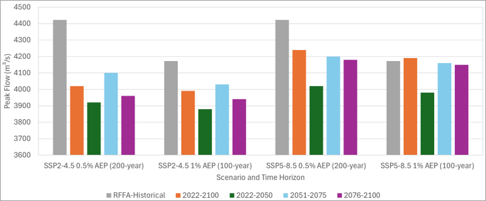
Figure 12: Sensitivity analysis results for cool/wet climate conditions (South Nahanni River).
Text Version
A grouped bar chart comparing peak flow values in cubic metres per second under different climate scenarios, return periods, and future time horizons. The chart is presented with horizontal gridlines and colour-coded bars representing historical and projected peak flows.
The vertical axis is labelled Peak Flow in cubic metres per second and has an approximative ranges 3600 to 4500 with 100 cubic metres per second intervals.
The horizontal axis is labelled Scenario and Time Horizon with four grouped categories. The categories are SSP2-4.5 0.5% AEP (200-year), SSP2-4.5 1% AEP (100-year), SSP5-8.5 0.5% AEP (200-year), and SSP5-8.5 1% AEP (100-year).
The scenarios combine two greenhouse-gas pathways: SSP2-4.5 with moderate emissions, and SSP5-8.5 with high emissions and two flood-frequency events: 0.5% AEP (200-year), and 1% AEP (100-year).
For each of the four categories, there are five bar colours that represent different time periods. The period RFFA-Historical is in grey, 2022 to 2100 in orange, 2022 to 2050 in dark green, 2051 to 2075 in light blue and 2076 to 2100 in purple.
Group 1: SSP2-4.5 0.5% AEP (200-year)
RFFA-Historical (grey) is approximately 4420 cubic metres per second and the highest bar in the group.
2022 to 2100 (orange) is approximately 4020 cubic metres per second.
2022 to 2050 (green) is approximately 3920 cubic metres per second and the lowest bar in the group.
2051 to 2075 (light blue) is approximately 4100 cubic metres per second.
2076 to 2100 (purple) is approximately 3960 cubic metres per second.
Historical values are substantially higher than all projected values under the SSP2-4.5 scenario for the 200-year event.
Group 2: SSP2-4.5 1% AEP (100-year)
RFFA-Historical is approximately 4170 cubic metres per second and the highest bar in the group.
2022 to 2100 is approximately 3990 cubic metres per second.
2022 to 2050 is approximately 3880 cubic metres per second and the lowest bar in the group.
2051 to 2075 is approximately 4030 cubic metres per second.
2076 to 2100 is approximately 3940 cubic metres per second.
The historical estimate exceeds all future projections. The mid-century period (2051 to 2075) shows the highest projected flow among future periods.
Group 3: SSP5-8.5 0.5% AEP (200-year)
This group contains some of the highest projected values in the chart.
RFFA-Historical is approximately 4420 cubic metres per second, the highest bar in the group and equal to or very close to the historical value in Group 1.
2022 to 2100 is approximately 4240 cubic metres per second.
2022 to 2050 is approximately 4020 cubic metres per second and the lowest bar in the group.
2051 to 2075 is approximately 4200 cubic metres per second.
2076 to 2100 is approximately 4180 cubic metres per second.
Projected flows under SSP5-8.5 are noticeably greater than those under SSP2-4.5. Projected values approach historical levels, particularly for the full-period projection and the mid-to-late century periods.
Group 4: SSP5-8.5 1% AEP (100-year)
RFFA-Historical is approximately 4170 cubic metres per second.
2022 to 2100 is approximately 4190 cubic metres per second and the highest bar in the group.
2022 to 2050 is approximately 3980 cubic metres per second and the lowest bar in the group.
2051 to 2075 is approximately 4160 cubic metres per second.
2076 to 2100 is approximately 4150 cubic metres per second.
This is the only scenario where projected values equal or slightly exceed the historical estimate.

Figure 13: Sensitivity analysis results for cool/wet climate conditions (Liard River).
Text Version
A grouped bar chart comparing projected and historical values across four climate-scenario and flood-frequency combinations. The chart uses five colour-coded bars within each group to represent historical data and projections for different future time periods.
Y-axis values range from approximately 13,500 to 18,000 with 500-unit intervals.
X-axis is labelled Scenario and Time Horizon with four grouped categories. The categories are SSP2-4.5 0.5% AEP (200-year), SSP2-4.5 1% AEP (100-year), SSP5-8.5 0.5% AEP (200-year), and SSP5-8.5 1% AEP (100-year).
For each four categories, there are five bar colours that represent different periods. The period RFFA-Historical is in grey, 2022 to 2100 in orange, 2022 to 2050 in dark green, 2051 to 2075 in light blue and 2076 to 2100 in purple.
The scenarios combine two greenhouse-gas pathways: SSP2-4.5 (moderate emissions), and SSP5-8.5 (high emissions) and two flood-frequency events: 0.5% AEP (200-year), and 1% AEP (100-year).
For each of the four categories, there are five bar colours that represent different periods. The period RFFA-Historical is in grey, 2022 to 2100 in orange, 2022 to 2050 in dark green, 2051 to 2075 in light blue and 2076 to 2100 in purple.
Group 1: SSP2-4.5 0.5% AEP (200-year)
RFFA-Historical (grey) is approximately 15,700 and the lowest bar in the group.
2022 to 2100 (orange) is approximately 16,350.
2022 to 2050 (green) is approximately 16,420.
2051 to 2075 (light blue) is approximately 16,380.
2076 to 2100 (purple) is approximately 17,600 and the highest bar in the group.
Group 2: SSP2-4.5 1% AEP (100-year)
RFFA-Historical is approximately 15,150 and the lowest bar in the group.
2022 to 2100 is approximately 16,170.
2022 to 2050 is approximately 16,220.
2051 to 2075 is approximately 16,190.
2076 to 2100 is approximately 17,220 and the highest bar in the group.
Group 3: SSP5-8.5 0.5% AEP (200-year)
RFFA-Historical is approximately 15,700 and the lowest bar in the group.
2022 to 2100 is approximately 17,050.
2022 to 2050 is approximately 16,400.
2051 to 2075 is approximately 17,080 and the highest bar in the group.
2076 to 2100 is approximately 16,900.
Group 4: SSP5-8.5 1% AEP (100-year)
RFFA-Historical is approximately 15,150 and the lowest bar in the group.
2022 to 2100 is approximately 16,850.
2022 to 2050 is approximately 16,200.
2051 to 2075 is approximately 16,900 and the highest bar in the group.
2076 to 2100 is approximately 16,680.
The figures present the historical peak flows from the RFFA and the future peak flows from FFA results for the climate change sensitivity analysis. In the Liard River (Figure 13), the peak flow appears to increase as climate change progresses, while the South Nahanni River (Figure 12) flows appear to stabilize or decrease in response to climate change.
The two climate change scenarios were selected in consultation with the Government of the Northwest Territories, Environment and Climate Change Canada, and Natural Resources Canada, and based on the following considerations:
- Annual Exceedance Probability: The hydraulic assessment of historical conditions indicated that flooding will happen during both 1% and 0.5% AEP historical flood events, and the difference between the extent of the two events was minor. As such, the 0.5% AEP was selected for the climate change scenario. This aligns the outcomes of this study with external initiatives (for example, the DFAA, which uses 200-year).
- Emission scenarios: SSP2-5.5 and SSP5-8.5 were selected for climate change scenarios to represent one moderate and one extreme emission scenario.
- Time period: The near future from 2022 to 2050 was selected to create flood hazard mapping under climate change scenarios as it is more useful in the short term for planning considerations.
The two selected scenarios to be used in flood mapping under climate change are summarized in Table 3. For clarity, they will be referred to by the appropriate emission pathway scenario, which is what differentiates the two, in the following sections.
| Flood Scenario ID | AEP (%) | Climate Change Scenario Name | Emission Pathway Scenario | Model | Modelling Period | Temperature/Precipitation Percentile |
|---|---|---|---|---|---|---|
| Scenario 1: Climate Change to 2050, SSP2-4.5 | 0.5 | Moderate Emission—Cool/Wet Conditions | SSP2-4.5 | Ensemble | 2022–2050 | 25th/75th |
| Scenario 2: Climate Change to 2050, SSP5-8.5 | 0.5 | High Emission—Cool/Wet Conditions | SSP5-8.5 | Ensemble | 2022–2050 | 25th/75th |
Results indicate that climate change will differentially affect the South Nahanni and Liard Rivers, with modelled flows on the South Nahanni River anticipated to decrease and flows on the Liard River anticipated to increase. The near-future statistical results for the 0.5% AEP (1:200-year) were chosen for SSP2-4.5 and SSP5-8.5.
Hydraulic modelling
A 2D HEC-RAS model was developed using lidar-derived terrain and bathymetric survey data of the Liard and South Nahanni Rivers. The 2D model used daily hydrographs from Raven as upstream boundary conditions on the Liard and South Nahanni Rivers. The downstream boundary condition was used as a calibration mechanism to align the flood elevations with surveyed high-water marks from the 2012 flood. The calibrated hydraulic model generated depth, velocity, and water surface elevation rasters for each of the modelled scenarios.
Outcomes
The project produced a set of detailed flood inundation and hazard maps for future community land use and emergency planning. The 2012 flood of record was produced as a flood inundation map, and four flood hazard maps were produced:
- 1% AEP (1:100-year) historical flood,
- 0.5% AEP (1:200-year) historical flood,
- 0.5% AEP (1:200-year) Climate change scenario 1 (T25/P75)—SSP2-4.5 for 2022–2050, and
- 0.5% AEP (1:200-year) Climate change scenario 2 (T25/P75)—SSP5-8.5 for 2022–2050.
The flood hazard maps define floodway and flood fringe areas, with the floodway primarily determined by water depths greater than 1 metre and/or velocity greater than 1 m/s. Due to the community's undulating topography, flood depths vary significantly across the area, and few places are expected to remain outside the flood fringe.
Conclusion
The Nahanni Butte study used updated Raven hydrologic modelling and 2D HEC-RAS hydraulic modelling, supported by ground surveys and bathymetric data, to simulate flood scenarios including historical (2012 flood), floods of 1% AEP and 0.5% AEP (1:100-year and 1:200 year), and future climate change scenarios.
Climate change analysis was based on downscaled CMIP6 datasets, and two emissions scenarios (SSP2-4.5 and SSP5-8.5) were evaluated using a cool/wet percentile combination (25/75). The climate change scenarios representing the 0.5% AEP (1:200-year) for the near-future horizon (2022–2050) were selected as a conservative planning scenario.
Five flood maps were developed, of which two quantified projected changes as a result of climate change scenarios. The final flood maps were shared with the community at the completion of the project.
3.2 Comox Valley Regional District: Coastal Flood Hazard Mapping
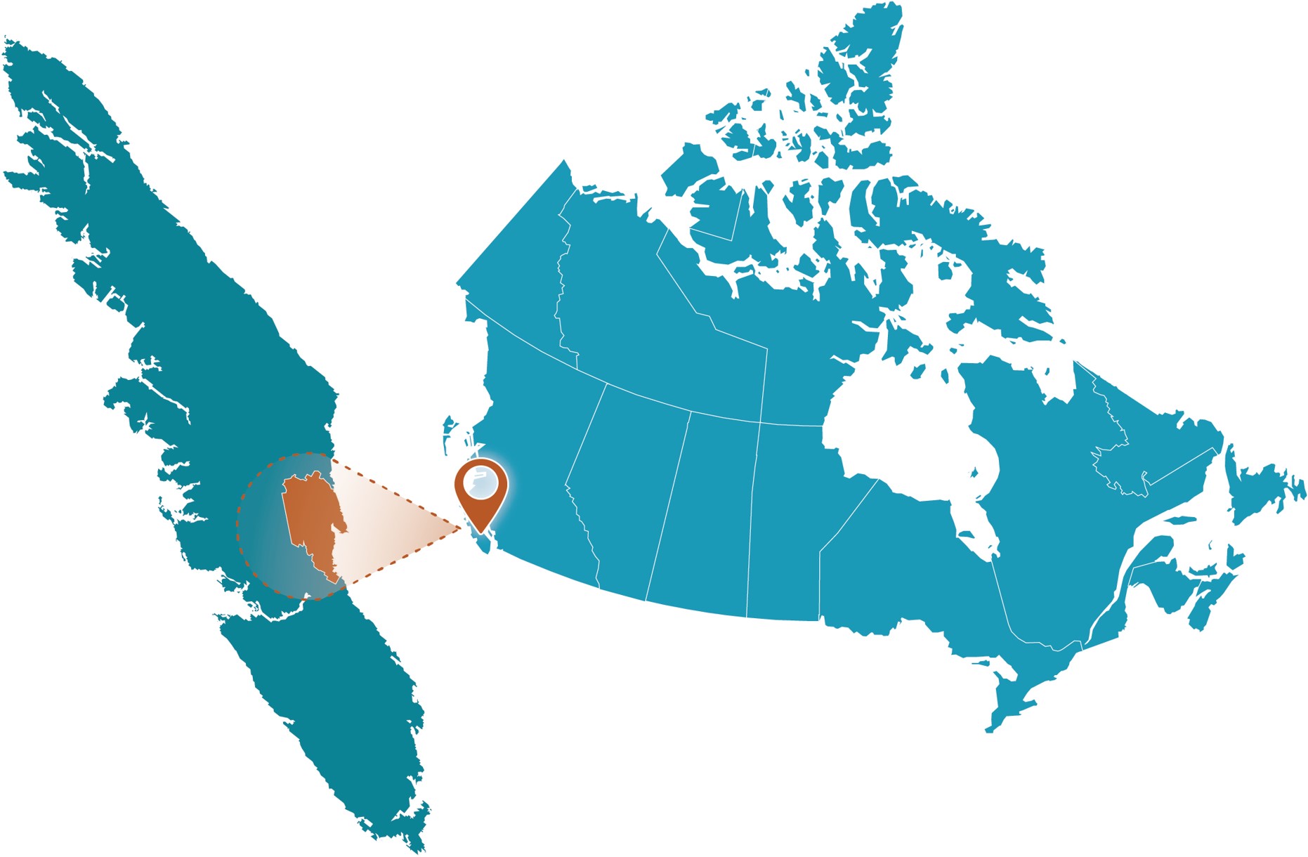
Figure 14: Comox Valley Regional District project location.
Text Version
A map showing the study area within Canada on the right side and a zoomed-in inset enclosed within a brown dashed rectangular border on the left side. The graphic uses a teal-coloured map of Canada. A brown map pin marks the site, while a brown spotlight effect and brown dashed outline connect the inset to its location on the national map.
Project Profile
- Client: Comox Valley Regional District, British Columbia
- Project lead: Kerr Wood Leidal Associates Ltd.
- Funding partners: Union of BC Municipalities’ Community Emergency Preparedness Fund; Canada’s National Disaster Mitigation Program
- Completion date: November 2021
- Budget: >$300k
- Portion for climate assessment: >$100k
- Nearest Community: City of Courtenay
- Waterbodies: Salish Sea, Oyster River, Courtenay River and tributaries
Community Profile
Comox Valley Regional District (CVRD) encompasses a 1,725 km2 area on the east coast of Vancouver Island, British Columbia (BC). It includes the incorporated communities of the Town of Comox, the City of Courtenay, the Village of Cumberland, and many smaller unincorporated communities. It is the ancestral home of the K’omoks First Nation, which has reserve lands on Comox Harbour adjacent to the CVRD.
The CVRD is situated on approximately 150 km of coastline on the Strait of Georgia in the Salish Sea, and includes the Oyster River and Courtenay River systems, as well as many smaller watercourses. Most of the approximately 67,000 residents live near the Strait or these river systems.
Local flood hazards
The CVRD has a history of flooding in its coastal and river areas. The severity of flooding is projected to increase under future climate change conditions. This project was the first step in its multi-year process to understand and prepare for flood hazards.
To create a variety of mapping products that illustrated current and projected future flood exposure, Kerr Wood Leidal Associates (KWLA) conducted detailed analysis and modelling of coastal flood and river hazards. KWLA considered coastal and river area flood conditions in parallel to better understand how water levels in coastal areas might influence river flood dynamics.
Purpose
KWLA produced flood mapping products with a set of technical memoranda describing the approach to modelling and mapping, including:
- Region-wide base maps that provided the platform for modelling and mapping this project.
- Regulatory flood maps that showed flood inundation extents for an extreme storm event under a specific set of future climate change conditions, as recommended by established guidelines (0.5% annual exceedance probability [AEP] storm event with 1 metre of sea level rise) (see Figure 12).
- Digital mapping data, including maximum water levels, maximum water depths, maximum flow velocity, flood hazard rating, maximum wave heights in the coastal floodplain, sea level rise planning areas, and setbacks for a range of AEP storm events with climate change.
CVRD is using the mapping products to inform flood hazard area land use management, risk assessment, emergency planning, and engagement with the community. For example, the regulatory flood maps have been used to create a public communication and education tool—a web-based mapping application on CVRD’s website.
Methodology
KWLA developed the flood mapping products according to established guidelines, including:
- the BC Provincial Flood Hazard Area Land Use Management Guidelines (PDF, 1.90 MB) (2018) (“BC provincial guidelines”),
- the Federal Flood Mapping Framework (PDF, 418 KB) (Natural Resources Canada & Public Safety Canada, 2018) including relevant guidelines,
- the Engineers and Geoscientists BC Flood Mapping Guidelines (PDF, 5.90 MB) (2017), and
- the Fraser Basin Council Floodplain Mapping Guidelines and Specifications (2004).
For the analysis, KWLA considered flood levels and depths for a wide range of storm events, ranging from 0.2% AEP (500-year return period storm event) to 10% AEP (10-year return period storm event), with allowances for climate change included in both sea levels and river flows.
Coastal analysis process
KWLA estimated coastal flood levels and setbacks using the probabilistic method from the BC provincial guidelines (Figure 15). They determined extreme static ocean water levels, including tides and storm surge, through analysis of historical water level data collected in the Strait of Georgia and CVRD area.
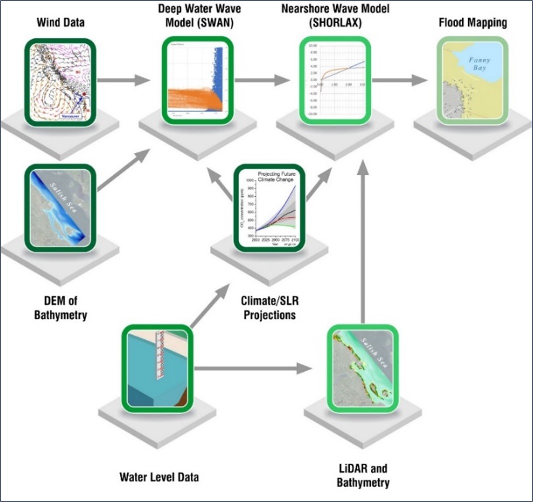
Figure 15: Coastal area analysis.
Text Version
A workflow diagram for the coastal flood hazard modelling and mapping, showing how different environmental datasets and numerical models were combined to produce flood maps.
The diagram is arranged as a series of connected boxes with arrows indicating the flow of information from left to right and bottom to top. Each dataset or model is represented by a green-bordered square icon positioned on a grey platform. Arrows show how outputs from one stage become inputs to the next.
Top Row
The first icon is labelled “Wind Data” and shows a weather map with wind vectors and contour lines. The icon is located in the upper left corner, and a grey arrow points from this box to the next stage.
The second icon is labelled “Deep Water Wave Model (SWAN)” and contains a graph with coloured data points. Inputs shown feeding into the icon are Wind Data from left, DEM of Bathymetry from below left, and Climate/SLR Projections from below right. A grey arrow points from this box to the next stage.
The third icon is labelled “Nearshore Wave Model (SHORLAX)” and shows a line graph with several curves. Inputs shown feeding into the icon are Deep Water Wave Model (SWAN) from left, Climate/SLR Projections from below left, and Lidar and Bathymetry from below. A grey arrow points from this box to the next, and final stage.
The fourth and final icon is labelled “Flood Mapping” and contains a coastal map, including the visible text: “Fanny Bay.”
Middle Row
The first icon is labelled “DEM of Bathymetry” and shows a coastal bathymetric image with bathymetry. The visible text inside the image reads: “Salish Sea.”
The second icon is labelled “Climate/SLR Projections” and contains a graph showing several projected curves over time. The title within the graph reads: “Projecting Future Climate Change.” An arrow points into this box from Water Level Data.
Bottom Row
The first icon is labelled “Water Level Data” and depicts a body of water with level gauge. An arrow from this box point up to “Climate/SLT Projections” and a second arrow points from this box right to “LiDAR and Bathymetry.”
The second icon is labelled “Lidar and Bathymetry” and shows a coastal map with shoreline and islands with visible text that reads, “Salish Sea.”
KWLA incorporated climate change projections in coastal flooding projections by considering sea level rise. They evaluated a range of sea level rise conditions from current conditions to 2.0 m of relative sea level rise and used sea level rise of 1.0 m for regulatory flood mapping, as per the BC provincial guidelines. Adjustments to windstorm intensity and frequency were considered but not implemented, as the climate literature in this area is still evolving and currently provides no consensus. (Most studies show little change in the vicinity of Vancouver Island).
KWLA used a high-resolution, two-dimensional deep water spectral wave model to estimate wave conditions in the Salish Sea. Windstorm events from each cardinal direction were modelled using spatially and temporally varying wind fields generated from data collected during historical storm events. To drive the wave model, wind speeds for each storm event were scaled to extreme values.
For nearshore wave modelling, KWLA performed a one-dimensional “transect-based” approach using its SHORLAX custom software for high-resolution regional wave effect analysis. The entire CVRD shoreline was divided into 233 transects, selected to be representative of the surrounding coastal “zone” in terms of both topography/bathymetry and wave exposure. At each transect, the SHORLAX model was forced with water levels and wave conditions from the two-dimensional deep water spectral wave model, and for each storm scenario, calculated the wave run-up. Secondary effects of sea level rise were captured in these simulations, as with deeper water, waves can travel further into shore before breaking, resulting in a larger wave run-up.
At each transect, the influence of tides, storm surge, wave effects, local land uplift or subsidence, sea level rise, and freeboard were combined to estimate the flood level and setbacks. The flood levels were converted into two-dimensional mapping based on the assumption that the flood level is constant within a given coastal zone.
River analysis process
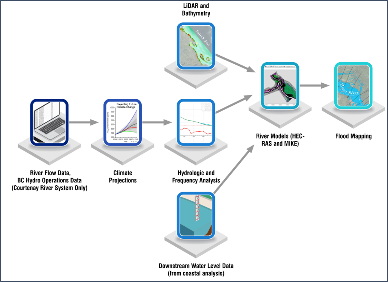
Figure 16: River analysis process.
Text Version
A workflow diagram illustrating the river flood analysis and flood mapping process. The diagram shows how different types of environmental, hydrologic, and topographic data were combined through a sequence of analytical steps to generate flood maps.
The workflow progresses from left to right, with several inputs converging into a central river modelling stage before producing a final flood mapping output. Each major step is represented by a blue-bordered icon sitting on a grey platform. Arrows show how outputs from one stage become inputs to the next.
River Flow Data, BC Hydro Operations Data (Courtenay River System Only)
This icon located in the centre-left portion of the diagram, depicts a laptop computer and represents the initial hydrologic input data. An arrow points from this stage to the climate projections.
Climate Projections
This icon is to the right and shows a graph with several upward-trending-coloured curves. The graph is titled “Projecting Future Climate Change.” The multiple-coloured lines indicate various future climate scenarios or projections. An arrow leads from this step to hydrologic and frequency analysis.
Hydrologic and Frequency Analysis
This icon contains a chart with coloured trend lines. An arrow leads to the river models (HEC-RAS and MIKE).
Lidar and Bathymetry
This icon is located in the centre top of the figure. The icon displays a coastal or riverine terrain image with coloured elevation features. The text, “Salish Sea,” is visible on the image. An arrow leads from this icon to the river models icon.
Downstream Water Level Data (from coastal analysis)
This icon is located in the bottom centre of the figure. The icon depicts a water body with a staff gauge. An arrow leads from this icon to the river models icon.
River Models (HEC-RAS and MIKE)
This icon is located near the centre right of the figure. The icon shows a river planform. An arrow leads from this icon to the flood mapping icon.
Flood Mapping
This icon is at the centre-right of the figure. It displays a map with blue shaded flood extents. The text, “Oyster River” is visible on the figure.
KWLA designed the flood hydrology for each river system based on its analysis of the historic flood frequency data, available guidance, and climate modelling projections. KWLA applied a factor of +15% to the peak design flood discharge, to account for projected climate change impacts on peak floods to mid-century (nominally the year 2050) and end of the century (nominally the year 2100). A factor of +30% was applied to the peak design flood discharge to account for projected climate change impacts on peak floods for the next century (nominally 2200) (Figure 16).
KWLA completed hydrologic and hydraulic modelling for the Oyster River and Courtenay River systems. They used one- and two-dimensional techniques to model and estimate flood elevations, depths, and flow velocities along the river channel and over the floodplain under a range of river storm intensities and climate change impacts. To ensure that the full range flood scenarios were captured, KWLA modelled current and proposed flood protection works and potential dike failure events.
Conclusion
An example of a regulatory flood map resulting from this process is shown below (Figure 17). Key findings from this flood mapping project include the following:
- Coastal flooding is expected to inundate only a small portion of CVRD lands overall, 1.1% under current conditions and 1.3% by 2100.
- There are several communities and agricultural areas in low-lying coastal areas that have been developed and are exposed to coastal flooding from extreme storms under current and future conditions.
- Sea level rise is expected to increase flood extents and the total area of land inundated across the CVRD. However, this increase is expected to be modest relative to the significant flooding expected in low-lying areas under current conditions (2,300 ha under current conditions versus 2,576 ha by 2100).
- Maximum water levels will rise under future climate change scenarios, with levels from a 0.5% AEP coastal storm event today being like those expected from a 10% AEP event with 0.5 m of sea level rise.
- On the Oyster River, low-lying properties within the confined river valley in the upper reaches are exposed to flooding under current and future climate change conditions. With the existing diking, the lower reaches are less exposed to flooding. However, the exposure becomes significantly larger in a dike breach scenario.
- For large events, flooding extents and water depths on the lower section of the Courtenay River system floodplain, southeast of Highway 19A, are mostly influenced by the coastal water levels. As sea level rises, coastal water levels will increasingly be the primary driver of smaller, more frequent events, as well.
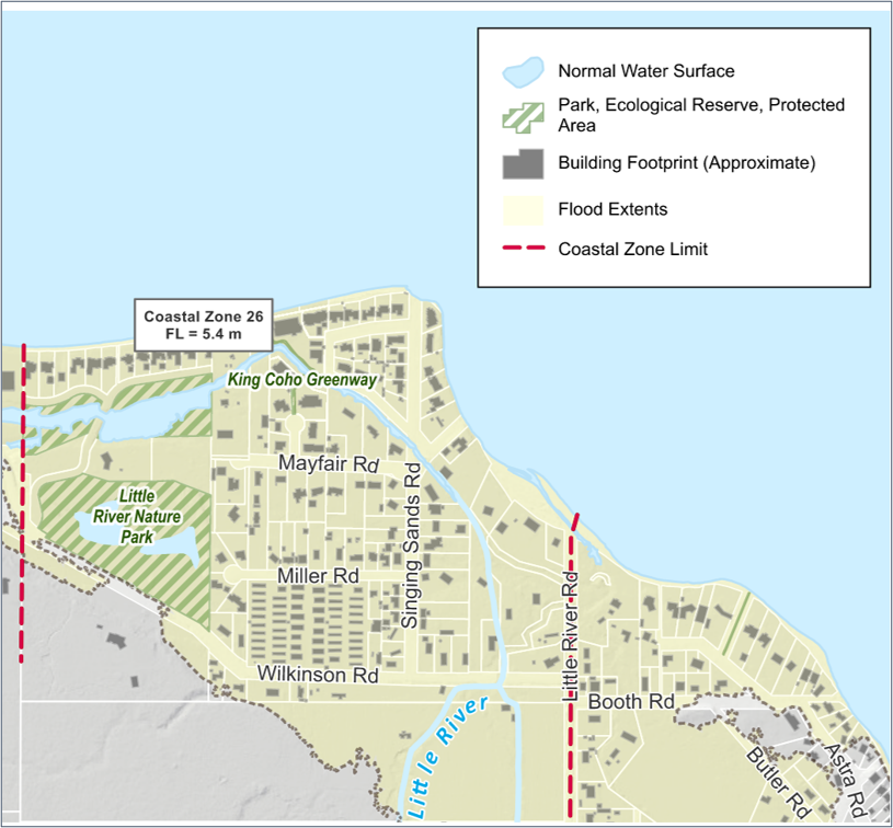
Figure 17: Example of a regulatory flood map from the CVRD (FL = Flood Level).
Text Version
A map of a lakeshore community showing flood hazard information and coastal zone boundaries. The upper half of the map is dominated by a large body of water, coloured light blue, representing a lake. Land areas are shown in pale beige with roads, buildings, parks, and waterways.
A legend in the upper-right corner identifies symbols:
- Light blue areas: Normal Water Surface
- Green hatched areas: Park, Ecological Reserve, Protected Area
- Grey rectangles: Building Footprint (Approximate)
- Pale beige shading: Flood Extents
- Red dashed lines: Coastal Zone Limit
The map contains a residential neighbourhood with many small grey building footprints arranged along a network of streets. Major labelled roads include Mayfair Rd, Miller Rd, Wilkinson Rd, Singing Sands Rd, Little River Rd, Booth Rd, Butler Rd, and Astra Rd.
A narrow blue watercourse labelled Little River flows northward through the centre-right portion of the map into the lake. Another small channel and pond-like water features appear near the northwest part of the neighbourhood.
Two protected natural areas are shown with green diagonal hatching:
- King Coho Greenway, located near the lakeshore in the northwest-central area.
- Little River Nature Park, located southwest of the neighbourhood.
Two dashed red vertical lines mark the Coastal Zone Limit:
- One near the western edge of the map.
- One near Little River Rd on the eastern side.
A callout box near the northwest shoreline reads: “Coastal Zone 26, FL = 5.4 m.”
The shoreline curves around the northern and eastern edges of the community, with houses located close to the water in several places.
3.3 Cowichan Lake: Shoreline and Lake Level Flood Mapping
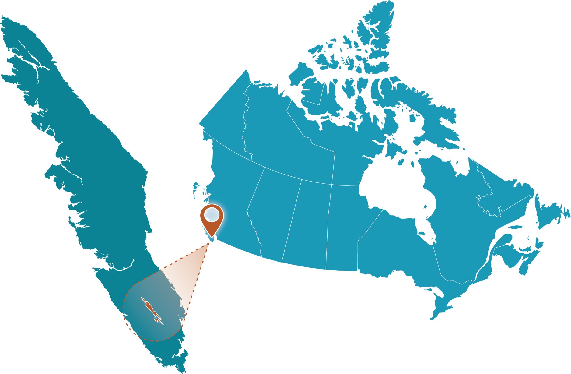
Figure 18: Cowichan Lake project location.
Text Version
A map showing the study area within Canada on the right side and a zoomed-in inset enclosed within a brown dashed rectangular border on the left side. The graphic uses a teal-coloured map of Canada. A brown map pin marks the site, while a brown spotlight effect and brown dashed outline connect the inset to its location on the national map.
Project Profile
- Client: Cowichan Valley Regional District, British Columbia
- Project lead: Kerr Wood Leidal Associates Ltd.
- Funding partner: BC Salmon Restoration and Innovation Fund
- Completion date: October 2022
- Budget: >$1M
- Portion for climate assessment: >$500k
- Nearest Community: Town of Lake Cowichan
- Waterbody: Cowichan Lake
Community Profile
Cowichan Lake is the second-largest lake on Vancouver Island, British Columbia (BC), with a surface area of approximately 62 km2. It is the headwaters of the Cowichan River, a nationally recognized Heritage River, which flows 47 km through the Cowichan Valley to the ocean at Cowichan Bay (Figure 19).
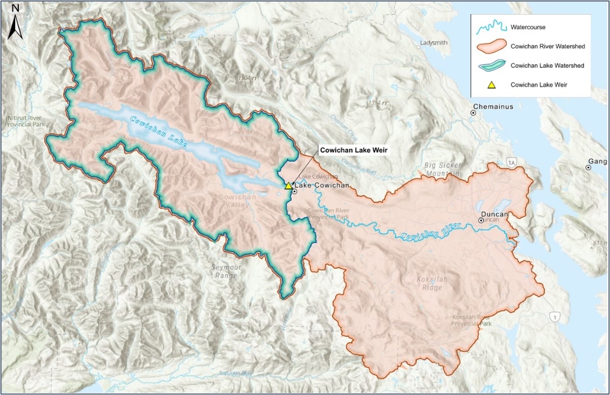
Figure 19: Cowichan Lake and Cowichan River watersheds.
Text Version
A shaded-relief watershed map showing the Cowichan Lake Watershed and Cowichan River Watershed on southeastern Vancouver Island, British Columbia. The map illustrates the spatial relationship between Cowichan Lake, the Cowichan River, the surrounding mountainous terrain, and the drainage basins that contribute water to the river system.
Overall Map Layout
The map covers an area from the mountainous interior in the west to the coastal lowlands and marine shoreline in the east. Terrain is depicted using a grey hillshade background that highlights ridges, valleys, mountains, and drainage patterns. A north arrow is displayed in the upper-left corner, indicating that the north is oriented toward the top of the map. Text and markers on the map label the communities of Ganges, Duncan, Chemainus, and Lake Cowichan.
The legend in the upper-right corner identifies four map elements:
Watercourses shown as a light blue line and represents rivers and streams.
Cowichan River Watershed is shown with a light peach-coloured fill and reddish-orange boundary and indicates the overall drainage basin feeding the Cowichan River.
Cowichan Lake Watershed is shown with a turquoise fill and dark blue-green boundary and represents the drainage basin contributing directly to Cowichan Lake.
Cowichan Lake Weir represented by a yellow triangular symbol and marks the location of the control structure at the outlet of Cowichan Lake.
Cowichan Lake Watershed
The largest watershed feature occupies the western half of the map and is highlighted in turquoise and surrounds Cowichan Lake, several tributary valleys, and mountainous upland regions. The watershed boundary follows mountain ridges and elevated terrain, indicating the land area where precipitation drains toward Cowichan Lake. The watershed has an irregular shape with numerous tributary basins extending into mountainous regions.
Cowichan Lake
Near the centre-left of the map is Cowichan Lake, displayed as an elongated light-blue water body oriented generally northwest to southeast. The lake occupies the centre of the lake watershed and stretches across much of the western basin. Cowichan Lake label appears diagonally across the lake. Several smaller inlets and lake arms extend into surrounding valleys.
Cowichan Lake Weir
At the eastern end of Cowichan Lake, adjacent to the community of Lake Cowichan, a yellow triangular symbol marks Cowichan Lake Weir. A nearby callout box identifies the structure. The weir is located at the outlet where lake water enters the Cowichan River. This structure serves as the connection point between the lake watershed and the downstream river system.
Cowichan River Watershed
The larger Cowichan River Watershed is shown in a light peach colour. This watershed encompasses the Cowichan Lake Watershed, the Cowichan River corridor, downstream tributaries, and extensive upland areas south and east of the main river. The watershed extends from the mountains in the west toward the eastern coastal lowlands. Its irregular perimeter follows topographic divides separating the Cowichan River drainage from neighbouring watersheds.
Cowichan River
The Cowichan River originates at the eastern outlet of Cowichan Lake and flows eastward across the centre of the map. The river is shown as a light blue winding line and labelled”Cowichan River.” The river corridor forms the central drainage pathway through the watershed. Many smaller streams and tributaries join the river along its course.
Local flood hazards
Cowichan Lake drains into the Cowichan River through a weir and flow control gate system. Constructed in the 1950s, the system retains water in the lake during the wet spring months and captures spring snowmelt to maintain summer baseflows in the river downstream. This supports habitat for important salmon species, maintains the ecological health of the river system, and supplies water withdrawals for the Crofton Pulp Mill.
The system manages lake levels to maintain river flow rates above established regulatory and environmental targets. A steady decline in late spring and summer (June—September) lake inflows has been observed since the 1960s and climate change is expected to cause further declines into the future, making it increasingly difficult to meet the target flow rates during dry summer months.
Upgrading the weir to facilitate climate adaptation on the Cowichan River has been discussed since the 1990s. The current proposal is to store more water through the wet spring season by raising the weir and initiating flow regulation earlier in the season to help secure water for the river during the dry summer months. The weir and gates would be raised by 0.7 metres, but the gates would only be operated during the spring and summer months, leaving flows and lake levels to be unregulated during the fall and winter. Consequently, the overall water level range in the lake would largely remain the same, while the timing of high and low water levels would be shifted. This approach is discussed in detail below.
Purpose
The goal of this project was to provide a detailed assessment of the potential impacts to the Cowichan Lake shoreline as a result of the weir upgrade and climate change. The assessment will support a future water licence application for the increased storage at Cowichan Lake. The project objectives were to:
- Assess, map, and document the current shoreline conditions;
- Forecast changes to the lake level and shoreline conditions; and
- Identify the potential impacts to lakeshore properties at a lot-by-lot scale.
Methodology
The natural boundary and lake level frequency were used by Kerr Wood Leidel Associates (KWLA) as the primary metrics for assessing shoreline impacts. The natural boundary was selected because of its legal significance in BC, and because it embodies several shoreline characteristics, including erosion, in a single variable. Lake level frequency was selected for its clear impacts on land use and flooding.
KWLA conducted an extensive field program and used subsequent desktop analysis to survey the natural boundary and the physical characteristics of the shoreline (vegetation, sediment, slope) around the entire lake.
Inflow
Cowichan Lake levels are primarily a function of inflow, river discharge, and evaporation. Continuous monitoring of discharge and lake levels since 1953 allowed for back-calculation of historic inflows. To project how inflow might change into the future, a hydrological model (UBC Watershed Model) was used. The inputs to the model included topographic, soil, and land cover parameters, as well as a continuous time series of temperature and precipitation data. KWLA calibrated and verified the model by comparing the model results over the historic period to inflow derived from observational data.
To assess inflows to the lake under climate change conditions, KWLA ran the hydrological model using the daily temperature and precipitation time series from a set of ten downscaled global circulation models (ESMs) from the Coupled Model Intercomparison Project 5 (CMIP5), using the business-as-usual Representative Concentration Pathway (RCP) 8.5 emissions scenario for 1981 to 2099 (Pacific Climate, accessed 2019). While the more recently completed CMIP6 climate projections were available, KWLA selected the CMIP5 data to be consistent with climate data sets used in other climate projection studies in the CVRD.
Lake levels
KWLA used the Cowichan Lake Operational Model to simulate past and future lake levels under both the current and upgraded weir scenarios. As a mass balance model, it uses lake inflow and river flow (either controlled by the gates or uncontrolled) to simulate lake levels throughout the year. The model accounts for seasonal operation of the gates, including spring and summer flow targets and minimum flow thresholds based on environmental targets and water licence requirements.
To understand the variability in future lake level and to select a single representative lake level time series for impacts assessment, KWLA used the modelled lake inflow for each of the ten downscaled ESMs as input to the operational model to generate ten daily lake level series for Cowichan Lake. They were generated for both the past climate and the future projected climate with the existing weir and proposed 0.7 m raised weir conditions.
Waves
Wind waves are thought to be the primary source of erosive energy on the Cowichan Lake shoreline. As a result, quantification of wave conditions was critical in determining shoreline impacts. A high-resolution computational wave model was used to estimate shoreline wave conditions under lake levels with the current and proposed weir.
Natural boundary
The natural boundary is intuitively understood as the line dividing the land from the lakebed. Using the extensive dataset of shoreline physical characteristics (vegetation, sediment, slope, waves, water levels), KWLA developed a statistically based equation that predicts the natural boundary elevation for any given shore segment based on its physical characteristics. The equation is based on the average wave power incident on the shoreline above the natural boundary and was used to estimate the change in the natural boundary elevation with the proposed weir around the entire lake. The estimated vertical change in the natural boundary was used to calculate the horizontal change.
Shoreline properties
Using the estimated location of the future natural boundary and the change in frequency of lake levels for the proposed raised weir scenario, KWLA assessed potential impacts to the 846 shoreline properties at Cowichan Lake.
Outcomes
KWLA considered inflow, lake levels, waves, the natural boundary, and shoreline properties in its assessment.
Inflow
The suite of modelled inflow results indicates that:
- The annual average inflow to the lake will increase 2.1% by the 2050s and 8.3% by the 2080s. Most of the increase will be seen in the fall and winter because of increased precipitation and higher temperatures, resulting in less precipitation falling as snow at high elevations.
- Inflow will decrease during the spring and summer; summer inflow is expected to decrease by 30% by the 2050s and 40% by the 2080s (see Figure 20). A reduction in summer inflow is expected due to reduced precipitation, reduced snowpack (and therefore reduced spring snowmelt runoff), and increased evaporation due to the higher temperatures expected in the future.

Figure 20: Average modelled seasonal inflow to Cowichan Lake for past and future climate.
Text Version
A statistical box-and-whisker chart titled: Comparison of Cowichan Lake Inflow Distribution for Past and Future Climate.
The chart compares the distribution of seasonal mean discharge in cubic metres per second, entering Cowichan Lake under three climate scenarios: Past Climate, 2050s, and 2080s.
The vertical axis represents Seasonal Mean Discharge in cubic metres per second and ranges from 0 to 100 in cubic metres per second. The horizontal axis is divided into four seasonal groups: Winter (JFM): January to March, Spring (AMJ): April to June, Summer (JAS): July to September, and Fall (OND): October to December.
The box plots are colour coded: yellow for Past Climate, green for 2050s, and blue for 2080s.
Each box plot displays the median, interquartile range, and overall spread of discharge values.
The graphic shows a clear seasonal shift of streamflow under future climate scenarios:
Winter and fall flow increase from the past climate to the 2080s.
Spring and summer flows decrease from the past climate to the 2080s.
Winter (JFM)
Three boxplots appear in the first seasonal group.
Past Climate
Median discharge is approximately 62 cubic metres per second.
Interquartile range extends roughly from 56 to 68 cubic metres per second.
Values range from about 45 to 80 cubic metres per second.
2050s
Median discharge is approximately 61 to 62 cubic metres per second.
Interquartile range extends roughly from 56 to 67 cubic metres per second. Values range from about 41 to 80 in cubic metres per second.
2080s
Median discharge is approximately 67 to 68 cubic metres per second.
Interquartile range extends roughly from 60 to 74 cubic metres per second.
Values range from about 50 to 90 cubic metres per second.
Spring (AMJ)
Three boxplots appear in the second seasonal group.
Past Climate
Median discharge is approximately 22 to 23 cubic metres per second.
Interquartile range extends roughly from 20 to 24 cubic metres per second.
Values range from about 15 to 31 cubic metres per second.
2050s
Median discharge is approximately 19 to 20 cubic metres per second.
Interquartile range extends roughly from 18 to 22 cubic metres per second.
Values range from about 14 to 25 cubic metres per second.
2080s
Median discharge is approximately 18 to 19 cubic metres per second.
Interquartile range extends roughly from 16 to 21 cubic metres per second.
Values range from about 12 to 26 cubic metres per second.
Summer (JAS)
Three boxplots appear in the third seasonal group.
Past Climate
Median discharge is approximately 6 cubic metres per second.
Interquartile range extends roughly from 4 to 8 cubic metres per second.
Values range from about 2 to 11 cubic metres per second.
2050s
Median discharge is approximately 4 cubic metres per second.
Interquartile range extends roughly from 3 to 5 cubic metres per second.
Values range from about 1 to 10 cubic metres per second.
2080s
Median discharge is approximately 3 to 4 cubic metres per second.
Interquartile range extends roughly from 2 to 5 cubic metres per second.
Values range from about 1 to 8 cubic metres per second.
Fall (OND)
Three boxplots appear in the fourth seasonal group.
Past Climate
Median discharge is approximately 57 to 58 cubic metres per second.
Interquartile range extends roughly from 52 to 64 cubic metres per second.
Values range from about 38 to 74 cubic metres per second.
2050s
Median discharge is approximately 66 cubic metres per second.
Interquartile range extends roughly from 61 to 73 cubic metres per second.
Values range from about 46 to 94 cubic metres per second
2080s
Median discharge is approximately 70 to 71 cubic metres per second.
Interquartile range extends roughly from 66 to 77 cubic metres per second.
Values range from about 47 to 93 cubic metres per second.
As the increase in inflow is expected to occur in the fall, when the gates at the weir are fully open and there is no control of lake level and river flow, they may not result in increased water availability during the critical summer months. Instead, water availability will be most impacted by the reduction in inflows expected during the spring and summer.
Lake levels
Figure 21 compares simulated water levels from the representative time series for the existing weir and the proposed raised weir over a four-year period.
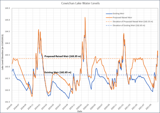
Figure 21: Sample of simulated lake levels for existing weir and proposed raised weir.
Text Version
A line chart titled Cowichan Lake Water, comparing the simulated lake levels for an existing and proposed raised weir at Cowichan Lake from May 2018 to November 2021. The y-axis represents lake level elevation in metres, ranging from 161.5 to 165.5 metres. The x-axis shows dates over the study period in intervals of 2 months.
The chart contains four plotted elements:
Existing Weir:
A solid blue line showing lake elevations under current weir conditions.
Proposed Raised Weir:
An orange solid line showing simulated lake elevations from raised weir crest.
Elevation of Proposed Raised Weir:
An orange dashed horizontal line at 163.35 metres
Elevation of Existing Weir:
A blue dashed horizontal line at 162.65 metres.
The proposed raised weir elevation is 0.70 metres higher than the existing weir.
Existing Weir Conditions
Under existing conditions, lake levels range between 161.7 metres and 163.0 metres during average conditions. Several large peaks exceed 164.0 metres.
The lowest observed elevations occur in late summer and autumn, dropping to approximately 161.7 to 161.9 metres.
Water levels often remain below the existing weir crest elevation of 162.65 metres during prolonged dry periods.
Proposed Raised Weir Conditions
Under the proposed raised weir scenario, lake levels are elevated overall. Summer and autumn low-water periods range between 162.0 to 163.0 metres.
The highest peak occurs around February to March 2020, reaching approximately 165.1 metres.
Seasonal and Extreme Events
Several prominent high-water events are visible during the winter 2018 to 2019: water levels rise rapidly, reaching approximately 164.5 metres. During winter 2019 to 2020, the largest peak of the record occurs, exceeding 165.0 metres under the proposed scenario. In winter 2020 to 2021, another peak reaches approximately 164.4 metres.
Waves
The difference in average wave power at the shoreline between the two weir scenarios is negligible in the deep areas of the lake but becomes larger close to shore. For most of the shoreline, the difference is less than 10%; however, differences of up to +/-30% were observed in some locations. The largest changes were predicted to occur at sheltered shorelines, or shorelines with a shallow foreshore, where the existing average wave power is very low.
Natural boundary
Figure 22 shows Gordon Bay Provincial Park, the estimated current and projected future natural boundary, as well as the contour lines associated with the current and proposed weir crest.
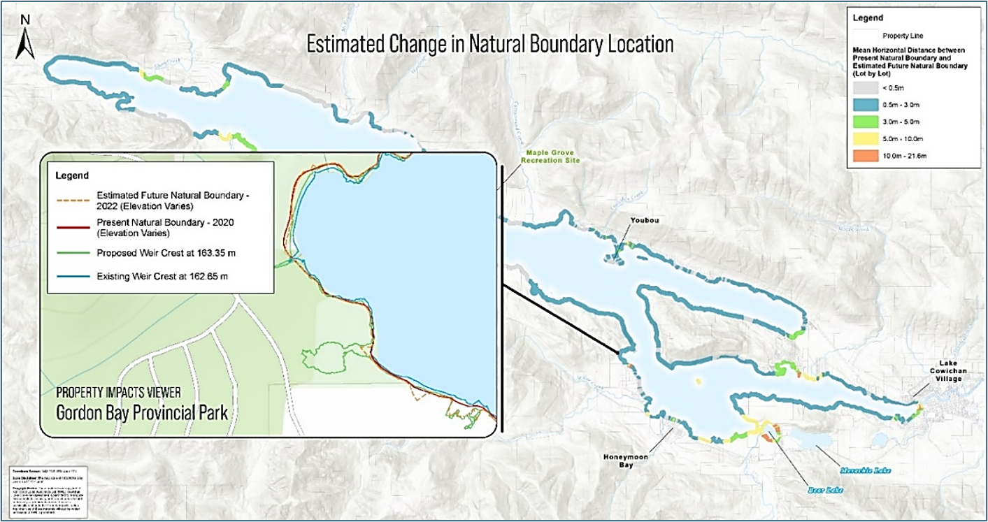
Figure 22: Project horizontal change in natural boundary location with proposed weir upgrades.
Text Version
A map of Cowichan Lake, British Columbia, with estimated changes in natural boundary location associated with a proposed increase in weir crest elevation. The map is oriented with the north at the top and includes a north arrow in the upper left corner.
The main map occupies the right side of the figure and depicts Cowichan Lake extending generally west to east. The shoreline is outlined with coloured bands representing the mean horizontal distance between the present natural boundary and the estimated future natural boundary. A legend in the upper right corner identifies five distance categories:
- Dark blue: less than 0.5 metre
- Light blue: 0.5 to 3.0 metres
- Green: 3.0 to 5.0 metres
- Yellow: 5.0 to 10.0 metres
- Orange: 10.0 to 21.6 metres.
Dark blue and light blue segments occur around much of the lake shoreline. Green, yellow, and orange segments appear at selected locations around the perimeter of the lake. Orange segments are present in several localized areas, including portions of the southern shoreline and near the eastern end of the lake.
Place names shown on the main map include Maple Grove Recreation Site, Youbou, Honeymoon Bay, and Lake Cowichan Village. Topographic hill shading is used as the background, and roads and waterbodies are displayed.
A detailed inset on the left side of the figure is labelled Property Impacts Viewer – Gordon Bay Provincial Park. Leader lines connect the inset to the corresponding shoreline area on the main map. The inset shows the shoreline at a larger scale and includes a separate legend identifying four line types:
- Dashed brown line: Estimated Future Natural Boundary – 2022 (Elevation Varies)
- Dark red line: Present Natural Boundary – 2020 (Elevation Varies)
- Green line: Proposed Weir Crest at 163.35 metres
- Blue line: Existing Weir Crest at 162.65 metres.
Shoreline properties
A selection of assessed impacts on shoreline properties is summarized in Table 4.
| Impact | Description | Findings |
|---|---|---|
| Flooding | Potential change in flood risk to primary residences. | Raising the weir would result in a relatively small increase in flood lake levels. Modelling indicates that the mean annual flood lake level could increase by about 0.1 m (4 in) while flood levels up to the 50-year return period could increase by no more than 0.05 m (2 in). Higher peak lake levels (greater than the 50-year flood) are not expected to have any change. |
| Inundation | Will the raised weir result in additional water being stored within the property boundary? | Approximately half of the shoreline properties (414) have some portion of the lot area with ground elevations below that of the proposed weir crest, such that water stored by the proposed raised weir will cover a portion of these lots. |
| Estimated change in natural boundary | Estimated horizontal change in natural boundary along lake frontage. | The projections of changes in the natural boundary indicate 708 properties (84%) could have a change of less than 3 m due to the proposed raised weir. There are 13 properties (2%) where the horizontal shift in the natural boundary is estimated to be between 10 m and 22 m. |
Conclusion
The largest change in water level regime, and consequently the largest change in natural boundary, would occur in the few years following the completion of the weir and control gate system upgrades. By the 2080s, KWLA projected that decreases in spring and summer inflows, combined with the storage of the upgraded weir, would result in a water level regime similar to current conditions. Consequently, it is expected that the natural boundary would migrate back toward its current location.
Should the weir not be raised, all shoreline properties will have some impact in years when storage is depleted, and lake levels drop below the lowest observed lake levels. Modelling indicates that by the 2080s, lake levels will drop below the lowest observed lake levels about ten times more often with the existing weir than the proposed raised weir.
3.4 Kootenay Boundary: Flood Mapping
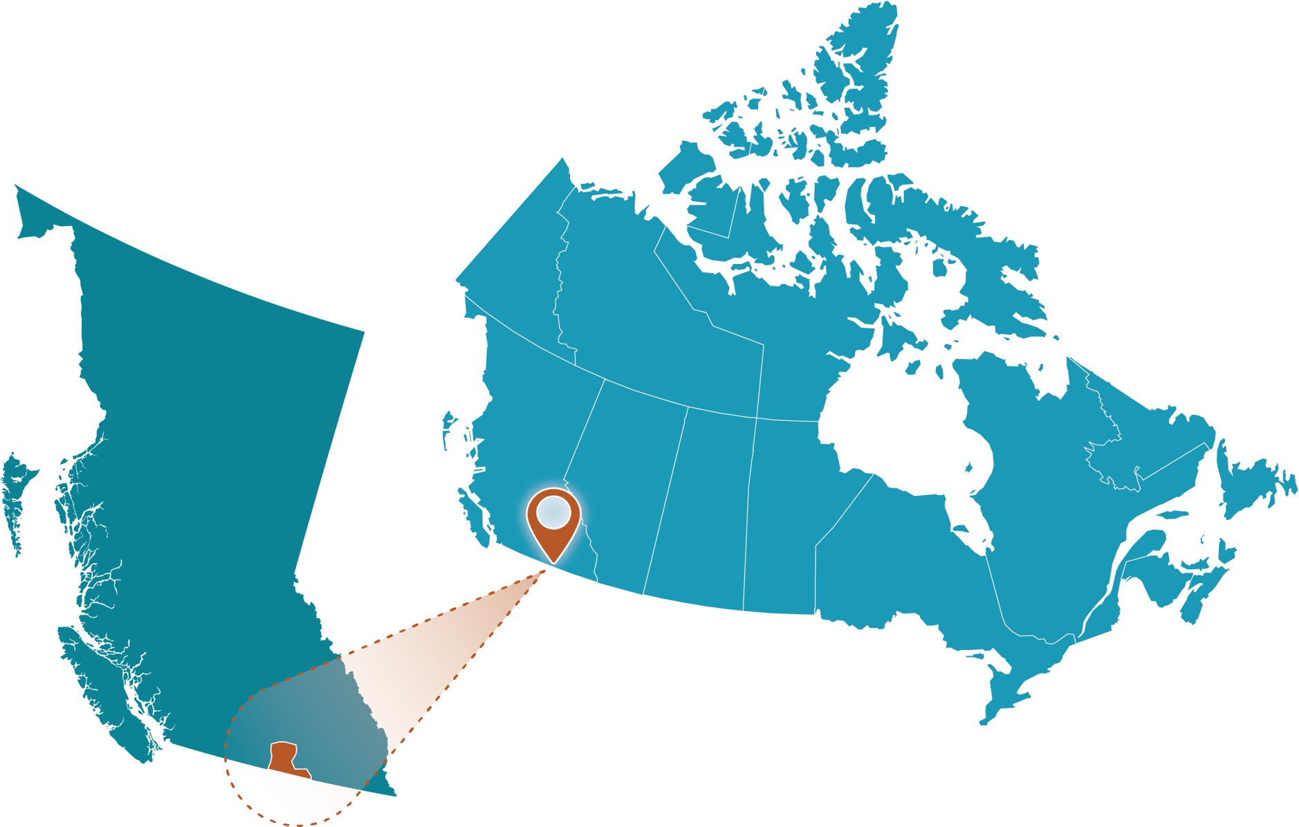
Figure 23: Kootenay Boundary project location.
Text Version
A map showing the study area within Canada on the right side and a zoomed-in inset enclosed within a brown dashed rectangular border on the left side. The graphic uses a teal-coloured map of Canada. A brown map pin marks the site, while a brown spotlight effect and brown dashed outline connect the inset to its location on the national map.
Project Profile
- Client: Regional District of Kootenay Boundary, British Columbia
- Project lead: Northwest Hydraulic Consultants Ltd.
- Funding partner: National Disaster Mitigation Program
- Completion date: March 2023
- Budget: >$300k
- Portion for climate assessment: ~12%
- Nearest Community: Grand Forks
- Waterbodies: Kettle River, West Kettle River, Christina Lake
Community Profile
The Kootenay Boundary Regional District serves more than 33,000 residents in the southeastern BC interior, stretching along the Canada-US border. As the mountainous region confines communities to the valley bottoms, they have been subjected to floods and fluvial geomorphic risks, including a catastrophic flood in 2018 in the western portion of the Boundary.
Purpose
The purpose of this study was to develop flood maps for four regions:
- Kettle River from Rock Creek to Midway (24 km)
- West Kettle River from Carmi to Beaverdell (16 km)
- Kettle River from Cascade Falls to the international boundary near Laurier
- Christina Lake and Christina Creek.
The Kettle River from Rock Creek to Midway study reach is shown in Figure 24. In 2018, the City of Grand Forks experienced considerable freshet flooding; the highest streamflows on record were recorded by Water Survey of Canada (WSC) hydrometric stations.
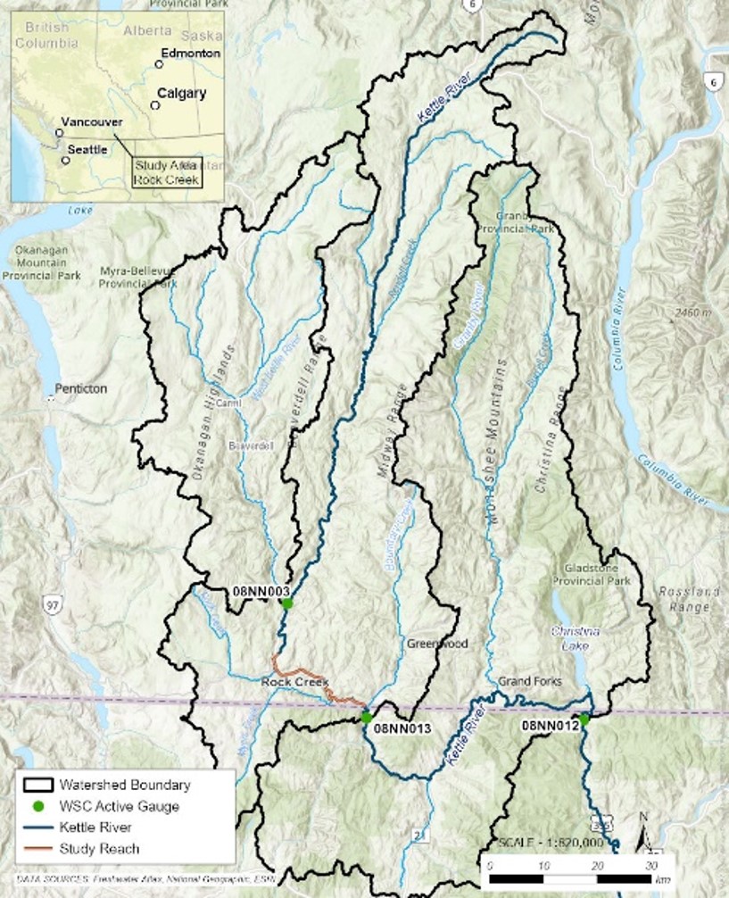
Figure 24: Kettle River watershed and Rock Creek to Midway study reach.
Text Version
This map shows the Kettle River watershed in southern British Columbia. The watershed boundary, river network, active Water Survey of Canada gauge stations, and a study reach near Rock Creek are displayed on a shaded topographic basemap.
The watershed occupies most of the map and is outlined by a thick black boundary. Several nested catchment boundaries are shown using the same black line style. Blue lines represent the Kettle River and major tributaries. River names visible on the map include Kettle River, West Kettle River, Granby River, Boundary Creek, and Christina Creek.
A locator inset in the upper-left corner shows western Canada, including British Columbia, Alberta, Saskatchewan, Washington, and surrounding areas. The inset identifies the study area near Rock Creek in southern British Columbia.
A legend in the lower-left corner identifies the map symbols:
- Black outline: Watershed Boundary
- Green circle: WSC Active Gauge
- Blue line: Kettle River
- Orange line: Study Reach
Three active Water Survey of Canada gauge stations are shown as green circles and labelled:
- 08NN003
- 08NN013
- 08NN012.
The study reach is shown as an orange line near Rock Creek in the southern portion of the watershed. The orange line follows a section of the Kettle River between the communities of Rock Creek and Grand Forks.
A north arrow is located in the lower-right corner. Adjacent to the north arrow is a scale bar marked from 0 to 30 kilometres. The printed map scale is 1:820,000.
The map depicts the Kettle River watershed and associated river network extending from the Canada-United States border northward into the interior of southern British Columbia.
Figure 25 presents the hydrologic regime for the Kettle River at Ferry (08NN013). To support flood mapping, historic floods were reviewed, and frequency analysis was completed on key WSC gauges to support development of hydraulic model inflows. Future conditions were developed using hydrologic model outputs developed by Associated Engineering (AE) (2021b) and by assessing the skew of the frequency analysis curves for mixed regime watersheds from NHC (2021). Results were applied to the study.
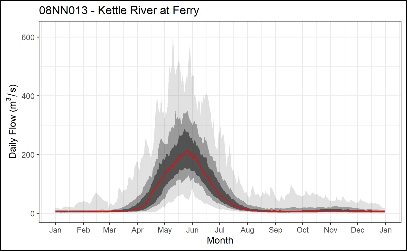
Figure 25: Hydrologic regime of the Kettle River at Ferry (08NN013).
Text Version
A graph titled 08NN013 – Kettle River at Ferry. The graph shows daily flow at the Kettle River at Ferry hydrometric station (08NN013) over the course of a year based on historical observations.
The horizontal axis represents months of the year, from January to December. The vertical axis represents daily flow in cubic metres per second (cubic metres per second) and ranges from approximately 0 to 650 cubic metres per second.
A red line represents the median daily flow. Grey shaded bands around the red line represent the distribution of observed flows. Darker grey bands are located closer to the median line, while lighter grey bands extend farther from the median.
The median flow remains near the lower end of the graph from January through March. Beginning in April, the median flow increases, reaching its highest values in late May and early June at approximately 200 cubic metres per second. The median flow then decreases through June and July and returns to lower values by August. From August through December, the median flow remains near the lower end of the graph with minor fluctuations.
The grey shaded bands follow the same seasonal pattern as the median flow. The bands are narrow during most of the year and become wider between April and July. The lightest grey band reaches its greatest extent during late May and early June, extending above 600 cubic metres per second.
The red line represents the median flow for the period 1929 to 2018. The grey bands represent the 25th to the 75th percentile, 10th to the 90th percentile, and maximum to minimum ranges, respectively, according to receding shade.
Note: Red line represents the median flow (1929–2018), grey bands represent the 25th—75th percentile, 10th—90th percentile and maximum/minimum, respectively according to receding shade.
For the purpose of describing the climate change approach undertaken for this study, only the Rock Creek to Midway reach is presented. However, the same approach was applied to all study reaches.
Local flood hazards
Flooding in the study area can be riverine and lake induced (including waves), with climate change projected to increase river peak flows and lake levels. Projected increases to river peak flows and lake level rise have potential knock-on effects on the fluvial geomorphology, in some cases increasing the potential of debris flows and avulsions, and potentially accelerating bank erosion, lateral channel migration, sedimentation, and riverbed aggradation.
Secondary impacts were considered. Forest harvesting and disturbance (for example, due to wildfires, insect infestation) has the potential to impact the hydrology of Kettle River watershed over the next century. Chernos et al. (2020) investigated climate change impacts for the Kettle River watershed. They found an increase of 3–6% for the 100-year peak flows for the Kettle River.
Methodology
A climate change assessment was mandatory for this project, based on professional practice guidelines and client requirements. Guidelines that were applied were:
- Flood Mapping in BC—Professional Practice Guidelines (PDF, 5.9 MB) (APEGBC, 2017)
- Legislated Flood Assessments in a Changing Climate in BC—Professional Practice Guidelines (PDF, 3.20 MB) (Engineers and Geoscientists BC, 2018)
- Federal Flood Mapping Guidelines Series (Natural Resources Canada, 2025a)
- Flood Hazard Area Land Use Management Guidelines (PDF, 1.92 MB) (BC Ministry of Forests, Lands, Natural Resources Operations and Rural Development, 2018).
The range of future time horizons and carbon concentrations considered was RCP 4.5 and 8.5, 2050 and 2100.
NHC relied on previous hydrologic modelling completed for the Kettle River watershed, which were then compared to Pacific Climate Impacts Consortium (PCIC) VIC-GL model output. The data sources and climate projections are described below.
A hydrologic modelling study of the Kettle River was carried out by AE (2021a), which extended a model developed in the Raven hydrologic modelling platform (Craig et al., 2020) to the entire Kettle River watershed (Chernos et al., 2020). The extended model used the BCCAQv2—PNWNA met bias-corrected Downscaled Global Climate Model Dataset to simulate projected flows for the Kettle River near Ferry (WSC 08NN013) from 1949 to 2099 using the six different climate models and two different carbon pathways (RCP 4.5 and 8.5).
In addition, modelled streamflow data under 12 climate scenarios was available from PCIC (2020) for the Kettle River near Ferry (WSC 08NN013). NHC compared the PCIC VIC model data to the AE Raven model results and found they aligned. However, as the spatial discretization of the AE Raven model includes the West Kettle River as a subbasin, which is of direct relevance to this study, only the AE Raven results are presented here.
Approach used for assessing climate impacts
The approach to assessing climate impacts was completed as follows:
- NHC first assessed hydrologic model output from AE (2021a) and examined the relative changes from the baseline to changes in magnitude and timing of future annual peak flows. The AE (2021a) model results did not show an increase in future annual peak flows for the Kettle River near Ferry (WSC 08NN013). Model results did however show the possibility of a future regime shift with the occurrence of winter peak flows on the Kettle River.
- The second step was to decide how to develop a climate change adjustment to account for a regime shift in future peak flows for the Kettle River. NHC examined the skew of the distribution for mixed regime watersheds that were similar in size to the Kettle River near Ferry (WSC 08NN013). The approach and rationale are as follows:
Watersheds that can experience peak flows in both winter and during the spring freshet tend to have higher skew values than more arid interior BC watersheds. NHC (2021) found that the most extreme floods tended to be winter rain-on-snow floods, a result that agrees with the understanding of different types of flooding in hydrology research (McCabe et al., 2007). In practice, adjusting skew rather than adjusting by a constant percentage will result in smaller changes to lower return periods (for example, 5-, 10-, 20-year) and larger changes to the higher return periods. This result is aligned with the modelling results, where spring peak flows may decrease, while very extreme winter peak flows may become possible.
To account for future conditions, NHC reinvestigated the skew results from NHC (2021) to determine an appropriate skew adjustment. They selected watersheds that had a:
- Similar size as of the Kettle River near Ferry (WSC 08NN013), and
- Similar ratio of winter to spring peak flows (15 to 25%) as the future modelled projections (from 2050–2100) for the Kettle River near Ferry.
From this subset of results, they found a (rounded) median skew value of 0.5 for the 1-day peak flow distributions. They then replaced the log Pearson Type III distribution with a skew value forced to 0.5 for the Kettle River near Ferry (08NN013) to account for future conditions.
Outcomes
The results from the assessment of the hydrologic model output from AE (2021a) are as follows:
- For the Kettle River, the modelled trend of annual maximum daily flow appears to be moving downward; modelled peak flows appear to be gradually decreasing over time. Figure 26 shows two-dimensional histograms of QPD values, binned in 5-year increments. As colours trend from blue to yellow, the frequency of occurrence increases. This result makes physical sense for a snow-dominated watershed such as the Kettle River; as winter snow accumulation decreases, one would expect a smaller spring freshet.
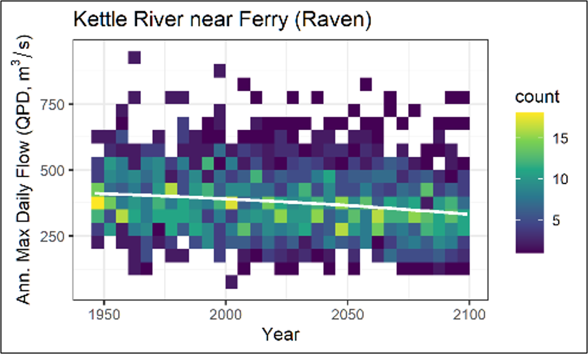
Figure 26: Change in annual peak flow (daily average flow) over time from the Raven hydrologic model developed in AE (2021) for the Kettle River near Ferry (WSC 08NN013) shown as a two-dimensional histogram.
Text Version
A graph of the annual maximum daily flow values for the Kettle River near Ferry generated using the Raven hydrologic model.
The horizontal axis represents years and extends from approximately 1950 to 2100. The vertical axis is labelled Ann. Max Daily Flow (QPD, cubic metres per second) and ranges from approximately 0 to 950 cubic metres per second.
The figure is displayed as a coloured density plot. Individual coloured grid cells represent the frequency of annual maximum daily flow values within a given year and flow range. A colour bar on the right side of the figure is labelled count and indicates the frequency associated with each colour. Colours range from dark purple for lower counts through blue, turquoise, and green to yellow for higher counts.
Coloured cells occur across most of the graph between approximately 100 and 800 cubic metres per second. The highest-density areas, indicated by green and yellow colours, are concentrated primarily between approximately 250 and 450 cubic metres per second throughout the period shown.
A light green trend line is superimposed on the density plot. The line extends across the full period of record and slopes downward from left to right. Near 1950, the line is positioned at approximately 400 cubic metres per second, and near 2100 it is positioned at approximately 330 cubic metres per second.
The figure title is Kettle River near Ferry (Raven). The plot displays annual maximum daily flow values and their frequency distribution from approximately 1950 to 2100, together with a fitted trend line.
- Model results also indicate the peak flow for the year gradually occurs earlier and earlier over the coming century, trending from ~125 (mid-May) to 100 (mid-April) (Figure 27). Model output also shows the occurrence of peak flows outside the normal freshet period (~day-of-year 300 or later). These are the outlier purple occurrences, which represent mid-winter rain or rain-on-snow events. This type of mid-winter melt event has not occurred on the Kettle River to date; however, the model results indicate that it may become possible in the future. Figure 27 shows that even if the timing of the peak flows becomes drastically different, the magnitude is not expected to increase.
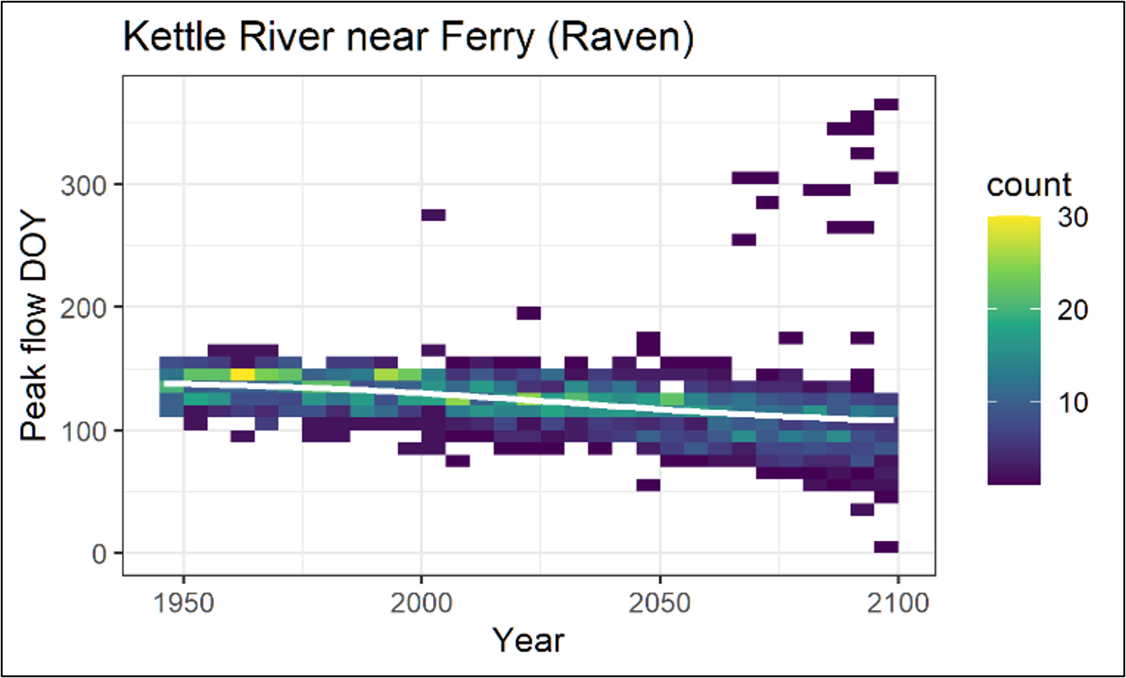
Figure 27: Change in day of year of peak flow over time from the Raven hydrologic model developed in AE (2021) for the Kettle River near Ferry (08NN013) shown as a two-dimensional histogram.
Text Version
A graph of the timing of annual peak flow for the Kettle River near Ferry based on Raven hydrologic model simulations. The plot displays the distribution of annual peak-flow timing from approximately 1950 to 2100 together with a fitted trend line.
The horizontal axis represents years and extends from approximately 1950 to 2100. The vertical axis is labelled Peak flow DOY (day of year) and ranges from 0 to approximately 365.
The figure is displayed as a coloured density plot. Individual coloured grid cells represent the frequency of peak-flow dates within a given year and day-of-year range. A colour bar on the right side of the figure is labelled count and indicates the frequency associated with each colour. Colours range from dark purple for lower counts through blue, turquoise, and green to yellow for higher counts.
Most coloured cells are concentrated between approximately day 50 and day 160 throughout the period shown. Additional isolated cells occur at higher day-of-year values, including several occurrences between approximately day 250 and day 350.
A light green trend line is superimposed on the density plot. The line extends across the full period of record and slopes downward from left to right. Near 1950, the line is positioned at approximately day 140. Near 2100, the line is positioned at approximately day 110.
- The skew of the distribution for mixed regime watersheds from NHC (2021) that were similar in size to the Kettle River near Ferry was 0.5 (median skew value of all reference gauges reviewed, for 1-day peak flow). NHC used this skew to develop a climate change adjustment to account for a regime shift in future peak flows. They replaced the log Pearson Type III distribution with a skew value forced to 0.5 for the Kettle River near Ferry (08NN013) to account for future conditions. The recommended design flow adjustments for 08NN013 using a skew value forced to 0.5 are shown in Table 5. Skew adjustments that resulted in future design flow changes less than 10% were capped at a 10% minimum, as recommended by EGBC (2018).
| Return period | 08NN013 | |
|---|---|---|
| Increase (%) | Design flow | |
| 2-year | 10 | 388 |
| 5-year | 10 | 483 |
| 10-year | 10 | 541 |
| 20-year | 10 | 593 |
| 50-year | 10 | 656 |
| 100-year | 11.7 | 713 |
| 200-year | 15.4 | 783 |
| 500-year | 20.6 | 880 |
Note: Peak flow increases of less than 10% from the skew adjustment were left at 10%, the minimum increase recommended by EGBC (2018)
3.5 Nisg̱a’a Nation: River Basin Flood Hazard Mapping
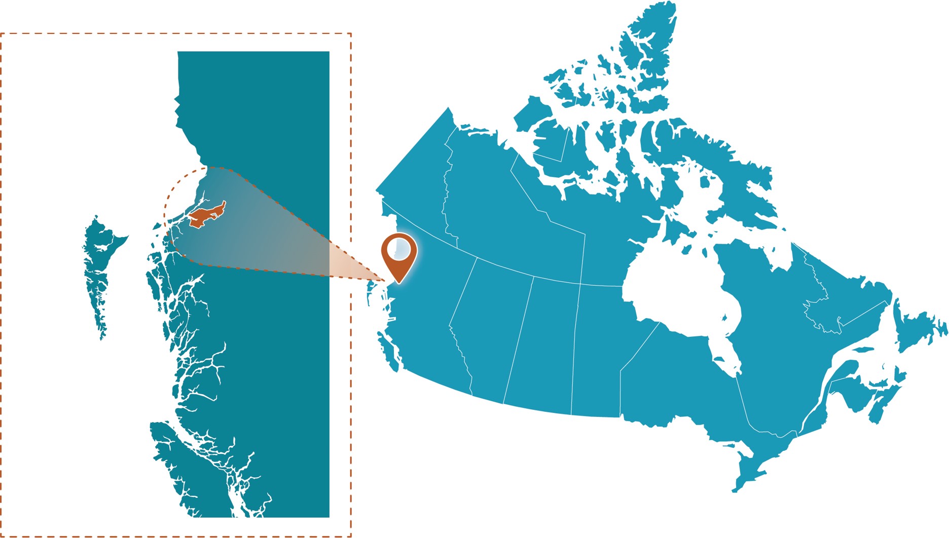
Figure 28: Nisg̱a’a Nation project location.
Text Version
A map showing the study area within Canada on the right side and a zoomed-in inset enclosed within a brown dashed rectangular border on the left side. The graphic uses a teal-coloured map of Canada. A brown map pin marks the site, while a brown spotlight effect and brown dashed outline connect the inset to its location on the national map.
Project Profile
- Client: Nisg̱a’a Lisims Government, British Columbia
- Project lead: Northwest Hydraulic Consultants Ltd. (NHC)
- Completion date: May 2023
- Budget: >$300K
- Portion for climate assessment: ~15%
- Nearest Communities: Villages of Gitwinksihlkw, Lax̱g̱alts’ap, and Ging̱olx
- Waterbodies: Nass, Greenville, and Ging̱olx rivers; Nass Bay and estuary
Community Profile
The Nass River flows 380 km from the Coast Mountains southwest to Nass Bay and has three major tributaries. This project focused on the areas of three Nisg̱a’a Villages — Gitwinksihlkw, Lax̱g̱alts’ap, and Ging̱olx — as well as the coastal road between Lax̱g̱alts’ap and Ging̱olx.
The Nass River basin is the location of the first modern-day treaty settlement in BC, between the provincial government and the Nisga'a Nation.
Local flood hazards
Flooding in the study area (Figure 29) can be due to riverine and coastal (wave, tsunami) sources, with climate change projected to increase river peak flows and sea levels. These projected increases to river peak flows and sea level rise have potential knock-on effects on the fluvial geomorphology, in some cases increasing the potential of debris flows and avulsions, and potentially accelerating bank erosion, lateral channel migration, sedimentation, and riverbed aggradation.
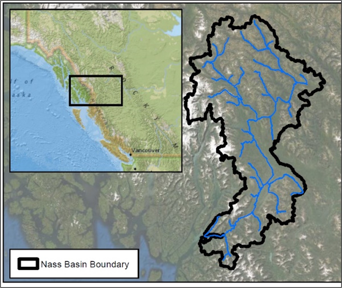
Figure 29: Nass River Basin boundary.
Text Version
This map title is Nass Basin Boundary. The map shows the location and extent of the Nass River Basin in northwestern British Columbia and the major river network contained within the watershed boundary through satellite imagery.
The main map occupies the right side of the figure. The Nass River Basin is outlined with a thick black boundary. Blue lines within the boundary represent the major rivers and tributaries of the basin. The river network extends throughout the watershed and converges into larger channels in the southern portion of the basin.
A locator inset is positioned in the upper-left corner of the figure. The inset shows western Canada and the Pacific coast. A black rectangular box identifies the location of the Nass River Basin within northwestern British Columbia. The city of Vancouver is labelled near the lower portion of the inset.
A legend is located in the lower-left corner of the figure. The legend contains a single symbol consisting of a black outlined polygon labelled “Nass Basin Boundary.”
The basin boundary is irregular in shape and extends generally north to south. Blue river channels are distributed throughout the basin, with several branches joining larger rivers as they progress toward the southern end of the watershed.
Purpose
The purpose of this study was to outline flood hazards in the Nisg̱a’a Nation, with consideration for climate change, focused on the three Nisg̱a’a Villages of Gitwinksihlkw, Lax̱g̱alts’ap, and Ging̱olx, and the coastal road between Lax̱g̱alts’ap and Ging̱olx.
The project deliverables consisted of flood hazard (depth and velocity), geomorphic hazard, and Flood Construction Level mapping developed through the following project components: bathymetric and topographic surveys, hydrometric monitoring, climate change impacts assessment, hydrological modelling, geomorphological assessment, hydraulic modelling, coastal flood hazard assessment, and flood mapping.
To understand if peak flows were sensitive to future deglaciation, with the volume of glacier ice within Western Canada expected to shrink by 70% by end of century (Clarke et al., 2015), the hydrological model was run with glacierized areas decreased and replaced with open barren land.
It was found that the impact to peak flows for the Nass River (6% glacierized) and smaller tributaries (up to 27% glacierized) was less than 5%. Given the uncertainty in deglaciation, current glacier coverage was used for the determination of design flows. It was highlighted that glacier loss may impact peak flows through potential mechanisms that were not simulated, such as transitional phases of loss that lead to sedimentation and reduction in-channel conveyance, or the formation of meltwater lakes with the potential for outburst floods.
Methodology
The guidelines that were followed that are relevant to a climate change assessment were:
- Flood Mapping in BC—Professional Practice Guidelines (PDF, 5.90 MB) (APEGBC, 2017)
- Legislated Flood Assessments in a Changing Climate in BC—Professional Practice Guidelines (PDF, 3.20 MB) (Engineers and Geoscientists BC, 2018)
- Federal Flood Mapping Guidelines Series (Natural Resources Canada, 2025a)
- Flood Hazard Area Land Use Management Guidelines (PDF, 1.92 MB) (BC Ministry of Forests, Lands, Natural Resources Operations and Rural Development, 2018).
The client also preferred that a comprehensive assessment of climate change impacts be included.
NHC investigated four greenhouse gas global emissions scenarios associated with four different shared socioeconomic pathways (SSPs) as part of the climate change analysis: SSP1-2.6, SSP2-4.5, SSP3-7.0, and SSP5-8.5. For each of these climate scenarios, climate projections from three global climate models were used for mid-century and end-of-century time horizons, resulting in 24 different climate change simulations. The models were selected on the basis of capturing a wide range of projections in temperature and precipitation (Cannon, 2015).
At the time of the study, downscaled CMIP6 projections were not yet available from provincial sources. CMIP6 projections were statistically downscaled using quantile mapping for the project from the following ESMs:
- CNRM-ESM2-1, developed by Centre National de Recherches Météorologiques (CNRM) and Centre Européen de Recherche et de Formation Avancée en Calcul Scientifique (CERFACS)
- EC-EARTH3, developed by EC-Earth Consortium (European community)
- ACCESS-ESM1-5, developed by Commonwealth Scientific and Industrial Research Organisation (Australia).
A hydrological model of the Nass River basin and tributaries to Nass Bay was developed in the Raven hydrological modelling framework to understand the impact of climate change on the hydrological processes within the basin, including the peak flows (Figure 30 and Figure 31). The model was first developed and calibrated to historical data prior to using future climate projections. During calibration, specific attention was given to simulating the historical flow regime and dominant flooding processes.
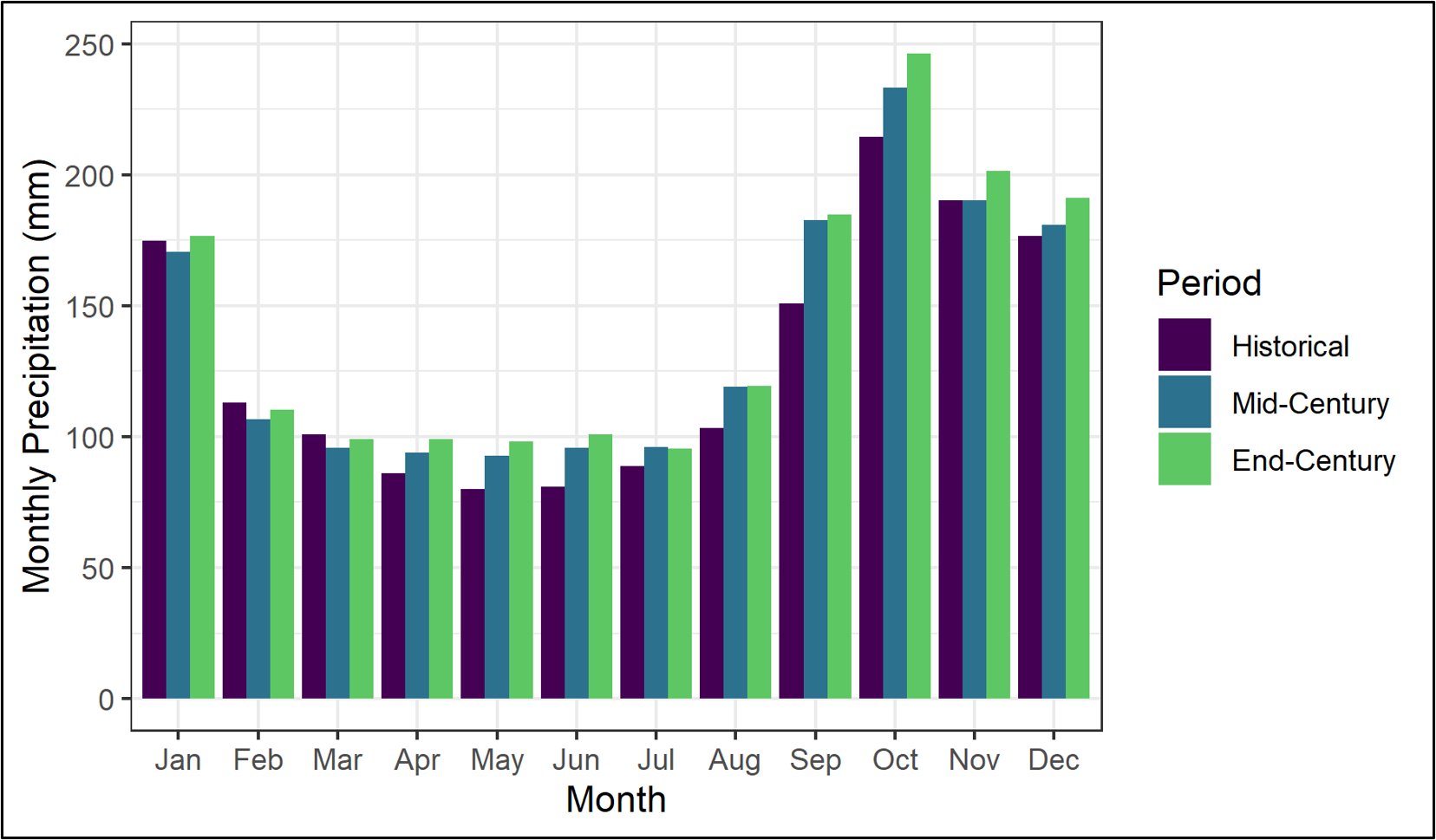
Figure 30: Monthly annual precipitation for the historical, mid-century, and end-of-century periodsFootnote 5.
Text Version
A grouped bar chart showing monthly precipitation for three time periods: Historical, Mid-Century, and End-Century.
The horizontal axis represents months of the year, from January through December. The vertical axis is labelled Monthly Precipitation (millimetres) and ranges from 0 to approximately 250 millimetres.
Three bars are shown for each month:
- Purple bars represent Historical conditions.
- Blue bars represent Mid-Century conditions.
- Green bars represent End-Century conditions.
A legend on the right side of the chart identifies the three periods.
Monthly precipitation values generally range from approximately 80 to 250 millimetres across the three periods. The lowest bars occur during late spring and early summer, particularly in May and June. The highest bars occur during autumn and winter, particularly in October, November, December, and January.
For most months, the blue and green bars are taller than the purple bars. In October, the bars are approximately 214 millimetres for Historical, 233 millimetres for Mid-Century, and 247 millimetres for End-Century conditions. In December, the bars are approximately 177, 181, and 192 millimetres, respectively.
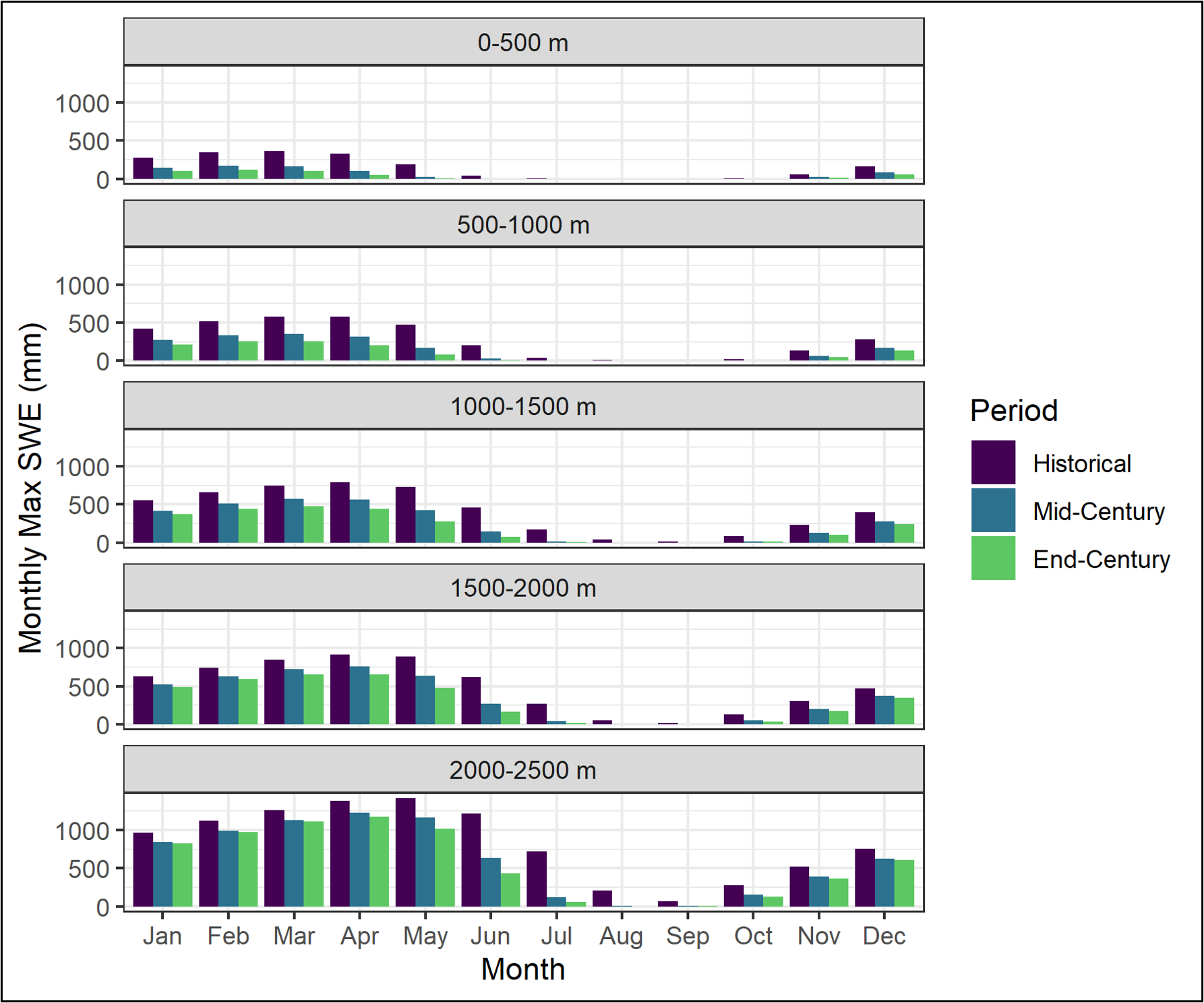
Figure 31: Monthly SWE by elevation band for the historical, mid-century, and end-of-century conditions.
Text Version
A multi-panel grouped bar chart showing maximum monthly snow water equivalent (SWE) for three time periods across five elevation bands. The chart consists of five stacked panels corresponding to elevation zones in metre: 0 to 500, 500 to 1000, 1000 to 1500, 1500 to 2000, and 2000 to 2500.
The horizontal axis represents months of the year, from January through December. The vertical axis is labelled Monthly Max SWE (mm) and represents monthly maximum snow water equivalent in millimetres.
Each panel contains three bars for each month:
- Purple bars represent Historical conditions.
- Blue bars represent Mid-Century conditions.
- Green bars represent End-Century conditions.
A legend on the right side of the figure identifies the three periods.
In all elevation bands, monthly maximum SWE values are generally higher during winter and spring months and lower during late summer and early autumn. Bar heights differ among the five elevation bands, with larger values shown in the higher-elevation panels.
In the 0 to 500 metres elevation band, bar heights are generally below 400 millimetres and are near zero for several summer and early autumn months. In the 500 to 1000 metres and 1000 to 1500 metres elevation bands, the highest bars occur during late winter and spring and reach approximately 600 millimetres and 800 millimetres, respectively. In the 1500 to 2000 metres elevation band, peak values approach approximately 900 millimetres. In the 2000 to 2500 metres elevation band, the tallest bars occur between March and May, with historical values reaching approximately 1,300 to 1,400 millimetres.
Within most months and elevation bands, the blue and green bars are shorter than the purple bars.
Outcomes
The model proved to have adequate performance in calibration and validation to assess the relative change between present day and future climate scenarios. Importantly, the model was able to adequately simulate both freshet and winter peaks, which provided confidence in the simulation of future scenarios where their distribution is expected to change.
The model was also able to simulate other internal processes such as snow accumulation and melt, which led to greater confidence in the ability of the model to simulate scenarios outside of the current range of precipitation and temperature.
Conclusion
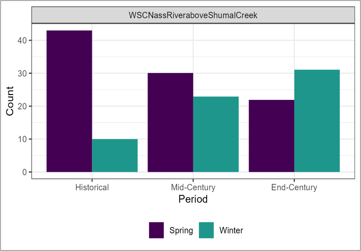
Figure 32: Plot of annual peak for the historic, mid-century and end-of-century periods, showing a transition from spring freshest-dominated peaks historically to winter peaks in the future.
Text Version
A grouped bar chart titled WSC Nass River above Shumal Creek. The chart compares the number of annual peak-flow events occurring during spring and winter for Historical, Mid-Century, and End-Century periods.
The horizontal axis represents the three periods: Historical, Mid-Century, and End-Century. The vertical axis is labelled Count and ranges from 0 to approximately 45.
Two bars are shown for each period:
- Purple bars represent Spring peak-flow events.
- Teal bars represent Winter peak-flow events.
A legend below the chart identifies the two seasons.
For the Historical period, the spring bar is approximately 43 events and the winter bar is approximately 10 events. For the Mid-Century period, the spring bar is approximately 30 events and the winter bar is approximately 23 events. For the End-Century period, the spring bar is approximately 22 events and the winter bar is approximately 31 events.
Across the three periods, the spring bars decrease in height while the winter bars increase in height.
The climate simulations project substantial changes over the Nass River basin by the end of the current century were determined to be as follows:
- A general increase in precipitation from April to December, with the largest increases in the fall.
- In terms of temperature, large rises in the seasonal mean values of daily minimum and maximum temperatures for all seasons, with winter temperature increases ranging from about 3 to 6 degrees Celsius.
- Rising temperatures result in a decrease in annual snowpacks. The overall increase in precipitation but decrease in snowpack indicates a shift to higher rain-to-snow ratios within the basin.
This results in a shift on the Nass River from a freshet-dominated regime to a mixed regime, with a larger number of peak flow events occurring in the fall. Historically, only 20% of annual peaks occur during the fall, but by end of century this increases to 60% of the annual peaks occurring as a result of fall rainfall events. Fall peaks are generally higher than the freshet driven peaks, resulting in a 48% increase in the 200-year return period under one climate scenario (CMIP’s SSP3-7.0) (Figure 32). Smaller, more coastal basins do not have as extreme a change in peak flows, as the basins already have a mixed hydrologic regime.
3.6 Rat Creek: Riverine Flood Mapping
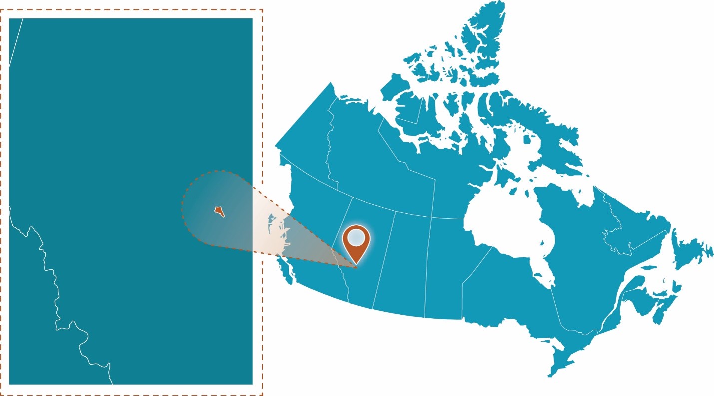
Figure 33: Rat Creek project location.
Text Version
A map showing the study area within Canada on the right side and a zoomed-in inset enclosed within a brown dashed rectangular border on the left side. The graphic uses a teal-coloured map of Canada. A brown map pin marks the site, while a brown spotlight effect and brown dashed outline connect the inset to its location on the national map.
Project Profile
- Client: Water Survey of Canada (ECCC)
- Project lead: National Hydrological Service (ECCC)
- Completion date: October 2024
- Nearest Community: Town of Drayton Valley
- Waterbody: Rat Creek
Community Profile
Rat Creek is a tributary to the Pembina River near Drayton Valley, southwest of Edmonton, Alberta (AB). The Water Survey of Canada (WSC) operates active hydrometric gauges in the area. The Rat Creek gauge is located 32 km west-southwest of Drayton Valley (Figure 34).
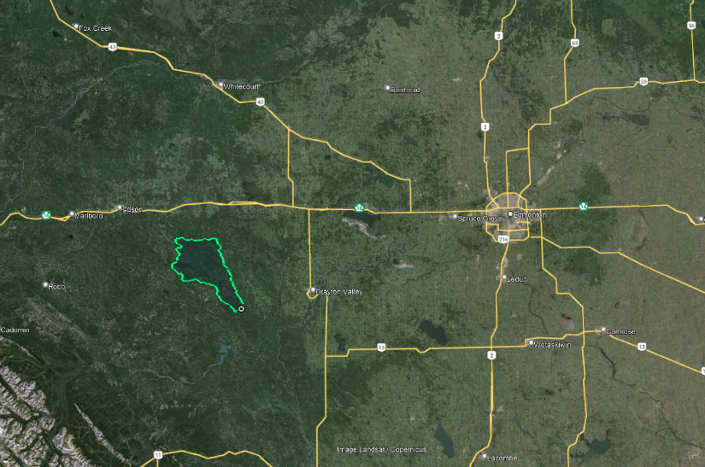
Figure 34: Location of Rat Creek gauge, west-southwest of Drayton Valley, Alberta.
Text Version
This map shows the location of a delineated watershed or study basin in central Alberta, Canada, southwest of Edmonton and west of Drayton Valley, displayed on a satellite imagery basemap. The watershed boundary is highlighted with a bright cyan-green outline, and a small circular marker identifies the outlet point near the southeastern end of the basin.
Local flood hazards
In June 2023, a WSC gauge at Rat Creek near Cynthia gauge (07BA002) was destroyed in a flood, due to a heavier than average rain event when large flows in Rat Creek destroyed the gauge infrastructure. The road and bridge across Rat Creek were also destroyed. It is unknown how high the flow got during this event; the upper limit of the rating curve is 100 cm (3.38 m stage), but stage continued to rise for another 1.5 m to 4.82 m before loss of transmission (Figure 35).
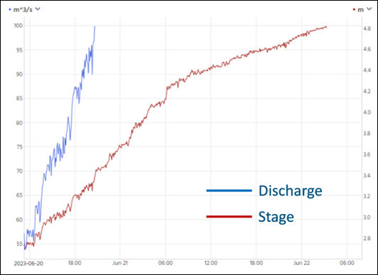
Figure 35: Rise of Rat Creek stage before loss of transmission.
Text Version
A time-series graph titled Rise of Rat Creek Stage Before Loss of Transmission. The graph shows discharge and stage measurements at Rat Creek from June 20 to June 22, 2023.
The horizontal axis represents date and time, spanning approximately June 20, June 21, and the early hours of June 22, 2023.
Two vertical axes are shown:
- The left vertical axis represents discharge in cubic metres per second (cubic metres per second) and ranges from approximately 55 to 100 cubic metres per second.
- The right vertical axis represents stage in metres and ranges from approximately 2.7 to 4.9 metres.
A blue line represents discharge and a red line represents stage. A legend within the graph identifies the two measurements. The blue discharge line is present only during the first portion of the record. It begins at approximately 55 cubic metres per second on June 20 and increases to approximately 100 cubic metres per second before the line ends. The red stage line extends across the full period shown. It begins at approximately 2.7 metres on June 20 and rises steadily to approximately 4.9 metres near the end of the record on June 22.
Both measurements increase over the period where the blue and red lines overlap. After the discharge record ends, the stage record continues and remains upward trending through the end of the graph.
Purpose
WSC completed a hydrology and hydraulic assessment at the gauge location to determine if it should be rebuilt in a different location. This project was minimal in scale as it was an internal investigation, not a full flood hazard assessment. Therefore, the following assessment is proportional in scale to this project.
Potential climate impacts typically have not been taken into account when determining locations for new WSC gauges or repairing gauges. However, integrating climate impacts into infrastructure decisions will help the WSC network better withstand extremes, so it can provide more consistent data collection that captures extreme events. More measurements (rather than focusing on gauge damage) during extreme floods will also make more data on these events available to users.
Methodology
To create a flood hazard map for the gauge location, WSC undertook a hydrologic analysis, climate change assessment, and hydraulic analysis.
A flood frequency analysis was completed with historic gauge data in HEC-SSP using Bulletin 17 C (Figure 36).
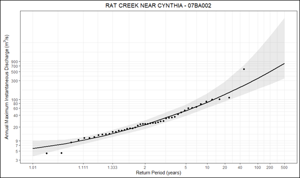
Figure 36: Flood frequency analysis.
Text Version
A flood-frequency plot titled RAT CREEK NEAR CYNTHIA – 07BA002. The graph shows annual maximum instantaneous discharge plotted against return period for hydrometric station 07BA002.
The horizontal axis is labelled Return Period (years) and is displayed on a logarithmic scale. Tick marks range from approximately 1 year to 500 years, including values such as 1.01, 1.11, 1.33, 2, 5, 10, 20, 40, 100, 200, and 500.
The vertical axis is labelled Annual Maximum Instantaneous Discharge (cubic metres per second) and is also displayed on a logarithmic scale. Values range from approximately 3 cubic metres per second to 900 cubic metres per second.
Individual black points represent observed annual maximum instantaneous discharge values. Most points are concentrated between return periods of approximately 1 and 20 years and discharge values of approximately 10 to 120 cubic metres per second. A small number of points occur at higher return periods and higher discharge values. One point is located near a return period of approximately 45 years with a discharge value of about 600 cubic metres per second.
A solid black curve passes through the centre of the plotted points. The curve rises continuously from left to right. Near a 1-year return period, the curve is approximately 6 cubic metres per second. Near a 2-year return period, the curve is approximately 25 cubic metres per second. Near a 10-year return period, the curve is approximately 90 cubic metres per second. Near a 100-year return period, the curve is approximately 300 cubic metres per second. Near a 500-year return period, the curve approaches approximately 850 cubic metres per second.
Two shaded grey bands surround the fitted curve. A darker grey band lies closest to the curve and is enclosed within a lighter grey band. Both shaded bands are relatively narrow at lower return periods and become progressively wider toward higher return periods. At return periods greater than approximately 100 years, the shaded region spans a large range of discharge values above and below the fitted curve.
The observed points generally follow the fitted curve, with most points located within the darker shaded band. The largest spread in values occurs at higher return periods where the grey bands are widest.
The flood frequency analysis indicates that the 100-year flow is 340 m3/s. However, at this site, a much larger flow occurred. In July 1986, a flow of 580 m3/s was found in the historic record. This value appears to be based on calculations from slope area analysis, as indicated by physical field notes from the event. This calculation has a large degree of error, but it was taken to be accurate as evidence of a large rainfall event and large flows from this time exist. News articles, ECCC weather station precipitation readings, and readings from a nearby downstream gauge (07BA001) indicate there was a large flood at this time.
To begin the climate change assessment for the area, a conceptual model (Figure 37) was created to better understand the area, including causes of floods and how climate change might affect floods. (The conceptual model visually represents how peak flow and floods are expected to be impacted in a changing climate, informing the rest of the assessment process.)
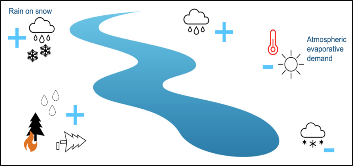
Figure 37: Conceptual model depicting the direction of change of factors that contribute to peak flows in the Rat Creek gauge watershed.
Text Version
A conceptual diagram showing factors associated with peak streamflows in the Rat Creek watershed.
A large blue river extends diagonally through the centre of the figure from the upper left toward the lower right. Several symbols are positioned around the river. Blue plus and minus signs accompany the symbols and indicate the direction of change.
In the upper left corner, the label Rain on snow appears beside a cloud containing raindrops and snowflakes. A blue plus sign is shown next to the symbol. Near the upper centre of the figure, a cloud producing rainfall is shown with a blue plus sign to its right. In the upper right portion of the figure, a thermometer and sun symbol appear beside the label Atmospheric evaporative demand. A blue minus sign is shown adjacent to these symbols. In the lower left corner, three water droplets are shown above a wildfire symbol consisting of a tree and flame, and a second tree symbol. A blue plus sign is positioned beside these symbols.
In the lower right corner, a cloud producing snowfall is shown with a blue minus sign beside it.
The figure contains three blue plus signs and two blue minus signs. The symbols represent rain on snow, rainfall, atmospheric evaporative demand, water droplets associated with forest disturbance symbols, and snowfall arranged around the central river graphic.
Figure 37 shows the effect that a given climate change impact will have on peak flow, including:
- Temperature is expected to increase (Shrestha et al., 2017), which may result in:
- Precipitation that may have fallen as snow will fall as rain. It is unclear the exact effect this will have on streamflow, but it may change the frequency and magnitude of large events.
- Increased instances of rain-on-snow events, which will result in a flashier system exhibiting higher peak flows.
- Increased atmospheric evaporative demand, which will result in less water available in the watershed during hot times of the year.
- There is the possibility of the loss of tree cover in the basin due to possible forest fires and deforestation. This will reduce rainfall interception from trees, resulting in increased runoff entering the stream.
- Precipitation is expected to increase (Shrestha et al., 2017).
Overall, peak flow magnitude is expected to increase in the watershed. Because quantitative assessment of the impact of climate change on peak flows was not possible due to time and budget constraints, a risk-based approach was completed to assess the impacts of possible shifts in peak flow. A literature review was undertaken to identify a range of expected changes in peak flow (by percentage) due to climate change. As Rat Creek is a small watershed, studies have not been completed on it directly. However, much research has been done in the wider area, such as for the Athabasca River watershed.
A study by Dibike et al. (2019) in the Athabasca near the AOI investigated projected changes (by percentage) in the magnitude of 100-year return period flows under emission scenario RCP 8.5. The study found that these flows will increase between 4–12%, depending on the method of extreme value analysis (Figure 38).
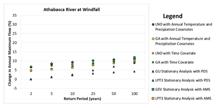
Figure 38: Change in annual maximum flow over several return periods (Dibike et al., 2019).
Text Version
A scatter plot titled Athabasca River at Windfall. The chart shows projected change in annual maximum flow, expressed as a percentage, for return periods ranging from 2 to 100 years. Eight statistical analysis methods are represented using different symbols and colours.
The horizontal axis is labelled Return Period (years) and includes values of 2, 5, 10, 25, 50, and 100 years. The vertical axis is labelled Change in Annual Maximum Flow (%) and ranges from approximately -5% to 35%.
A legend on the right identifies the eight data series:
- Purple circles: LNO with Annual Temperature and Precipitation Covariates
- Yellow circles: GA with Annual Temperature and Precipitation Covariates
- Orange diamonds: LNO with Time Covariate
- Green diamonds: GA with Time Covariate
- Red triangles: GU Stationary Analysis with PDS
- Blue triangles: LPT3 Stationary Analysis with PDS
- Green squares: GEV Stationary Analysis with AMS
- Yellow squares: LPT3 Stationary Analysis with AMS
For the 2-year return period, plotted values range from approximately 0% to 7%. The lowest value is the blue triangle representing the LPT3 stationary PDS analysis at approximately 0%, while the highest values are the green diamond and purple circle at approximately 7%.
For the 5-year return period, values range from approximately 1% to 9%. The blue triangle is near 1%, and the green diamond is near 9%.
For the 10-year return period, values range from approximately 2% to 10%. Most points are clustered between 6% and 10%.
For the 25-year return period, values range from approximately 3% to 10%. The green diamond is the highest point at approximately 10%, while the red triangle is the lowest at approximately 3%.
For the 50-year return period, values range from approximately 4% to 11%. Several methods are clustered between 9% and 11%.
For the 100-year return period, values range from approximately 4% to 12%. The highest point is the green square representing the GEV stationary AMS analysis at approximately 12%, while the lowest point is the red triangle representing the GU stationary PDS analysis at approximately 4%.
Most series show higher values at longer return periods. The plotted points generally form upward trends from left to right, with the green diamond, green square, and purple circle series occupying the upper portion of the graph and the red and blue triangle series occupying the lower portion.
Rat Creek and the Athabasca River will experience similar changes in climate (temperature, precipitation). However, as a smaller basin, Rat Creek is more likely to experience synchronized runoff generation (via rainfall, snowmelt, or a combination of both) than the Athabasca River. Thus, the 4–12% change identified in this study was considered to be the lower end of peak flow increase due to climate change at Rat Creek.
Conversely, in a watershed that is much smaller than Rat Creek with little storage, the maximum percent change in peak flow that can be expected is equal to the percent change in intensity of extreme rainfall events. To estimate the increase in rainfall (and by extension, peak flow) on a very small, flashy watershed in the same region as Rat Creek, a climate change adjusted IDF curve was investigated. It was found that projected change in 100-year 24-hour rainfall intensity is about 20% under SSP2-4.5, which was taken to be the higher end of possible peak flow increases for Rat Creek.
Conclusion
Climate change can potentially increase peak flows in this area by about 4–20%. To complete the risk-based assessment, this range of climate-adjusted flows was hydraulically modelled to analyze the impacts of the increased flows. The hydraulic model of the Rat Creek stream channel near the WSC gauge indicated the inundated areas throughout the range of climate-adjusted flows (Figure 39). Since even the 100-year flood with no adjustment indicated flooding in the AOI it was clear the gauge infrastructure should be relocated to an area less prone to flooding. The 20% climate change adjustment was modelled to identify other areas for the gauge location that are resistant to future flooding.
The right bank to the east of the road was identified as a possible location for the gauge; a location that remained free from flooding during the July 1986 580 cm event. These results were provided to the WSC operations team to finalize the gauge relocation.
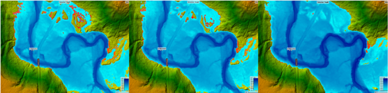
Figure 39: Inundated area due to a 100-year event (left), inundated area due to a 20% climate change adjusted 100-year event (middle), and inundated area due to 580 m3/s flow (right).
Text Version
Three side-by-side flood inundation maps showing the same river reach under different flow scenarios. From left to right, the panels are labelled 100-year flood, 100-year flood plus 20%, and 580 cubic metres per second.
Each map is displayed on a shaded topographic basemap. Lower elevations are shown in shades of blue, while higher elevations are shown in green, yellow, and brown. A meandering river channel extends through the centre of each panel.
Flooded areas are represented by blue shading. Darker blue areas generally follow the main river channel, while lighter blue areas extend across adjacent low-lying terrain. Small red and orange areas occur along portions of the floodplain margins.
In the left panel, representing the 100-year flood scenario, blue inundation extends across much of the central floodplain. Several isolated flooded areas are visible away from the main channel, particularly in the upper portion of the map. Red and orange patches occur along the edges of the inundated area.
In the middle panel, representing the 100-year flood plus 20% scenario, the overall inundation pattern is similar to the left panel. Flooded areas extend farther into surrounding low-lying terrain in several locations. Red and orange areas are visible along portions of the floodplain margins, including areas in the upper and right portions of the map.
In the right panel, representing the 580 cubic metres per second scenario, inundation remains concentrated around the main river channel and adjacent floodplain areas. Isolated flooded areas are less numerous than in the other two panels. Red and orange patches are present but occupy fewer locations around the floodplain margins.
Each panel includes a colour scale in the lower-right corner showing flood depth values and a small location label positioned near the river channel. The river channel follows a similar course in all three panels, allowing comparison of inundation extent between scenarios.
3.7 Conservation Halton: Local Waterbody Flood Hazard Mapping
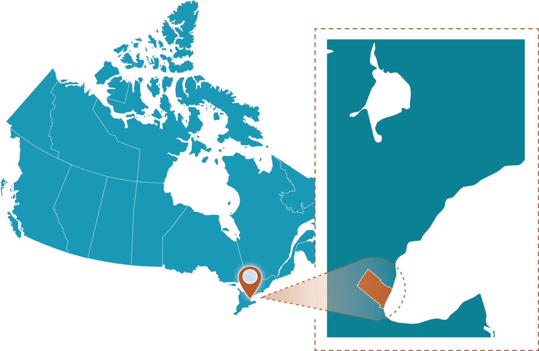
Figure 40: Conservation Halton project location.
Text Version
A map showing the study area within Canada on the right side and a zoomed-in inset enclosed within a brown dashed rectangular border on the left side. The graphic uses a teal-coloured map of Canada. A brown map pin marks the site, while a brown spotlight effect and brown dashed outline connect the inset to its location on the national map.
Project Profile
- Client: Conservation Halton, Ontario
- Project lead: Morrison Hershfield Ltd.
- Completion date: March 31, 2020
- Budget: $100,000—$300,000
- Portion of climate assessment: <10%
- Nearest Community: Town of Oakville
- Waterbodies: Morrison-Wedgewood Diversion Channel; Munn’s Creek; West Morrison Creek; East Morrison Creek; West Wedgewood Creek; East Wedgewood Creek
Community Profile
Conservation Halton is one of Ontario’s 36 conservation authorities and a local watershed management agency. Its jurisdiction spans the Grindstone, Bronte, and Sixteen Mile Creek watersheds, and 18 smaller urban watersheds that drain to Lake Ontario. This study focused on urban watercourses in the Town of Oakville that drain to Sixteen Mile Creek.
Local flood hazards
The Town of Oakville has experienced significant flooding due to heavy rainfall, like many other southern Ontario municipalities. To understand the magnitude and extent of flood hazards and potential risks to life and property, the project used Ontario’s flood event standards (PDF, 322 KB): the 100-year flood event and the 1954 Hurricane Hazel flood event, both of which are based on heavy rainfall. The Hurricane Hazel event consisted of 285 mm of rain over 48 hours, with 212 mm of rain during the last 12 hours at a peak hourly intensity of 53 mm/hr.
Purpose
The purpose of the project was to update peak flows and develop engineered flood hazard mapping sheets to support land use planning and decision-making for the watercourse contributing flows to the Morrison-Wedgewood Diversion Channel (Figure 41).
Conservation Halton also sought to understand how climate change may increase the frequency and severity of rainfall events, and how it may increase the estimated hydrologic peak flows and associated flood inundation on local waterbodies.
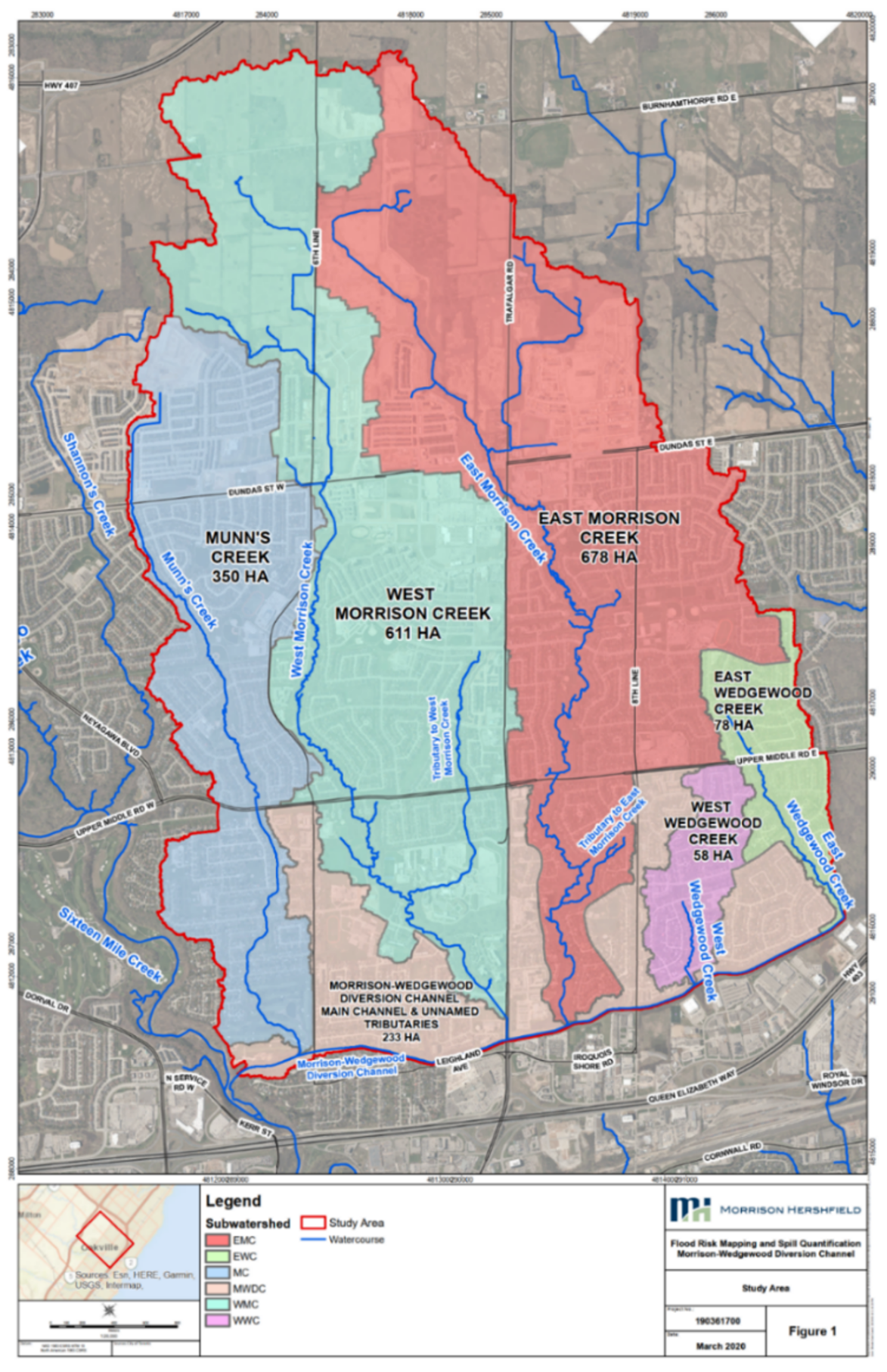
Figure 41: Study area and sub-watersheds.
Text Version
A map of the Morrison–Wedgewood study area in Oakville, Ontario. The map is displayed on an aerial imagery basemap and shows the study area boundary, subwatershed boundaries, and watercourses.
The study area is outlined by a red boundary and extends from Highway 407 near the northern edge of the map to Highway 401 near the southern edge. Blue lines represent watercourses and drainage channels throughout the study area.
Six subwatersheds are identified using different colours:
- East Morrison Creek (EMC), shown in red, occupies much of the eastern half of the study area and is labelled 678 hectares.
- West Morrison Creek (WMC), shown in light green, occupies the central portion of the study area and is labelled 611 hectares.
- Munn's Creek (MC), shown in light blue, occupies the western portion of the study area and is labelled 350 hectares.
- Morrison–Wedgewood Diversion Channel and Unnamed Tributaries (MWDC), shown in tan, occupies the southern-central portion of the study area and is labelled 233 hectares.
- East Wedgewood Creek (EWC), shown in light green near the eastern edge of the map, is labelled 78 hectares.
- West Wedgewood Creek (WWC), shown in purple near the southeastern corner of the study area, is labelled 58 hectares.
Several watercourses are labelled on the map, including East Morrison Creek, West Morrison Creek, Munn's Creek, Shannon's Creek, Wedgewood Creek, West Wedgewood Creek, and the Morrison–Wedgewood Diversion Channel. The watercourses generally follow north-to-south pathways through the study area.
Major roads shown on the map include Highway 407, Dundas Street East, Dundas Street West, Upper Middle Road East, Upper Middle Road West, Neyagawa Boulevard, Trafalgar Road, and Highway 403. Sixteen Mile Creek is labelled along the southwestern edge of the map.
A legend at the bottom of the figure identifies the subwatershed colours, the red study-area boundary, and blue watercourses. A locator inset in the lower-left corner shows the study area's location within the Town of Oakville. The map also includes a north arrow, scale bar, and coordinate grid.
Methodology
The scope of work included an assessment of previous hydrologic models, selection of a modelling platform, and selection of existing and future hydrologic scenarios.
The climate scenario included as part of the hydrologic model was based on the recommendations for future climate change rainfall scenarios (Wood, 2018). The rainfall scenarios were based on Representative Concentration Pathways (RCP) scenario 8.5. The time horizons selected by the Wood study included both 2050 and 2080 rainfall IDF scenarios. The 2080 scenario was selected for assessment due to the expected design life of stormwater infrastructure in the area.
The primary data source for the climate projections was also drawn from Wood. The climate change assessment required by the client included incorporating the recommended approach from the Town of Oakville’s climate change assessment.
The approach was guided by Oakville’s Climate Change Strategy (PDF, 628 KB) (2014) and Review of Future Rainfall Studies (Wood, 2018). In keeping with this study’s recommendations, climate-adjusted IDF projections (based on Western’s IDF-CC Tool [V2]) were applied based on a projected climate year of 2080. A 24-hour Chicago rainfall distribution was applied (per Town standards and findings of the sensitivity analysis), given the absence of long-term flow monitoring data that would support selection of a less conservative distribution.
On August 4, 2014, a series of thunderstorms resulted in significant flooding in a nearby watershed in the City of Burlington. Conservation Halton collected and analyzed available rainfall data and defined the hyetograph associated with the maximum rainfall impacting a 1 km2 cell, based on calibrated radar data from the NexRAD station in Buffalo, New York. The maximum rainfall determined for the storm totaled more than 190 mm over seven hours. While the maximum hourly rainfall intensity (56 mm/hr) was similar to the Hurricane Hazel flood event standard, the rainfall hyetograph generated for the August 4th, 2014 storm applied 10-minute time steps (rather than hourly time steps), and so the rainfall distribution included a maximum intensity of 126.7 mm/hr over a 10-minute duration. This maximum cell rainfall from the storm was simulated and compared with flows associated with the regulatory flood hazard (associated with the greater of the 1:100-year or Hurricane Hazel storms) and the climate-adjusted 1:100-year flows.
Conclusion
The climate-adjusted rainfall scenario resulted in the greatest peak flows at four of the six watercourse outlets, with both the Hurricane Hazel flood event and the peak August 4, 2014 flows generating higher peak flows at the remaining two nodes. Only the flows associated with the provincial flood event standards were mapped.
3.8 Durham Region: Riverine Crossings and Roads Flood Hazard Mapping
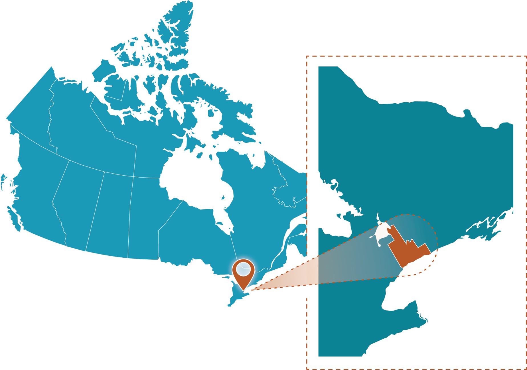
Figure 42: Durham Region project location.
Text Version
A map showing the study area within Canada on the right side and a zoomed-in inset enclosed within a brown dashed rectangular border on the left side. The graphic uses a teal-coloured map of Canada. A brown map pin marks the site, while a brown spotlight effect and brown dashed outline connect the inset to its location on the national map.
Project Profile
- Client: Region of Durham, Ontario
- Project lead: Toronto and Region Conservation Authority with Savanta and Climate Risk Institute
- Nearest Communities: City of Pickering; Town of Ajax; Township of Uxbridge
- Waterbodies: Carruthers Creek and Frenchman’s Bay watersheds, and most of the Petticoat and Duffins Creek watershed
Community Profile
The study area for this project is the riverine regulatory flood plain within the Toronto Region Conservation Authority’s (TRCA) jurisdiction in Durham Region, Ontario. Most of the land in the watershed has undergone significant urbanization but also includes rural agricultural land and golf courses.
There are four TRCA watersheds that are within, or mostly within, the Durham Region boundary:
- Frenchman’s Bay watershed: Approximately 2,700 ha in the City of Pickering, with four sub-watersheds that drain into Frenchman’s Bay and then into Lake Ontario.
- Petticoat Creek watershed: Approximately 2,417 ha, mostly in the City of Pickering, surrounded by the Rouge River, Duffins Creek, and Frenchman’s Bay watersheds.
- Carruthers Creek watershed: An approximate drainage area of 3,971 ha in the City of Pickering and Town of Ajax. The watershed consists of the Main Branch and East and West tributaries, which join with the Main Branch approximately 300 m upstream of Taunton Road East; the creek then drains through Carruthers Marsh into Lake Ontario.
- Duffins Creek watershed: The biggest of the four watersheds, spanning an approximate drainage area of 28,216 ha. Most of the watershed is in the City of Pickering; the watercourse network includes several creeks (Lower Duffins, Main Duffins, East Duffins, West Duffins, and Miller Creek).
Local flood hazards
The intensity, duration, and frequency of extreme precipitation events is linked with how the climate is changing. Climate modelling efforts by the international community demonstrate that as global air temperatures warm, the availability of moisture increases, thereby potentially increasing the amount and intensity of precipitation during extreme weather events. How often extreme rainfall events occur is still an active area of research globally, but numerous academics, municipalities and decision makers are developing approaches to update tools used in infrastructure design to consider future conditions, such as Intensity-Duration-Frequency (IDF) curves.
While it was out of scope to update IDF curves for the Region as part of this work, Savanta and the Climate Risk Institute (CRI) were tasked with providing an approach of “shifting” return periods based on future climate scenarios. This task was guided through the following research question: “What is the expected new return period based on a given historical event (for example, two-year) amount of rainfall?” In other words, this task focuses on “shifting” the annual exceedance probability (AEP) considering climate change, not determining the future amount of extreme rainfall (i.e., in millimetres).
Purpose
This study informed the Region’s Community Climate Adaptation Plan (PDF, 7.9 MB) (2016), focusing on riverine crossings and roads within TRCA’s jurisdiction in Durham Region only, and did not consider flood vulnerability of roads under urban (non-riverine) flooding scenarios.
Methodology
The project team undertook a literature review to identify potential methodologies, analyses, and approaches toward updating return periods in light of future climate change. These included, broadly:
- Temperature scaling;
- Applying a “climate model-derived” safety factor;
- Transposing a design storm from another jurisdiction or altering its application to approximate future conditions; and
- Using a statistical analysis to update annual exceedance probabilities (for example, extreme value or a sensitivity analysis).
Following discussions among TRCA and Durham Region staff, Savanta and CRI confirmed they would undertake a statistical procedure and sensitivity analysis that leveraged future precipitation and storm-related information available across Ontario. More specifically, the project team would conduct an analysis to compare future IDF-related information and interpret the extent to which return periods may be shifting in TRCA watersheds within the region.
The project brought together flood impact information, road criticality information, and hydraulic model information to provide a desktop-based risk ranking of roads at risk of riverine flooding, and to characterize the hydraulic performance of crossings (as reflected in TRCA’s hydraulic models) in comparison to Ontario Ministry of Transportation (MTO) criteria. As part of this study, Savanta and the CRI conducted another study on how to incorporate future climate change in which an approach of “shifting” return periods based on future climate scenarios was developed (i.e., “shifting” the AEP of already-modelled storms considering climate change). The results of this study, namely the projected “shifted return period” tables, were used to add a climate change scenario to the flood vulnerable roads and crossing databases.
Crossing information and results were extracted from TRCA’s current hydraulic models for the four watersheds (Figure 43). The extracted model information was further processed to identify which crossings were pressurized and/or overtopped, and the first return period at which they became pressurized or overtopped (meaning that they could not pass the associated storm event). This provided information on the actual level of service a crossing could provide.
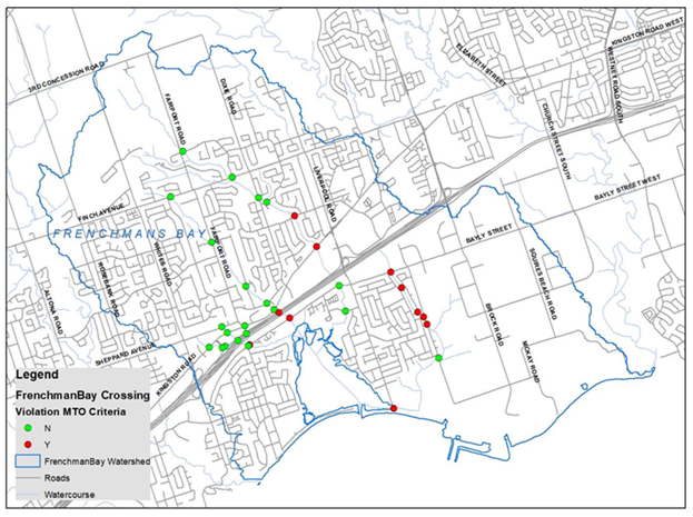
Figure 43: Crossings in Frenchman's Bay watershed for existing climate conditions.
Text Version
A map of the Frenchman’s Bay watershed showing roadway and infrastructure crossing locations and whether each crossing meets or violates Ministry of Transportation of Ontario (MTO) criteria under existing climate conditions. The map is displayed on a grey and white street basemap with roads, watercourses, and the watershed boundary shown.
The Frenchman’s Bay watershed boundary is outlined with a blue line and extends from inland areas in the north to the Lake Ontario shoreline at the south edge of the map. Watercourses are shown as blue lines throughout the watershed. Roads are shown in grey and labelled with street names.
Crossing locations are represented by circular symbols. Green circles indicate crossings that do not violate MTO criteria (labelled “N” in the legend), and red circles indicate crossings that violate MTO criteria (labelled “Y” in the legend).
Green and red crossing symbols are distributed throughout the watershed. A cluster of crossing locations is visible in the south-central portion of the watershed near the major transportation corridor that runs diagonally from southwest to northeast. Additional crossing locations are scattered across the central, northern, eastern, and shoreline areas of the watershed.
The legend identifies the crossing status categories, watershed boundary, roads, and watercourses. The figure presents the spatial distribution of crossings classified as meeting or violating MTO criteria within the Frenchman’s Bay watershed under existing climate conditions.
The MTO provides flood design criteria to assign the hydraulic level of service that a crossing is supposed to provide, depending on the road classification, road environment, and crossing span. TRCA compared the actual level of service provided by the crossing and the MTO design level of service, which revealed that several crossings in each of the four watersheds did not provide the current level of service as per MTO design criteria. In addition, the crossing capacity assessment was also undertaken to incorporate future climate change conditions (that is, shifted return periods), which identified more crossings that would not meet MTO criteria in the future, due to the anticipated shifting of return periods for the associated storm flows moving from being less frequent to more frequent.
The flood vulnerability of roads was also assessed by extracting the maximum flood depth for each modelled event over the road for each inundated road segment within the regulatory flood plain. Using consensus-based tables to assign a closure disruption to flood depth, and utilizing daily traffic information for each road segment, the event-based disruption and average annualized disruption (AAD) for the road segments was calculated. AAD is a function of closure time, annual average daily traffic, and AEP. Future climate change scenarios were incorporated in the flood vulnerable road assessment, as reflected by revised AEP in calculations of AAD (Figure 44).
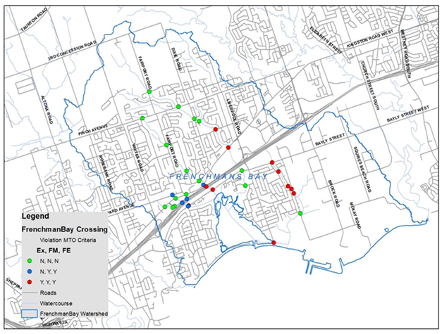
Figure 44: Crossings in Frenchman's Bay watershed for existing and future climate conditions.
Text Version
A map of the Frenchman’s Bay watershed showing road and infrastructure crossing status under three climate conditions: Existing (Ex), Future Medium (FM), and Future Extreme (FE). Crossing locations are classified according to compliance with the Ministry of Transportation of Ontario (MTO) criteria under each climate condition.
The map is displayed on a grey and white street basemap with the watershed boundary outlined in blue, watercourses shown as blue lines, and roads shown as grey lines. Major roads labelled on the map include Fairport Road, Liverpool Road, Bayly Street, Rosebank Road, West Shore Boulevard South, Kingston Road West, Finch Avenue, and Sheppard Avenue.
The Frenchman’s Bay watershed extends from inland urban and residential areas in the north to the shoreline of Frenchman’s Bay and Lake Ontario in the south. Watercourses are shown throughout the watershed and flow toward the bay.
Crossing locations are represented by coloured circular symbols. Green circles represent crossings classified as N, N, N, indicating no violation under Existing, Future Medium, or Future Extreme conditions. Blue circles represent crossings classified as N, Y, Y, indicating no violation under existing conditions and violations under both Future Medium and Future Extreme conditions. Red circles represent crossings classified as Y, Y, Y, indicating violations under Existing, Future Medium, and Future Extreme conditions.
Green circles are distributed throughout the watershed, including the northern, central, eastern, and southern areas. Several green circles are concentrated in the south-central portion of the watershed near a major transportation corridor.
Blue circles are clustered in the south-central portion of the watershed near the intersection of several watercourses and adjacent to the transportation corridor.
Red circles are distributed throughout the central, eastern, and southern portions of the watershed. Several red circles are located along watercourses near Bayly Street and other tributaries draining toward Frenchman’s Bay. Additional red circles occur near the shoreline in the southern portion of the watershed.
The legend identifies the three crossing-status categories, roads, watercourses, and the Frenchman’s Bay watershed boundary.
The criticality of road segments was also assessed, based on eight factors: 1) functional classification of roads; 2) average annual daily traffic; 3) designated transit routes; 4) goods movement routes; 5) degree of redundancy; 6) evacuation and disaster recovery—proximity to nuclear hazards; 7) proximity to sensitive receptors; and 8) social equity and justice. Each of the indicators was assigned a score based on a scale from one to five, with an overall criticality score calculated as a sum of the scores for each of the factors for each inundated road segment. The larger the combined score along a road, the more critical a given road segment was. The criticality scores were then converted to a multiplier that was applied to the AAD for a comprehensive flood risk score.
Outcomes
The deliverables from this study include:
- A geodatabase of crossing capacity information for each watershed, including a crossing point shapefile, and a crossing table for each storm event for both existing and future climate conditions.
- A geodatabase of road capacity information for each watershed, including the road segment polyline shapefile, the road table including disruption calculation for each storm event for both existing and future climate condition, and the AAD.
- A geodatabase of criticality ranking for the road segments, including a road segment polyline shapefile for each factor, and one for the criticality score determined by the combined eight factors.
- An ArcGIS.mxd file with links to each above geodatabase and select map views.
- A comprehensive report which details methodologies and results, as well as a short executive summary report.
Conclusion
Assessing and reducing climate risks, as well as undertaking comprehensive adaptation efforts, is an iterative process. Infrastructure planners, designers, engineers, and all other municipal staff should expect to revisit their research, results and how they are interpreted, and their implications on a regular basis (for example, every five years) to ensure they can be updated as new science and implicating choices are being made. The following considerations were provided as outputs:
- Always ensure that a fulsome discussion regarding Durham Region’s risk tolerance, associated cost-benefit trade-offs, and the level of regional appetite for upgrading infrastructure exists prior to adapting results contained in this report. Projected shifts in some return periods can be significant and carry large implications at the municipal level.
- Avoid using only the single multi-model ensemble average (“one number”) result in the 2050s- and 2080s-time horizons for future return periods of storms. Rather, consider the range in projected return periods and annual exceedance probabilities as part of future investigations.
- Generally, as these future return periods are applied to public works, additional consideration and/or engineering analysis is warranted to ensure that the results are appropriate for site-specific contexts. Recall that climate scenarios can change, and that there is no single, standard scenario that municipalities can design for. Therefore, enable flexibility wherever possible and examine the range in these results as part of engineering analyses and design criteria.
3.9 Mimico Creek: Erosion-Related Flood Mapping
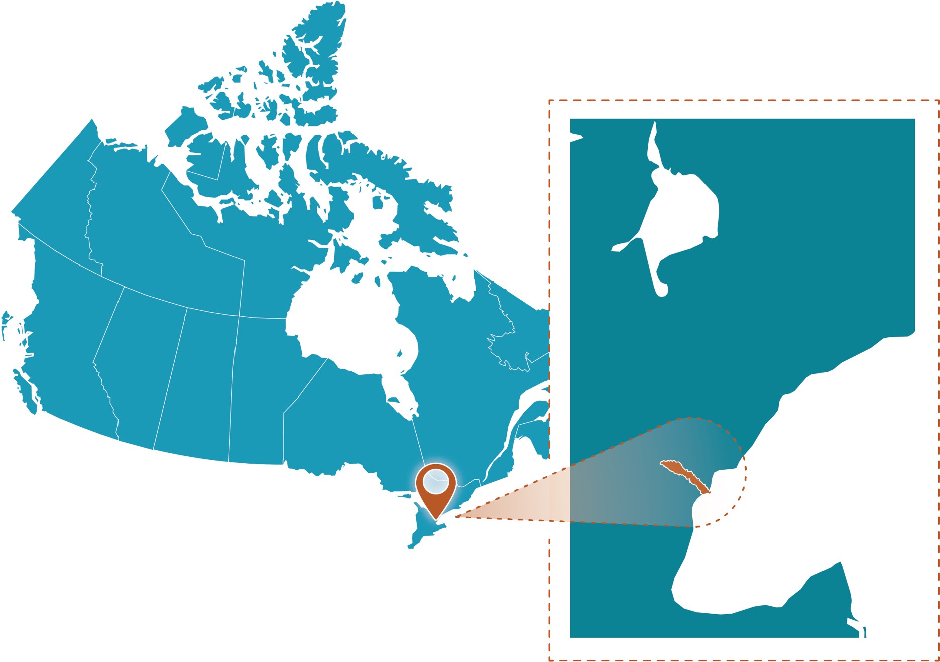
Figure 45: Mimico Creek project location.
Text Version
A map showing the study area within Canada on the right side and a zoomed-in inset enclosed within a brown dashed rectangular border on the left side. The graphic uses a teal-coloured map of Canada. A brown map pin marks the site, while a brown spotlight effect and brown dashed outline connect the inset to its location on the national map.
Project Profile
- Client: City of Toronto, Ontario
- Project lead: Aquafor Beech Limited and EBNFLO
- Completion Date: December 31, 2024
- Budget: >$300k
- Portion for Climate Assessment: 10%
- Nearest Community: City of Toronto
- Waterbody: Mimico Creek
Community Profile
The Mimico watershed is a completely urbanized watershed. More than 30% of its land mass features industrial uses and over 60% of its reach is artificially channelized. Mimico Creek runs 33 km on the west side of Toronto, Ontario, is part of the Great Lakes basin, and is a Lake Ontario tributary.
Local flood hazards
To address erosion-related risks to water infrastructure, more than 200 water risk sites were inventoried across more than 20 km of channel length.
Purpose
The City of Toronto retained Aquafor Beech to undertake the Mimico Creek Geomorphic Systems Master Plan (GSMP) with the intent of identifying, evaluating, and prioritizing erosion-related risks to Toronto water infrastructure in the watershed.
Unique to this study was the integration of climate change modelling to evaluate the impacts of climate change on reach-scale geomorphic processes.
Methodology
Working with EBNFLO, Aquafor Beech developed an innovative modelling process that leverages the outputs of regional climate models as inputs to watershed scale hydrological (HSPF) and hydraulic (HEC-RAS) models to evaluate climate change implications with respect to in-channel erosion indices (velocity, shear stress, stream power).
Results from the climate change assessment were used to refine the evaluation of proposed design alternatives and prioritization of capital works projects. While the emphasis was on understanding the relationship between climate change and in-stream erosion, the assessment also considered flooding implications (i.e., how climate change will impact the seasonality of rainfall and flooding in Mimico Creek and how it will increase the intensity and frequency of existing return period events).
The assessment was a mandatory component of the project scope of work and completed in accordance with the guiding principles defined in Ontario’s Adaptive Management of Stream Corridors guidelines (2001) by the Ministry of Natural Resources (MNR) and the Trent University Watershed Science Centre. It was also designed to apply methods consistent with the MNRF’s Guide for Assessment of Hydrologic Effects of Climate Change in Ontario (2010).
The climate change assessment consisted of two parts requiring different approaches. The first examined the potential impacts of climate change on various components of the hydrological cycle, including air temperature, precipitation, evapotranspiration potential, and total streamflow volume in Mimico Creek. The second focused on the potential impacts of warming climates on the potential severity and frequency of major storm events. The methodologies are discussed in detail below.
Secondary climate change impacts were also considered, particularly with respect to defining climate change impacts on geomorphic processes. The relationship between modelled peak flow rates and stream power was leveraged to evaluate climate change impacts on in-stream erosion rates, taking into consideration reach-scale variability with respect to channel composition (bed and bank materials).
As a response to uncertainty around global climate models (ESMs) and greenhouse gas emission (GHG) scenarios, Aquafor considered six future climate conditions as part of the climate change assessment. They involved three GHG emission scenarios applied at two future time periods, 2050 and 2080. The scenarios and timeframes were as follows:
- RCP 2.6 2050: This low emission scenario (3.0 W/m2 of global radiative forcing) results in rising global air temperatures to about the year 2050, followed by a period of temperature stabilization. It examines climate around the year 2050 when global warming would be limited to about 2°C.
- RCP 4.5 2050: This is an intermediate emission rate scenario (4.5 W/m2) that results in higher rates of temperature increase than RCP 2.6. This emission scenario is expected to cause global warming of about 3 °C after stabilizing in the latter part of this century. It examines climate around 2050.
- RCP 8.5 2050: This is a very high emission rate scenario (8.0 W/m2), representing the worst case examined. This emission rate would cause warming greater than 4°C beyond 2100 without stabilization. It represents the climate around 2050.
- RCP 2.6 2080: This scenario/timeframe results in identical climate in 2080 as 2050 due to stabilization of temperature beyond 2050.
- RCP 4.5 2080: This scenario/timeframe represents the RCP 4.5 emission case around the year 2080 when climate stabilization is expected.
- RCP 8.5 2080: This scenario/timeframe represents the RCP 8.5 emission case around the year 2080 as warming continues.
All future climate projections used in support of the Mimico Creek GSMP climate change assessment were sourced from the ClimateData.ca and the Ontario Climate Data Portal.
Assessment of potential impacts for the key factors
As noted above, the Mimico Creek GSMP climate change assessment included two parts requiring different approaches.
Part 1 examined the potential hydrologic impacts of different climate warming scenarios in terms of the resultant runoff and streamflow, including components of the hydrologic cycle in the local study area. The HSPF hydrologic model was used to simulate runoff in the watershed and streamflow in reaches under various climate conditions. The model was calibrated with 2011 to 2016 climate inputs and updated land use data. This simulation timeframe includes some large storms including a significant storm in July 2013. Meteorological inputs, including air temperature, precipitation, dewpoint temperature, and potential evapotranspiration were altered to reflect the various future climate scenarios (Figure 46).
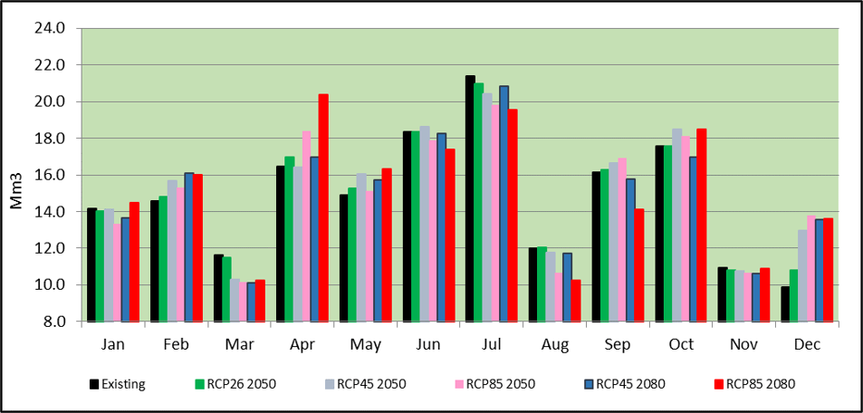
Figure 46: Five-year streamflow volume by month, three GHG scenarios, and two timeframes.
Text Version
A grouped bar chart showing monthly streamflow volume for existing conditions and six future climate scenarios. Streamflow volume is expressed in million cubic metres, and values are shown for each month from January through December.
The horizontal axis lists the months of January through December. The vertical axis shows streamflow volume ranging from 8 to 24 million cubic metres.
Each month contains seven colour-coded bars representing:
- Black: Existing conditions
- Green: RCP2.6 2050
- Light grey: RCP4.5 2050
- Pink: RCP8.5 2050
- Blue: RCP4.5 2080
- Red: RCP8.5 2080
Monthly streamflow volumes range from approximately 10 to 21.5 million cubic metres across the seven scenarios. January values are approximately 14 to 14.5 million cubic metres. February values range from approximately 14.5 to 16 million cubic metres. March values range from approximately 10 to 11.5 million cubic metres. April values range from approximately 16.5 to 20.5 million cubic metres, with the tallest bar occurring under the rcp8.5 2080 scenario. May values range from approximately 15 to 16.5 million cubic metres. June values range from approximately 17.5 to 18.8 million cubic metres. July values range from approximately 19.5 to 21.5 million cubic metres, including the highest existing-condition value. August values range from approximately 10 to 12 million cubic metres. September values range from approximately 14 to 17 million cubic metres. October values range from approximately 17 to 18.5 million cubic metres. November values range from approximately 10.7 to 11 million cubic metres. December values range from approximately 10 to 13.8 million cubic metres. Across all scenarios, the tallest bars generally occur in April, June, July, and October, while the shortest bars occur in March, August, November, and December. The legend below the chart identifies the seven climate-condition categories and their corresponding colours.
To account for uncertainty around ESMs and GHG emission scenarios, the six future climate conditions were considered involving three GHG emission scenarios applied at two future time periods (2050 and 2080). The reference climate (2011–2016) and the climate of the different climate change scenarios were compared in terms of monthly average, maximum and minimum air temperature, and precipitation volume for each future timeframe. The change or delta values for future climates were determined by averaging the results for 20-year periods. For example, to characterize the results around the year 2050, the simulation results for 2040 through 2059 were averaged. Climate input series data used in hydrologic modelling was synthesized for each climate scenario by factoring the reference period climate time series by the delta factors determined on a monthly basis. Meteorological inputs were synthesized for air temperature, dewpoint temperature, and precipitation in this manner. HSPF was then run for the period 2010–2016, with 2010 treated as a spin-up year for each climate scenario. Model outputs were summarized for 2011–2016 in terms of annual, monthly, and seasonal runoff/streamflow. Streamflow time series were also compared directly across climate change scenarios to explain differences and impacts.
Part 2 of the climate change assessment examined the potential impacts of climate warming on the occurrence and intensity of major storms in the study area in the future and their impact upon in-stream flow. The approach developed in this study for assessing the potential hydrologic impacts of future storms on geomorphological systems relies on RCM simulations conducted across North America and focuses on the largest storms typically observed in the study area.
This rational approach relates storm severity in the future to air temperature increase. It follows that atmospheric water holding capacity will increase as global warming worsens and, under ideal storm generation conditions, it is more likely that storms will be able to accumulate more moisture. This worsening of storms should be realized in terms of storm magnitude (intensity and duration) as well as frequency. The World Meteorological Organization has published definitions and procedures for estimating a hydrometeorological expression termed probable maximum precipitation (PMP), defined as the greatest depth of precipitation for a given duration meteorologically possible for a watershed or location at a particular time of year. It has been hypothesized that PMP is temperature dependent and should not be considered constant into the future. Future increases in PMP in a particular area may be directly related to warming. This increase in PMP would be due to the atmospheres’ water holding capacity increasing.
Studies focused on the Great Lakes region, which encompasses the Mimico Creek GSMP study area, project a 4% increase in PMP per °C. Using this relationship, future major storms relevant to the Mimico Creek Watershed (i.e., design storms) were synthesized by adjusting precipitation volumes proportionally to projected increases in temperature. These adjustments were made to reflect future increases in PMP. Hydrologic model runs were then made to simulate each storm response for the present day and future time periods, thereby allowing for an analysis of climate change impacts.
Outcomes
Key conclusions from the first part of the climate change assessment included lower summer precipitation in the future leading to decreased baseflow and the possibility of severe drought (Figure 37). During the colder months (November to April) snowpack development will be significantly reduced and nearly eliminated in the worst-case scenario. With the loss of snowpack and warming air temperatures in the winter, surface waters will be subject to increased evaporation, leading to less winter storage of water across the watershed, which will in turn reduce the likelihood of a typical spring freshet. However, more streamflow will occur throughout the winter due to more precipitation in the liquid form, more frequent snowmelt, and higher precipitation in general. In both the warm and cold months, the risk of severe thunderstorms will increase due to climate change.

Figure 47: Change in Ontario summer average temperatures for four RCPs, 1981 through 2100Footnote 6.
Text Version
A multi-line graph showing projected changes in Ontario summer average maximum temperature from 1981 to 2100 under four Representative Concentration Pathway greenhouse gas emission scenarios. Temperature change is expressed in degrees Celsius relative to a historical baseline.
The horizontal axis represents years from 1981 to 2100. The vertical axis represents temperature change, ranging from approximately -2°C to 10°C.
Four coloured lines represent the emissions scenarios:
- Dark blue: RCP 2.6
- Light blue: RCP 4.5
- Orange: RCP 6.0
- Red: RCP 8.5
All four lines begin near 0°C change in 1981 and show year-to-year fluctuations throughout the period. From 1981 to approximately 2030, the four scenarios follow a similar upward trajectory, reaching roughly 1 to 1.5°C above the baseline.
After approximately 2030, the scenarios begin to diverge. The RCP 2.6 line continues upward to about 2°C by the mid-century period and then fluctuates around approximately 1.5 to 2°C through 2100. The RCP 4.5 line continues to increase gradually, reaching approximately 3°C by 2100. The RCP 6.0 line follows a steeper upward trend, reaching approximately 4 to 4.5°C by 2100. The RCP 8.5 line shows the largest increase, rising above 4°C after approximately 2070 and reaching approximately 6 to 6.5°C by 2100.
The separation between the four scenario lines increases over time. The lines are closely grouped during the early decades of the record and become increasingly separated after the mid-century period.
The graph title is “Summer Tx(°C).” A legend located below the graph identifies the four RCP scenarios and their corresponding colours.
The conclusion of the second part of the study was that climate change will increase the potential for more severe storms to occur, in part due to increasing the atmospheric water holding capacity. It is also expected that climate change will increase the severity of major storm events when they do occur. It is estimated for the Mimico Creek GSMP study area that major storm rainfall may increase by factors of 8% to represent 2050 storms and 11% to represent 2080 storms (Figure 48).
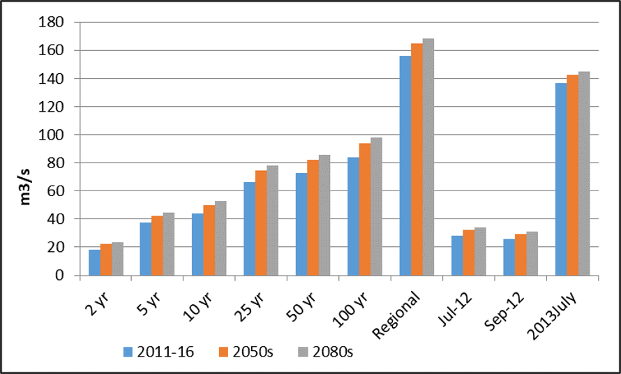
Figure 48: Mimico Creek simulated streamflow peaks for design and historical storms .Footnote 7
Text Version
A grouped bar chart comparing estimated flow rates for six return-period events and four reference-event categories across three time periods: 2011–2016, the 2050s, and the 2080s. Flow rates are expressed in cubic metres per second.
The horizontal axis contains ten categories: 2-year, 5-year, 10-year, 25-year, 50-year, and 100-year return period events, followed by Regional, Jul-12, Sep-12, and 2013 July. The vertical axis ranges from 0 to 180 cubic metres per second with gridlines at intervals of 20 cubic metres per second.
Each category contains three bars:
- Blue: 2011–2016
- Orange: 2050s
- Grey: 2080s
For the 2-year event, the flow rates are approximately 18 cubic metres per second for 2011–2016, 22 cubic metres per second for the 2050s, and 23 cubic metres per second for the 2080s.
For the 5-year event, the flow rates are approximately 37 cubic metres per second for 2011–2016, 42 cubic metres per second for the 2050s, and 44 cubic metres per second for the 2080s.
For the 10-year event, the flow rates are approximately 43 cubic metres per second for 2011–2016, 49 cubic metres per second for the 2050s, and 52 cubic metres per second for the 2080s.
For the 25-year event, the flow rates are approximately 66 cubic metres per second for 2011–2016, 74 cubic metres per second for the 2050s, and 77 cubic metres per second for the 2080s.
For the 50-year event, the flow rates are approximately 72 cubic metres per second for 2011–2016, 81 cubic metres per second for the 2050s, and 85 cubic metres per second for the 2080s.
For the 100-year event, the flow rates are approximately 83 cubic metres per second for 2011–2016, 94 cubic metres per second for the 2050s, and 97 cubic metres per second for the 2080s.
For the Regional category, the flow rates are approximately 156 cubic metres per second for 2011–2016, 164 cubic metres per second for the 2050s, and 168 cubic metres per second for the 2080s.
For the Jul-12 category, the flow rates are approximately 28 cubic metres per second for 2011–2016, 32 cubic metres per second for the 2050s, and 34 cubic metres per second for the 2080s.
For the Sep-12 category, the flow rates are approximately 26 cubic metres per second for 2011–2016, 29 cubic metres per second for the 2050s, and 31 cubic metres per second for the 2080s.
For the July 2013 category, the flow rates are approximately 137 cubic metres per second for 2011–2016, 143 cubic metres per second for the 2050s, and 145 cubic metres per second for the 2080s.
Within each category, the orange bar is higher than the blue bar and the grey bar is higher than the orange bar. The tallest bars occur in the Regional category, followed by the July 2013 category. The shortest bars occur in the 2-year event category.
The legend below the chart identifies the three time periods and their corresponding colours.
In terms of secondary climate change impacts, on average it was projected that lateral (bank) erosion rates would increase by 14% by 2050 and 31% by 2080 when compared to existing climate conditions. Conversely, vertical (channel bed) erosion rates are projected to increase by 38% by 2050 and 70% by 2080.
Conclusion
The implications of these results included shortened expected lifespans for existing erosion control measures and further expected enlargement of the existing Mimico Creek channel form. It is the intent of the GSMP to leverage this understanding of future climate change implications on in-stream erosion to select and develop channel restoration solutions that will be resilient to future climate change impacts, to ensure the long-term protection of at-risk Toronto water infrastructure.
3.10 Gaspereau Primary Watershed: Municipal Flood Line Mapping
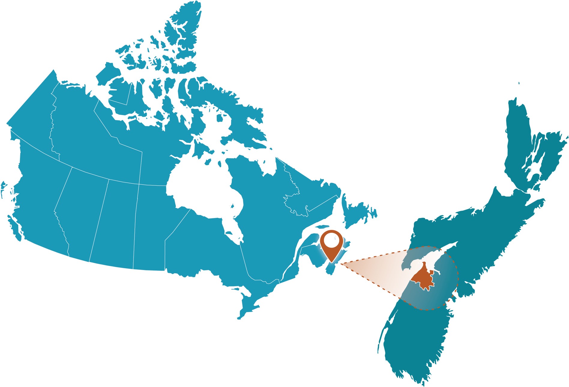
Figure 49: Gaspereau Primary Watershed project location.
Text Version
A map showing the study area within Canada on the right side and a zoomed-in inset enclosed within a brown dashed rectangular border on the left side. The graphic uses a teal-coloured map of Canada. A brown map pin marks the site, while a brown spotlight effect and brown dashed outline connect the inset to its location on the national map.
Project Profile
- Client: Town of Kentville, Nova Scotia
- Project lead: Dillon Consulting
- Funding Partners: Nova Scotia Department of Municipal Affairs; Nova Scotia Environment and Climate Change; Public Safety Canada; Natural Resources Canada
- Completion date: April 2023
- Total Budget: $183,600
- Nearest Community: Town of Kentville
- Waterbody: Gaspereau Primary Watershed
Community Profile
The Town of Kentville is the most populous community in Nova Scotia’s Annapolis Valley. In 2022, the province granted funding to the Town to engage Dillon Consulting in carrying out flood line mapping in the Gaspereau primary watershed. The project committee includes representatives from the Department of Municipal Affairs (DMA) and the municipalities that intersect with the watershed.
Local flood hazards
The Gaspereau primary watershed drains east towards the Minas Basin, which experiences some of the highest tides in the world with a range up to 16 m. Numerous smaller secondary (shore direct) watersheds discharge directly to the Bay of Fundy; each of these watercourses are tidally influenced with numerous communities and agricultural lands located along the shoreline and within the dykelands. The watershed drains towards the heart of the Annapolis Valley, with surface water travelling through multiple communities, historical sites, tourist centres, and agricultural regions. Historically, flooding has been a fairly regular occurrence in the watershed, with flood events occurring in 2003, 2008, and more recently, in July 2023 and July 2024.
Purpose
In 1999, the province enacted regulations under the Municipal Government Act through a Statement of Provincial Interest (SPI) to set minimum criteria and planning standards within floodplain areas. Between 2018 and 2020, the DMA developed a Municipal Flood Line Mapping (PDF, 1.54 MB) (MFLM) document to provide a set of standards that apply across the entire province, creating consistency for how flood line mapping is carried out. The end goal was to ensure that all municipalities apply the Province’s SPI on Flood Risk to areas in their jurisdiction that are likely to flood, including the Gaspereau primary watershed.
Methodology
Provincial staff created a Climate Change Standard prior to developing the MFLM document. The objective was to develop a consistent framework for the incorporation of future climate changes into riverine and coastal flood mapping in Nova Scotia. The framework was developed with the intention of providing a scientifically defensible, consensus-based approach that is practical to implement. The standard was developed in consultation with experts from multiple universities (Dalhousie, St. Francis Xavier, St. Mary’s). An interdisciplinary working group included researchers in municipal planning, water resources engineering, coastal hydraulics, and climatology.
The Climate Change Standard prescribes minimum analysis scenarios for precipitation and coastal water levels (storm surge and tide) for both current and future conditions. Climate change is layered on existing scenarios. Identified scenarios are to have the rainfall amount and sea levels increased by the respective values, as prescribed by the standard.
In addition to the baseline scenarios for the flood line criteria that apply to existing development conditions, potential future scenarios that are specific to the study area must be considered. These may include modifications to the current state of development of the watersheds or the current state of the drainage system.
Climate change standard requirements included:
Emissions scenarios: The Representative Concentration Pathway of 8.5 W/m2 (RCP8.5 [AR5]) is to be used for all climate change projections used in riverine and coastal flood mapping studies.
Time horizon: The future time horizon for mapping riverine and coastal flood boundaries is to extend until 2100. An interim flood boundary should be produced with a time horizon extending to 2050 for interim municipal planning purposes.
Intensity-Duration-Frequency curves: Inputs to the hydrologic model are to include 1:20 and 1:100 rainfall events derived from a future climate IDF relationship. A dual-method approach consisting of estimates from both the statistical IDF_CC tool (Institute for Catastrophic Loss Reduction, Western University) and the semi-physical Clausius-Clapeyron scaling method (C-C) were to be used as per the following:
IDF-CC tool specifications: The complete “Bias-Corrected Ensemble” is to be used to generate future IDF relationships for the time horizon of 2050–2100.
The outputs are to be used to determine the 95th percentile rainfall totals/intensities for the storm durations of interest.
C-C scaling method specifications: Statistically downscaled and/or dynamically downscaled daily maximum temperature projections are to be used. Either or both datasets should be obtained from the following sources:
The Environment and Climate Change Canada (ECCC) Climate Data Extraction Tool should be used to obtain an ensemble of statistically downscaled daily maximum temperature projections.
Dynamically downscaled daily maximum temperature ensemble projections should be obtained from the Coordinated Regional Climate Downscaling Experiment (CORDEX).
The future projection period shall be 2070–2100, and the historical period is to be determined by a qualified professional given the available observational data for the site of closest interest.
The IDF relationship based on observational climate data is to be scaled using the difference in the 95th percentile of average daily maximum temperature between modelled historical and future time periods. Scaling factors are to be used for the C-C scaling calculation, where:
A scaling factor of 7% per 1-degree Celsius rise in temperature is to be used to scale historical IDF relationships for rainfall durations greater than six hours.
A scaling factor of 14% per 1-degree Celsius rise in temperature is to be used to scale historical IDF relationships for rainfall durations of less than or equal to six hours.
The 1:20-year and 1:100-year rainfall totals are to be used in flood mapping and shall be the higher of the rainfall values yielded from both methods (i.e., IDF_CC and C-C).
Coastal flood and downstream riverine boundary conditions
The total sea level to be used in riverine and coastal flood mapping is to be computed as per Equation 1:
Total Sea Level (m) = Higher High Water Large Tide (HHWLT) (m)
+ Relative Sea Level Rise (climate change + subsidence) (m)
+ Storm Surge (1:20-year and 1:100-year values) (m)
To determine the HHWLT, the HHWLT grid from the Hydrographic Vertical Separation Surfaces from the Canadian Hydrographic Service and the Canadian Geodetic Survey was used.
The 95th percentile of the (James et al., 2014) projected global relative sea level rise (RSLR) is to be used, for RCP8.5 and projected to year 2100 for the location nearest to the area of interest. Local effects, such as tidal expansion in the upper Bay of Fundy region, should also be considered.
An additional 65 cm should be added to the RSLR projection to account for the possibility of the melting of the West Antarctic Ice Sheet.
The 1:20-year and 1:100-year historical storm surge is to be included. The methodology used for the estimation of this term should be determined by a qualified professional given the available historical data or model projections.
Outcome
The Nova Scotia provincial climate change standard provides guidance to practitioners on the appropriate approaches for incorporating climate change impacts into flood hazard assessments in the province.
3.11 Nova Scotia Sissiboo-Bear Rivers: Primary Watershed Flood Line Mapping
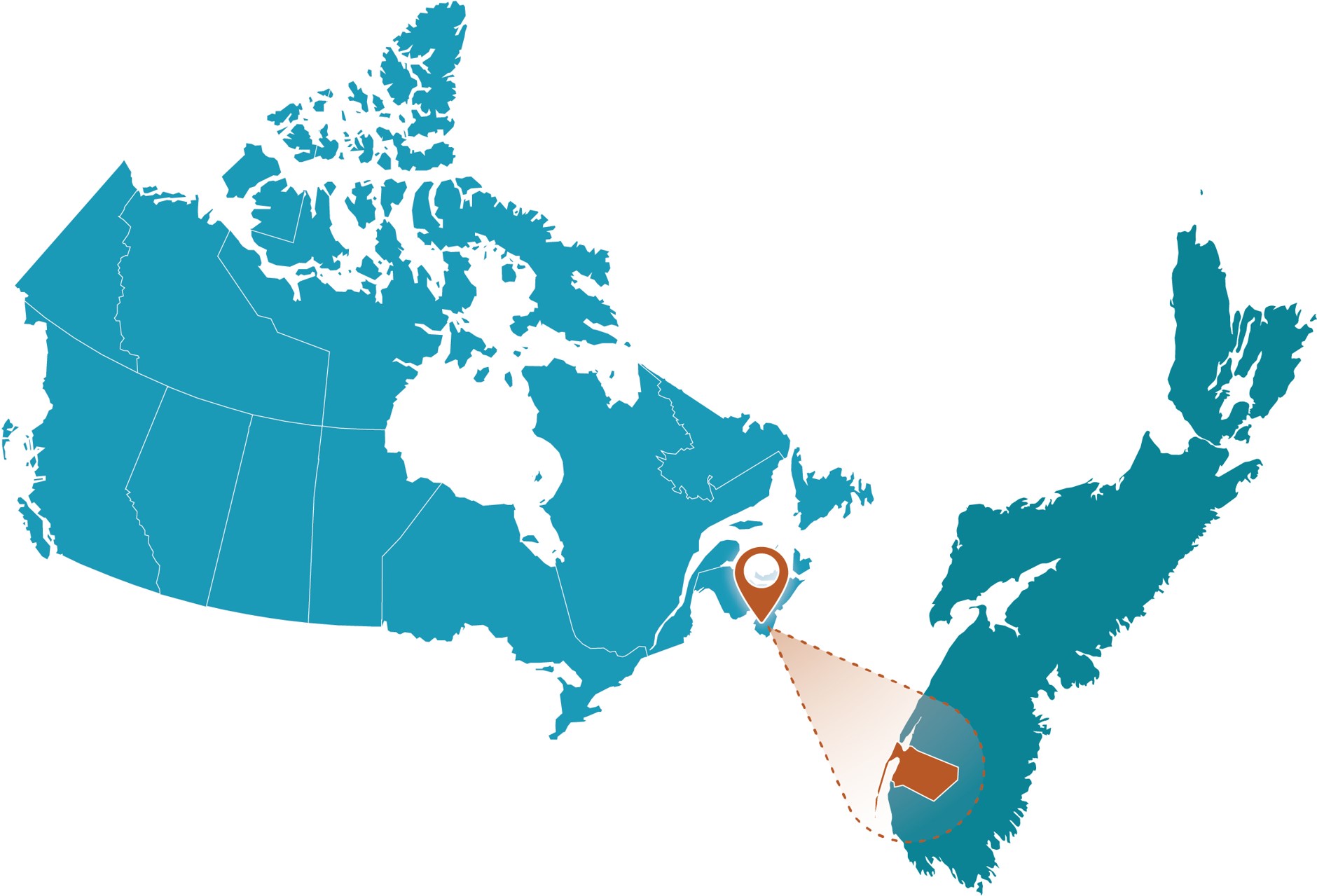
Figure 50: Nova Scotia Sissiboo-Bear Rivers project location.
Text Version
A map showing the study area within Canada on the right side and a zoomed-in inset enclosed within a brown dashed rectangular border on the left side. The graphic uses a teal-coloured map of Canada. A brown map pin marks the site, while a brown spotlight effect and brown dashed outline connect the inset to its location on the national map.
Project Profile
- Client: Municipality of the District of Digby, Nova Scotia
- Project lead: CBCL Limited
- Completion Date: December 2023
- Budget: <$100,000
- Portion for Climate Assessment: <10%
- Nearest Communities: District of Digby; Villages of Bear River and Weymouth
- Waterbodies: Sissiboo River, Bear River
Community Profile
The study is located primarily in the Municipality of the District of Digby, with the eastern side of the Bear River Estuary in the Municipality of Annapolis County, Nova Scotia (NS). Beyond the Sissiboo and Bear Rivers, the coastal extent of the study area extends from within the Annapolis Basin, through the west side of Digby Gut, along the Bay of Fundy, west along Digby Neck, and encompassing Brier Island, as well as the inside portion of St. Mary’s Basin ending near the Village of Weymouth at the mouth of the Sissiboo River (Figure 51).
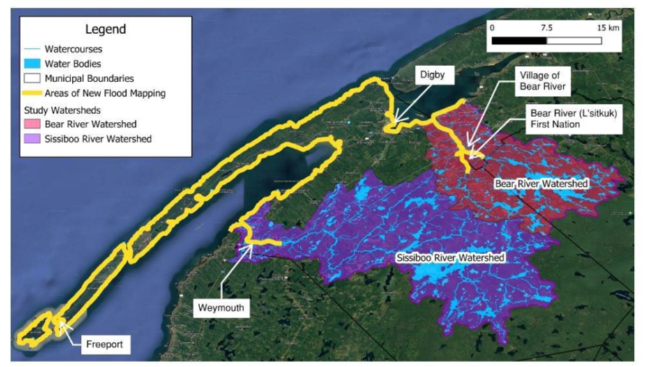
Figure 51: Sissiboo-Bear study area.
Text Version
A thematic map showing two study watersheds and an area identified for new flood mapping in southwestern Nova Scotia. The map is displayed on a satellite-image basemap showing land cover, transportation corridors, communities, rivers, water bodies, and the coastline along the Bay of Fundy.
The map legend identifies the following features:
- Light blue lines: Watercourses
- Blue polygons: Water bodies
- White outlines: Municipal boundaries
- Yellow outline: Areas of New Flood Mapping
- Pink shading: Bear River Watershed
- Purple shading: Sissiboo River Watershed
A scale bar in the upper-right corner shows distances from 0 to 15 kilometres.
The map covers a coastal region along the Bay of Fundy. A yellow boundary delineates the area of new flood mapping. This boundary follows the coastline and extends inland around both study watersheds.
The Bear River Watershed is shown in pink in the northeastern portion of the mapped area. The watershed contains a network of watercourses displayed as light blue lines. Labels identify the Village of Bear River, Bear River (L'sitkuk) First Nation, and the Bear River Watershed. The community of Digby is located northwest of the watershed near the coast.
The Sissiboo River Watershed is shown in purple and occupies a larger area to the south and west of the Bear River Watershed. The watershed contains numerous tributaries and interconnected watercourses shown in light blue. The Sissiboo River Watershed extends inland from the coast and includes areas near the community of Weymouth.
Additional community labels shown on the map include Freeport at the southwestern end of the coastal peninsula and Weymouth inland near the western portion of the study area.
The yellow flood-mapping boundary encompasses both the Bear River Watershed and the Sissiboo River Watershed and follows much of the coastal perimeter shown on the map.
Purpose
The primary objective of this study was to prepare a set of defensible flood extent and hazard maps for major rivers and coastline within the study area, considering both existing and projected future conditions, to help guide decision-making and planning. Historically, major floods in the area were mainly caused by storm surge combined with the Bay of Fundy’s extreme high tides. In addition, along the study area major rivers, there are specific flood-prone areas above the estuarine zone, such as near the confluence of the East Branch and West Branch of the Bear River.
The impacts of flooding and climate change in these areas can include not only infrastructure damage, but also public safety risks, economic impacts, and severe environmental impacts. Waterfront development is becoming increasingly vulnerable to flooding as development densifies and climate change continues to pose greater risks. Waterfront infrastructure along River Road near the Village of Bear River and Evangeline Trail are examples of valuable assets that provide essential services to residents.
Methodology
This project produced an extensive set of flood maps covering approximately 23 km of river length on the Sissiboo and Bear Rivers and approximately 200 km of coastline along the Annapolis Basin, Digby Neck and Islands, and St. Mary’s Bay. Flood mapping includes the six defined scenarios in the province’s Municipal Flood Line Mapping (PDF, 1.54 KB) (MFLM) specifications, including the 5% and 1% AEP for current, 2050, and 2100 climate conditions. Map products include flood lines, flood depths, flood velocity, and hazard. This range of flood scenarios and flood mapping products provides a rich dataset to help portray flood risk in the study area. Flood lines for all scenarios are provided with the report, as well as hazard mapping of current climate conditions.
The study produced flood maps for six scenarios, shown in Table 6:
| Annual Exceedance Probability (%) | Description | Time Horizons for Climate Condition |
|---|---|---|
| 5 | The 1 in 20-year return period, described as “Floodway” in the Statement of Provincial Interest | Current |
| 2050 | ||
| 2100 | ||
| 1 | The 1 in 100-year return period, described as “Flood Fringe” in the Statement of Provincial Interest | Current |
| 2050 | ||
| 2100 |
This study followed the draft MFLM specifications (final published 2024). The project progressed in the following major phases:
- Review of previous studies, reports, and flood events.
- Water level monitoring and bathymetric surveying of rivers and bridge structures.
- Stakeholder engagement via questionnaire and discussion with stakeholders.
- Climate change and sea level rise analysis.
- Coastal water level analysis.
- Hydrological analysis including review of historical flood events, development of hydrologic model of the watersheds.
- Hydraulic analysis and modelling of rivers.
- Production of flood maps for riverine and coastal water levels.
The Statement of Provincial Interest on Flood Risk Areas establishes the 1 in 20-year return period event as the floodway and the 1:100-year return period event as the flood fringe. This study used the term annual exceedance probability (AEP) to describe the probability of a flood event.
Flood mapping methodology
Flood lines for all six flood scenarios (present, 2050, and 2100 in combination with 5% and 1% AEP) covering the coastline and rivers of the study area were prepared following the MFLM requirements. In addition, flood hazard maps for the rivers were developed based on the MFLM hazard classification (depth x velocity). Flood lines developed for coastlines and rivers were merged into a single continuous flood line to represent the conditions of the AEP of that scenario, as in Figure 52.
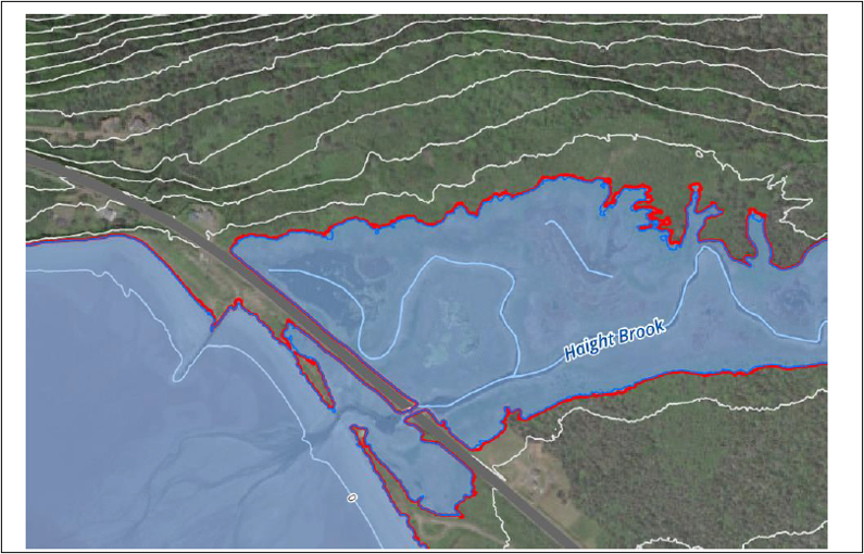
Figure 52: Flood lines at Haight Brook, Digby Neck, along Highway 217 under current conditions. [5% blue, 1% red AEP.]
Text Version
A map-based floodplain visualization showing Haight Brook, a delineated floodplain area, surrounding terrain contours, and a transportation corridor. The map is displayed over an aerial or satellite image basemap.
The floodplain is shown as a semi-transparent light blue polygon outlined by a red boundary. Haight Brook is depicted as a light blue stream line running through the centre of the floodplain. The label “Haight Brook” appears near the centre of the map.
White contour lines are displayed across the map and represent changes in elevation. The contour lines extend generally from west to east across the image and are visible on both sides of the brook valley.
A roadway crosses the map diagonally from the lower left toward the centre. The roadway appears as a broad grey corridor and intersects Haight Brook near the centre-left portion of the image.
The floodplain occupies the low-lying area surrounding Haight Brook and extends both upstream and downstream of the roadway crossing. The inundation area widens to the right side of the image, where the floodplain forms a broad irregular shape with multiple inlets and protrusions along the red boundary.
South of the roadway crossing, the floodplain extends into additional low-lying areas adjacent to the brook. Near the roadway crossing, the floodplain narrows where it passes beneath the transportation corridor before widening again on either side of the crossing.
The red floodplain boundary generally follows the valley bottom and is enclosed by areas crossed by white contour lines. Vegetated and forested land cover is visible outside the floodplain boundary, while the floodplain occupies the lower-elevation areas adjacent to Haight Brook.
The figure contains the following primary map elements: the Haight Brook watercourse, the light blue floodplain area, the red floodplain boundary, white elevation contours, the roadway crossing, and the aerial-image basemap.
Regarding the coastal flood line mapping, note that the maps represent static water levels, without the effect of wave run-up. During a storm event, other dynamic components will contribute to the extreme water levels observed. Wave run-up, for example, can significantly enhance the damage caused. Wave run-up at exposed coastline areas in the Bay of Fundy can be in the order of metres, while more sheltered areas will be limited by the fetch length and water depths near the coast.
Depth, velocity, and hazard mapping was carried out for the 5% AEP and 1% AEP events in current and future climate conditions. These maps contain extensive information that could be useful for emergency management and risk management of people and property, as well as to support land use planning.
In addition to flood lines maps, depths, velocity, and hazard maps can provide rich detail to describe the potential hazards from flooding. The following examples show the depth, velocity, and hazard from riverine flooding under the 1% AEP scenario at the Village of Weymouth. Depth maps show the depth of water over each square metre of land during the peak of the flood and are a helpful representation for visualizing flooding (Figure 53).
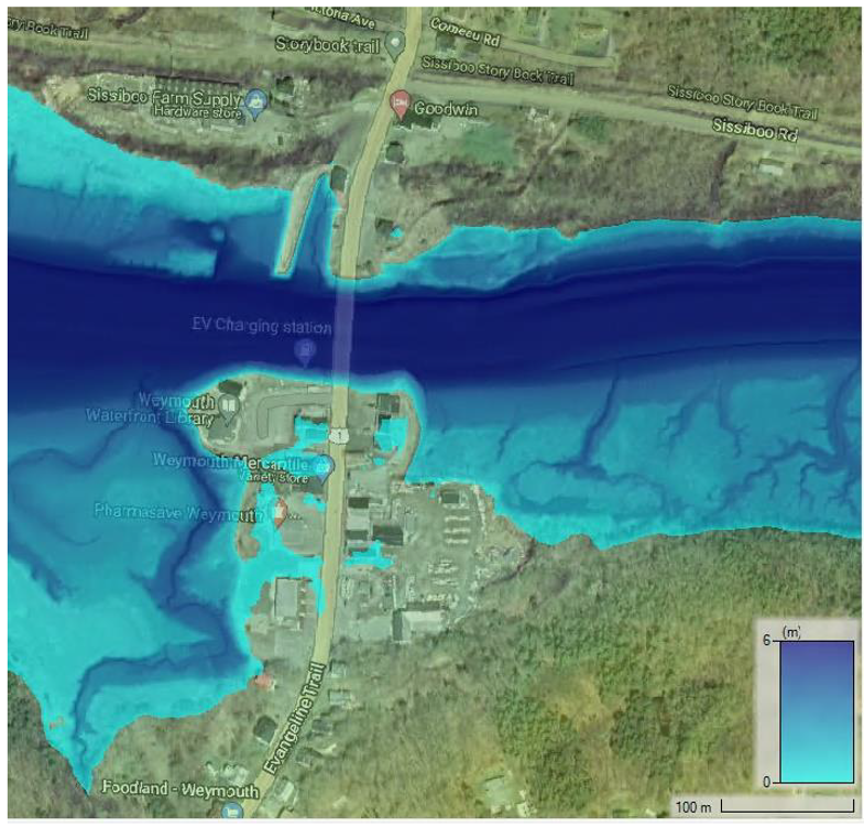
Figure 53: Current conditions 1% AEP riverine flood depth mapping at Weymouth.
Text Version
A map of a section of the Sissiboo River at Weymouth, Nova Scotia, showing water depth across the river channel and adjacent shoreline areas. The map is displayed on a satellite-imagery basemap with a colour-shaded water-depth overlay.
The Sissiboo River extends horizontally across the centre of the map from west to east. A road crossing labelled Evangeline Trail spans the river near the centre of the image, connecting the northern and southern shores.
Water depth is represented using a graduated blue colour scale. A legend in the lower-right corner shows water depths ranging from 0 metres in light cyan to 6 metres in dark blue. The lighter blue shades represent shallower water depths, and darker blue shades represent greater water depths.
The main river channel is shown as a continuous band of dark blue extending across the width of the river. Water depths decrease toward the shorelines, where the colour transition from dark blue to medium blue and light cyan.
Several branching channels are visible within the river and are shown as darker blue features extending through lighter blue areas. These channels are particularly visible south of the Evangeline Trail crossing.
Shallow-water areas occur along both shorelines and around the margins of the river. Extensive light-blue areas are visible near the community waterfront and along the riverbanks.
The community of Weymouth occupies much of the southern shoreline near the bridge crossing. Buildings, roads, parking areas, and other developed features are visible on both sides of the river within the satellite-imagery basemap.
A scale bar in the lower-right corner indicates a distance of 100 metres. The lower-right corner also contains the water-depth legend. The map includes the Sissiboo River, the Evangeline Trail crossing, the water-depth overlay, shoreline development, and the satellite-imagery basemap.
Velocity maps are generated based on the 1D velocity profiles at each model cross section and on interpolated data between cross sections. These maps are helpful to identify areas with swiftwater hazards and locations that may be susceptible to erosion damage (Figure 54).
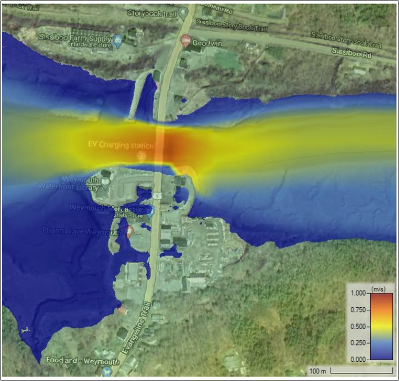
Figure 54: Current conditions 1% riverine flood velocity mapping at Weymouth.
Text Version
A map of the Sissiboo River at Weymouth, Nova Scotia, showing floodwater velocity overlaid on a satellite-imagery basemap. Water velocity is displayed using a graduated colour scale ranging from 0.000 to 1.000 metres per second.
The Sissiboo River extends horizontally across the centre of the map from west to east. A road crossing labelled Evangeline Trail spans the river near the centre of the image and connects the northern and southern shorelines.
Water velocity is represented using a colour gradient. A legend in the lower-right corner shows velocities ranging from 0.000 metres per second in dark blue to 1.000 metres per second in orange red. Intermediate velocities are represented by light blue and yellow.
A broad band of yellow extends through the centre of the river channel, indicating areas with higher velocities than the surrounding blue areas. Orange and orange-red areas are concentrated near the Evangeline Trail bridge crossing, immediately upstream and downstream of the crossing.
The higher-velocity zone forms a continuous corridor along the central portion of the river channel and extends across the width of the mapped area. Velocity colours transition from orange and yellow in the channel centre to light blue and dark blue toward the channel margins.
Dark blue areas occur along shorelines, embayments, side-water features, and nearshore areas on both sides of the river. Light blue areas occur between the central yellow corridor and the darker blue shoreline zones.
The community of Weymouth is visible on the southern shoreline adjacent to the bridge crossing. Buildings, roads, parking areas, and waterfront development are visible on the satellite-imagery basemap. Additional road and property features are visible on the northern shoreline.
A scale bar in the lower-right corner indicates a distance of 100 metres. The lower-right corner also contains the velocity legend. The primary map elements include the Sissiboo River, the Evangeline Trail bridge crossing, the velocity overlay, developed shoreline areas, and the satellite-imagery basemap.
Hazard mapping is created by multiplying flood depth by the flow velocity as a proxy for the level of danger posed to people. Velocity is important to include, as shallow but swift flowing water can pose a high hazard. Based on the MFLM specifications, hazard was defined as velocity (m/s) multiplied by depth (m) and categorized into three classes described in Table 7. Coastal flooding has been included to illustrate the potential extent of flooding and assigned a nominal class of 1. The coastal flood hazard mapping does not represent the actual expected hazard but illustrated the extent of potential flooding. A sample is shown in Figure 55. At this location, several roads, many buildings, and the fire station are within a Class 1 hazard area. Infrastructure including roads, bridges, and coastal harbours, are at risk of inundation from current and future flood events.
| Class | Hazard Value (Depth [m] * Velocity [m/s]) | Level of Hazard |
|---|---|---|
| 0 | Below 0.5 | Caution |
| 1 | 0.5 to 1.5 | Danger to Some |
| 2 | 1.5 to 2.5 | Danger to Most |
| 3 | Above 2.5 | Danger to All |
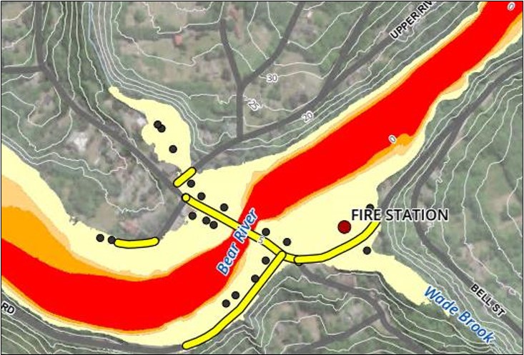
Figure 55: Current conditions 1% AEP riverine flood hazard mapping at Bear River (m x m/s).
Text Version
A flood map of the Bear River area is shown on an aerial-imagery basemap. The map displays flood zones, elevation contours, roads, watercourses, buildings, and other mapped features surrounding Bear River, Wade Brook, Upper River Road, Bell Street, and a fire station.
Bear River runs diagonally across the map from the southwest toward the northeast. Wade Brook enters the mapped area from the southeast and joins the Bear River floodplain near the eastern portion of the image.
Flood zones are shown using three colours. Red occupies the central portion of the river corridor. Orange forms a narrow band adjacent to portions of the red zone. Light yellow extends beyond the orange zone and covers a wider area on both sides of the river corridor.
White contour lines are displayed throughout the map and are labelled with elevations including 20, 25, 30, and 35. The contour lines follow the surrounding terrain on both sides of the river valley.
Several roads cross or approach the floodplain. Upper River Road is labelled in the northeastern portion of the map. Bell Street is labelled in the southeastern portion of the map near Wade Brook. Road crossings are visible near the centre of the image where roads cross Bear River. Several roadway segments are highlighted in yellow.
Black circular symbols are distributed throughout the central portion of the map, primarily within and adjacent to the flood-zone areas. The image does not include a legend identifying these symbols.
A larger circular red symbol labelled “FIRE STATION” is located on the southeast side of the river corridor. The fire station marker is situated within the light yellow flood-zone area and east of the central river crossing.
The aerial-imagery basemap shows vegetation, developed areas, roads, and watercourses beneath the flood-zone overlay. The primary map elements include Bear River, Wade Brook, the colour coded flood zones, elevation contours, transportation infrastructure, black point symbols, and the fire station location.
Outcomes
The findings and recommendations of this study were based on available information at the time of completion with uncertainties associated such as, gaps in data, unknown effects of dam and reservoir operations, future rainfall, and sea level rise projections under climate change, and more.
Conclusion
This flood mapping exercise demonstrated the presence of flood risk at several locations around the municipality, most notably at the villages of Bear River and Weymouth. Policies and bylaws will require updating to reflect the findings of the flood study. For example, CBCL recommended that the District of Digby update its Municipal Planning Strategy (MPS) and bylaws to acknowledge the risk and enact policies to address it. They further recommended comprehensive consultations with First Nations, stakeholders, municipal staff, and the public to ensure that everyone understands the purpose of any changes and its importance for improving public safety.
CBCL also recommended that the municipality and the provincial Department of Municipal Affairs collaborate with Nova Scotia Power to evaluate the potential influence of hydroelectric facilities on downstream flooding. Further information on the operations of the system during extreme events will help reduce uncertainty in the flood line mapping. As well, it is recommended that the effect of dam operations be considered for flood line mapping.
Additional analysis and modelling were also recommended for coastal flooding, including analysis of wave exposure, wave run-up and overtopping for relevant areas, as well as other related analysis and modelling to enhance the value of the present flood study.
CBCL recommended that the flood maps be reviewed carefully by the municipality and local partners to ensure they are consistent with local knowledge.
3.12 Prince Edward Island: Pluvial Flood Mapping Project
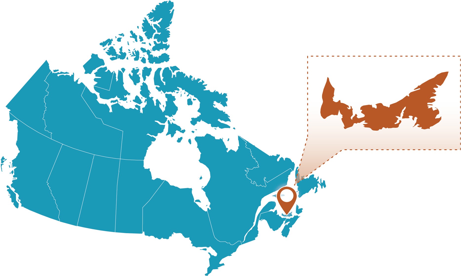
Figure 56: Prince Edward Island project location.
Text Version
A map showing the study area within Canada on the right side and a zoomed-in inset enclosed within a brown dashed rectangular border on the left side. The graphic uses a teal-coloured map of Canada. A brown map pin marks the site, while a brown spotlight effect and brown dashed outline connect the inset to its location on the national map.
Project Profile
- Client: Department of Energy, Environment and Climate Action, Government of Prince Edward Island (PEI)
- Project lead: Climate Smart Lab, Canadian Centre for Climate Change and Adaptation, UPEI
- Funding Partners: Natural Resources Canada FHIMP through a partnership with the PEI Department of Environment, Energy and Climate Action
- Completion Date: March 31, 2024
- Budget: >$300,000
- Portion for Climate Assessment: ~50%
- Nearest Communities: Cities of Charlottetown and Summerside, Towns of Stratford, Cornwall, Three Rivers, and Tignish), Indigenous communities of Lennox Island First Nation and Abegweit First Nation (and entire Province of PEI)
- Waterbodies: All PEI watersheds
Community Profile
Surrounded by the Atlantic Ocean and the smallest province in Canada, Prince Edward Island (PEI) is susceptible to intense and frequent storm surges, coastal erosion, and floods. The province is 5,681 km2 and has a population of more than 154,000 (2021).
The project team developed detailed pluvial flood maps for six municipalities, two Indigenous communities, and the entire island of PEI.
Purpose
In recent years, Islanders have been seeing more intense and frequent heavy rainfalls that always cause unexpected floods.
Although the Government of PEI has offered publicly available province-wide online mapping for coastal flooding from storm surge and sea level rise since 2021, the mapping did not include pluvial flood risks associated with intense rainfall. This project aimed to address that gap by modelling pluvial flood risks under both current and future climate conditions. The result is a set of island-wide pluvial flood maps designed to help Islanders plan for flood mitigation and climate adaptation.
Methodology
Climate-scaled Intensity-Duration-Frequency (IDF) curves developed by ECCC were used to support the climate change assessment for this project. Due to the tight project timeline and budget limitation, this project considers one future climate scenario under SSP5-8.5. Based on the recommendation from the technical advisory committee, four return periods (10-, 25-, 50-, and 100-year) were considered for both current climate and future climate.
The HEC-RAS 2D model was selected to conduct pluvial flood modelling for PEI, after a preliminary and comparative assessment of three flood models (i.e., HEC-RAS 2D, PCSWMM, and FloodMapper). It was used to drive pluvial flood maps based on two configurations, including detailed maps for major municipalities and an island-wide level. The model was validated with the flood event data for September 2, 2021 (for Charlottetown) (Figure 57) and July 3–4, 2023 (for three counties across PEI). The rainfall IDF curves with four return periods (10-, 25-, 50-, and 100-year) under current and future climate condition were used to design rainfall events for pluvial flood mapping.
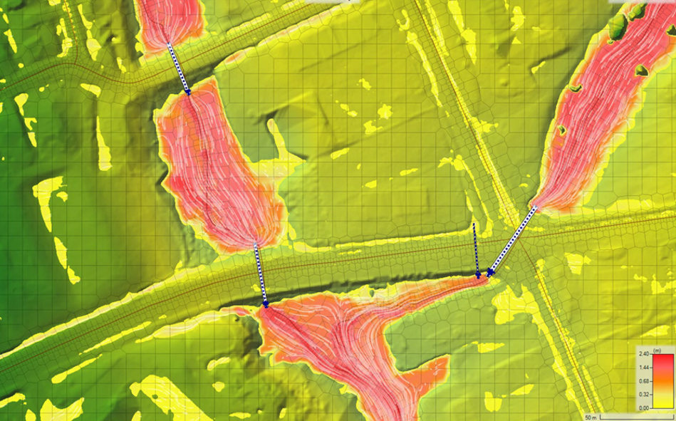
Figure 57: An example of culvert representation in Charlottetown and testing results showing water passing through the culverts.
Text Version
A terrain-based hydraulic connectivity map showing a gridded digital elevation model, transportation corridors, and culvert connections. Elevation is represented using a colour scale ranging from green through yellow and orange to red, with values from approximately 0.00 to 2.40 metres shown in the legend.
The map is displayed as a regular grid over a terrain surface. Lower elevation areas are shown in green, while higher-elevation areas are shown in yellow, orange, pink, and red. A colour legend in the lower-right corner displays elevation values ranging from approximately 0.00 metres to 2.40 metres.
Two transportation corridors cross the mapped area. One corridor extends horizontally across the centre of the image from west to east. A second corridor intersects the first near the right side of the image and extends diagonally from northwest to southeast.
Several elongated elevated landforms are shown in shades of pink and red. These features occur on both sides of the transportation corridors and contain numerous closely spaced curved contour-like lines. The contour patterns extend across the elevated areas and follow the terrain surface.
Blue nodes are located on opposite sides of the transportation corridors at several locations. Pairs of nodes are connected by blue dashed lines that cross beneath or through the corridor embankments.
One dashed connection is located near the upper-left portion of the image, linking elevated terrain on opposite sides of the horizontal corridor. A second dashed connection is located near the centre-left portion of the image, connecting terrain north and south of the horizontal corridor. Additional dashed connections are located near the corridor intersection on the right side of the image, linking terrain across both transportation corridors.
The dashed connections span the transportation embankments and connect adjacent terrain features located on either side of the corridors. The blue node and dashed-line symbols are distributed at multiple crossing locations throughout the mapped area.
A scale bar in the lower-right corner indicates a distance of 50 metres. The primary map elements include the gridded elevation surface, colour-coded elevation values, contour-like terrain patterns, transportation corridors, blue node symbols, dashed culvert connections, the elevation legend, and the scale bar.
Throughout this study, the project team encountered many challenges, as this was the first attempt to generate island-wide pluvial flood maps for PEI. Challenges included the representation of stormwater systems in cities, of the impacts of ocean tides on those systems, and of hydraulic structures (bridges and culverts), as well as determining the feasibility of the flood model for province-wide flood modelling.
The data used to run the HEC-RAS 2D model (for land use, soil, roadways, watercourses, hydraulic structures, stormwater systems, rainfall IDF curves under current and future climate conditions, flood events) was obtained from existing sources and multiple field visits.
To generate the pluvial maps, the model setup included a hydrological analysis at both municipal and island-wide levels. This involved watershed delineation and identification of its characteristics and parameters. It also involved the design of rainfall events: four design rainfall storms under two climate conditions, to generate eight scenarios (Table 8). The model setup also included analysis of hydraulic structures (and considerations of coastal and downstream boundary conditions), and simulation setup (setting parameters, a warm-up period, and configurations) at both municipal and island-wide levels.
| No. | Climate Condition | IDF Return Period (years) |
|---|---|---|
| 1 | Current Climate | 10 |
| 2 | Current Climate | 25 |
| 3 | Current Climate | 50 |
| 4 | Current Climate | 100 |
| 5 | Future Climate (SSP5-8.5, 2071–2100) | 10 |
| 6 | Future Climate (SSP5-8.5, 2071–2100) | 25 |
| 7 | Future Climate (SSP5-8.5, 2071–2100) | 50 |
| 8 | Future Climate (SSP5-8.5, 2071–2100) | 100 |
Because complete model calibration was not possible (due to a lack of calibration data), a preliminary sensitivity analysis was performed to identify an optimal combination of parameter values for antecedent moisture conditions, Manning’s coefficient, and infiltration rates that yielded satisfactory results compared to observed events.
Considering the constraints in hydrometric data, different flood data was used for validating the flood models (the September 2, 2001 flood for Charlottetown and July 3–4, 2023 flood for the island). In addition to flow rates, the project team also attempted to collect the water level data at these three hydrometric stations to support further comparisons (however, these did not provide necessary information). Additional verification of model parameters was also considered by looking at the infiltration ratio patterns: four test runs were performed and the results were found to be reasonable. The project team also conducted a cross-check of the differences between the model and island-wide models.
To ensure the quality of the developed pluvial flood maps, the project team undertook quality assurance and control measures throughout the HEC-RAS model runs and the post-processing of output maps. In particular, the percent error in water volume accounting was used as a criterion to check the validity of a model run; the output pluvial flood maps from the HEC-RAS were carefully inspected and post-processed to ensure a certain level of consistency for final map presentation.
Outcomes
The resulting pluvial flood maps are available for public viewing through the PEI Climate Hazard and Risk Information System (CHRIS), an interactive map portal where users can browse to visualize different climate hazards that affect PEI communities and properties. These flood maps are available for four return periods (including 10-, 25-, 50-, and 100-year) and two climate conditions (current climate condition and future climate scenario for the period of 2071–2100 under SSP5-8.5) (See Figure 58 and Figure 59).
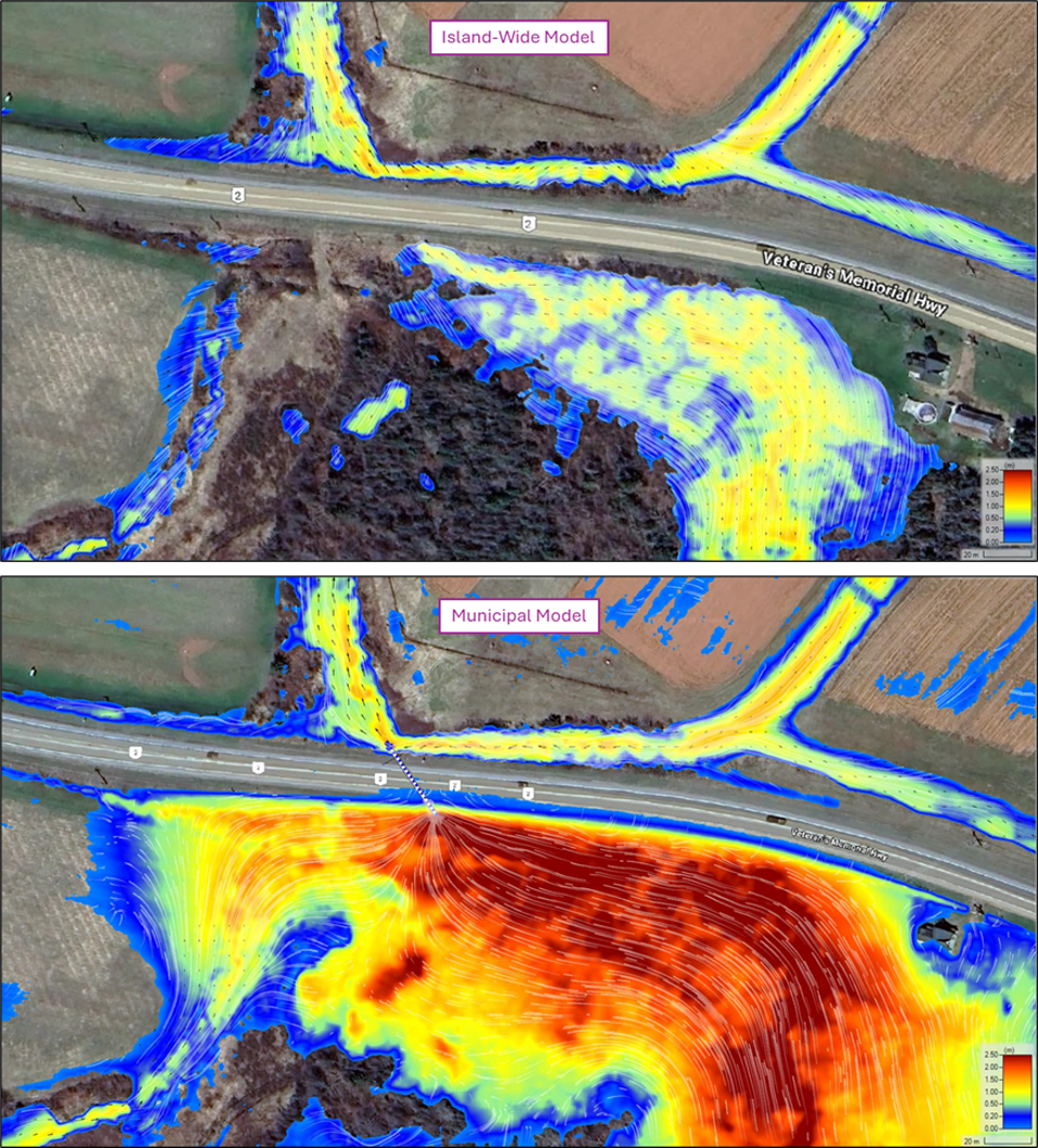
Figure 58: A comparison of the 100-year return period pluvial flood maps along with the highway in Summerside under the same current climate condition between the island-wide model and the municipal model.
Text Version
Two vertically stacked flood maps showing 100-year return period pluvial flood mapping results for an area along Veterans Memorial Highway Route 2 in Summerside. The upper panel is labelled “Island-Wide Model,” and the lower panel is labelled “Municipal Model.” Both maps are displayed on aerial imagery and use the same flood-depth colour scale ranging from blue to red, with values from approximately 0.00 to 2.50 metres. White flow-path lines are shown on both maps.
In both panels, Veterans Memorial Highway extends horizontally across the centre of the image. Agricultural fields are visible north of the highway, while a low-lying vegetated area occupies the land south of the highway. Several drainage channels converge north of the highway and approach a crossing point beneath the roadway.
Flood depth is represented using a graduated colour scale. Blue indicates the shallowest depths, followed by green and yellow, with orange and red representing the greatest depths. A flood-depth legend is located in the lower-right corner of each panel.
In the Island-Wide Model panel, flooded areas occur along drainage channels north of the highway and within the low-lying area south of the highway. Flood depths are predominantly shown in blue, green, and yellow. South of the highway, a broad flooded area occupies portions of the vegetated basin. White flow-path lines extend through the drainage network and the flooded areas.
In the Municipal Model panel, a dashed line identifies a culvert crossing beneath the highway. Flooding occurs in the same general drainage corridors shown in the upper panel. South of the highway, the flooded area covers a larger portion of the low-lying basin and includes extensive orange and red areas. White flow-path lines converge toward the culvert crossing and extend throughout the flooded basin south of the highway.
The highway crossing location is visible in both panels at the point where drainage features approach and pass beneath the roadway. Drainage channels north of the highway connect to the flooded area south of the highway through this crossing location.
A scale bar of approximately 20 metres is shown in the lower-right corner of each panel. The primary map elements include the aerial-imagery basemap, Veterans Memorial Highway, drainage channels, flood-depth mapping, flow-path lines, the culvert crossing shown in the lower panel, flood-depth legends, and scale bars.
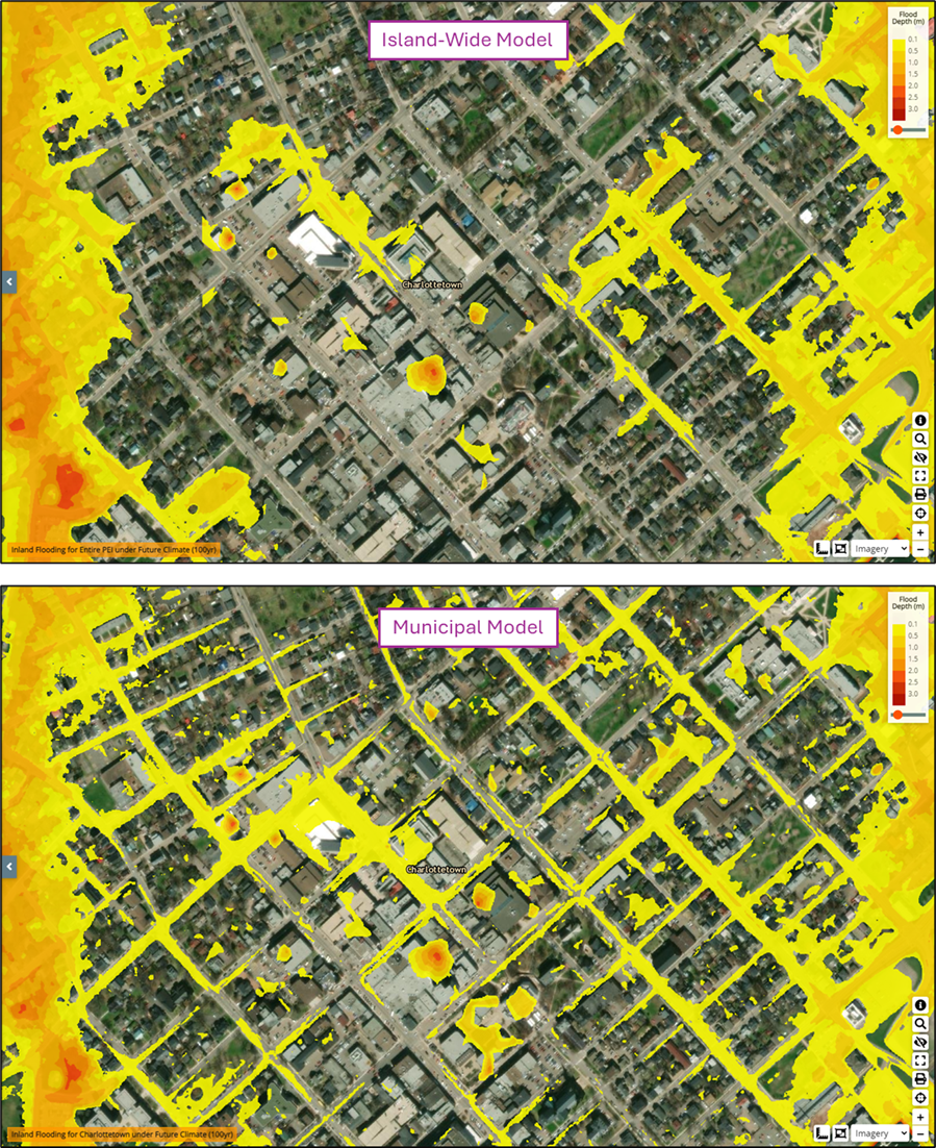
Figure 59: A comparison of the 100-year return period pluvial flood maps of downtown Charlottetown under the same future climate condition between the island-wide model and the municipal model.
Text Version
Two vertically stacked flood maps showing 100-year return period pluvial flood mapping results for downtown Charlottetown under the same future climate scenario. The upper panel is labelled “Island-Wide Model,” and the lower panel is labelled “Municipal Model.” Both maps are displayed on high-resolution aerial imagery and use the same flood-depth colour scale ranging from 0.0 to 3.0 metres.
The maps show a dense urban area with a grid of streets, commercial buildings, institutional buildings, residential properties, parking areas, and other developed features. The label “Charlottetown” appears near the centre of both panels.
Flood depth is represented using a graduated colour scale shown in the upper-right corner of each panel. Yellow indicates the shallowest mapped flooding, followed by orange and red, representing progressively greater flood depths.
In the Island-Wide Model panel, flooded areas are shown along selected streets, within low-lying areas, and in several isolated depressions. Yellow flood zones occur throughout the downtown area, with several localized orange and red areas visible within individual blocks and intersections. Flooded areas are distributed across portions of the street network and adjacent developed lands.
In the Municipal Model panel, flooded areas occur throughout the downtown street network and developed urban areas. Yellow flood zones follow a larger number of streets and occupy additional areas around buildings, intersections, parking areas, and urban blocks. Multiple localized orange and red areas are distributed throughout the mapped area, indicating locations with greater flood depths.
Both panels show flooded areas within many of the same general locations, including along streets, intersections, and low-lying portions of the downtown core. The Municipal Model panel contains a greater number of mapped flood features, including narrow flood corridors, small isolated flooded areas, and additional flooded sections of the street network.
Flood-depth legends are located in the upper-right corner of both panels. The primary map elements include the aerial-imagery basemap, the downtown Charlottetown street grid, buildings and developed areas, flood-depth mapping, panel labels, and flood-depth legends.
Conclusion
PEI is facing an increasing risk of compound floods caused by rising sea levels, extreme storm surges, and extreme rainfall. Due to the lack of research on the compounding flood risk in the region, this project only considered normal ocean water level (1.6-year return period) to drive island-wide pluvial flood modelling. However, in the context of climate change, the compound floods may become more frequent. This means that the flood maps might need to be updated in the near future when new information becomes available.
Given the limited scope and the tight timeline of this project, the project team introduced several assumptions to ensure the successful delivery of the project:
- The HEC-RAS 2D model selected for this project is unable to represent the urban stormwater systems in urban areas.
- Ocean boundary conditions are critically important for pluvial flood modelling over low-lying coastal areas like PEI, where people have seen some unprecedented post-tropical storm events in recent years.
- Although the island-wide pluvial flood maps generated from this project can provide useful information for decision-making, there are some limitations (for example, further efforts should be made to better represent the major hydraulic structures in island-wide pluvial modelling).
- Because the IDF curves are based on a very limited number of weather stations in PEI that cannot fully represent the spatial variations of rainfall intensities, the project team recommends using the University of PEI’s Canadian Centre for Climate Change and Adaptation’s weather monitoring network, or using radar or satellite observations.
- Finally, the model calibration and validation in this project are limited due to the lack of high-quality data.
3.13 Newfoundland and Labrador: Climate Change Flood Risk Mapping Study
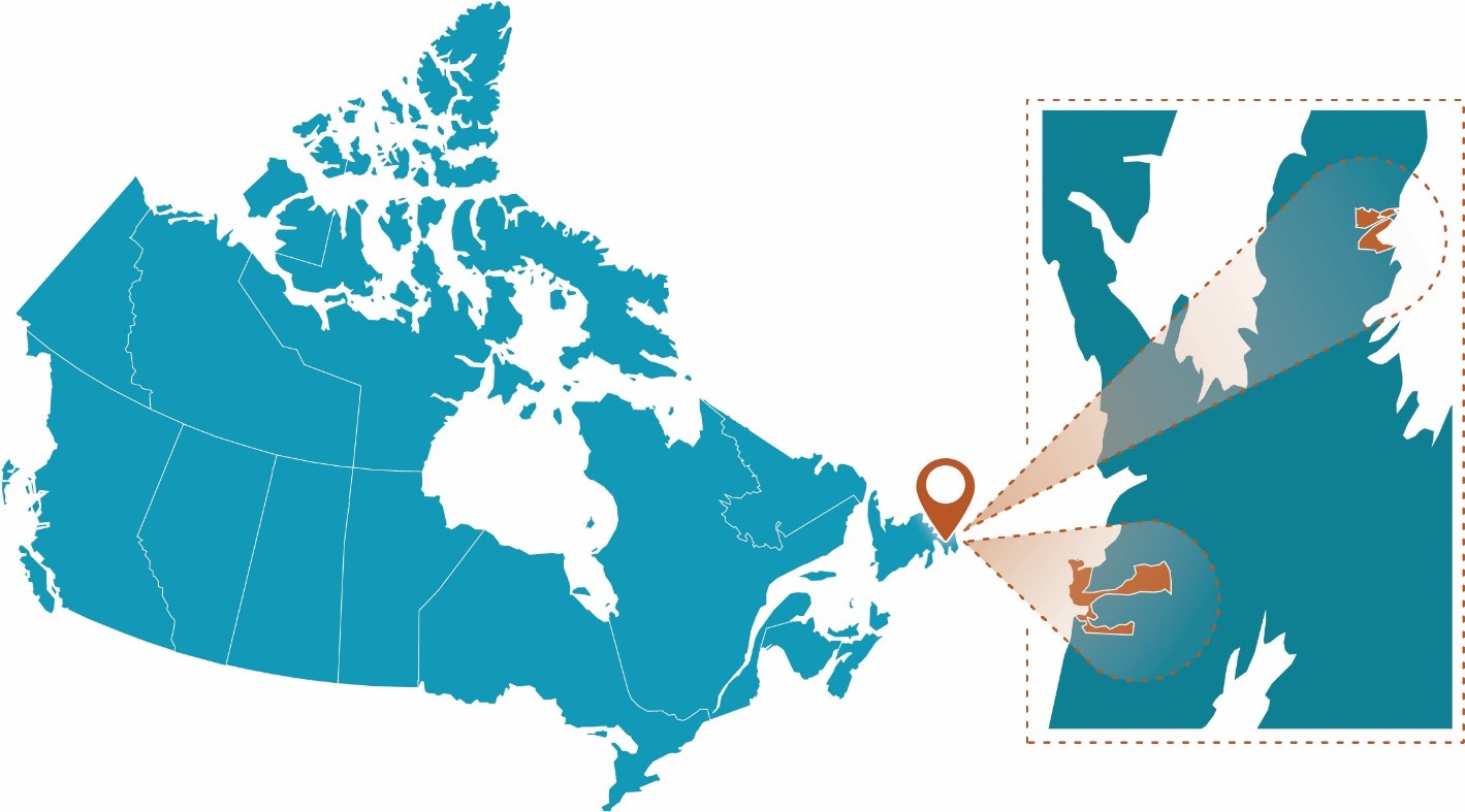
Figure 60: Newfoundland and Labrador project location.
Text Version
A map showing the study area within Canada on the right side and a zoomed-in inset enclosed within a brown dashed rectangular border on the left side. The graphic uses a teal-coloured map of Canada. A brown map pin marks the site, while a brown spotlight effect and brown dashed outline connect the inset to its location on the national map.
Project Profile
- Client: Water Resources Management Division, Government of Newfoundland and Labrador
- Project lead: KGS Group, DHI Water & Environment Inc.
- Completion date: January 2023
- Total project budget: >$300K
- Portion for climate assessment: ~25–30%
- Nearest Community: Town of Placentia (including Jerseyside, Freshwater, Ferndale, Dunville, Southeast Placentia), Carbonear, Victoria, Salmon Cove
- Waterbodies: Placentia Bay, Conception Bay, Northeast Arm, Southeast Arm, Swan Arm, Salmon Cove River, Island Pond Brook, Powells Brook, Northeast River, Southeast River, Mill Brook, Baldwins Brook, Rattling Brook, and Smelt Brook
Community Profile
The Avalon Peninsula is a large peninsula that makes up the southeast portion of Newfoundland and Labrador, about 130 km from the capital of St. John’s. Approximately 9,000 km2, it is home to more than half of the province’s population. Placentia is located to the southwest, while Carbonear, Victoria, and Salmon Cove are to the northeast.
Communities throughout the province have a pattern of settlement in localized areas such as bays and coves, rather than being evenly distributed along the coastline.
Local flood hazards
Flooding in the region is driven by both coastal and riverine processes. Coastal hazards include storm surge, wave run-up, and sea level rise, while riverine flooding is caused by heavy rainfall and ice jamming. Climate change is expected to exacerbate both mechanisms, increasing flood frequency and severity.
In Placentia, low-lying areas are particularly vulnerable to coastal flooding. In Carbonear and Salmon Cove, inland development mitigates coastal risk, but riverine flooding remains a concern. Victoria, being inland, is primarily affected by riverine flooding.
Purpose
After Hurricane Fiona (September 2022) exposed the flood risks facing hundreds of coastal communities, the province began incorporating coastal flood mapping into its hazard studies. This study marked the first use of coastal flood hazard mapping and the province’s initial step toward a comprehensive coastal flood mapping approach. The new maps that were developed highlight vulnerable areas and inform flood management and infrastructure planning.Footnote 8
The project updated and developed new flood risk and hazard maps for the four communities. It considered both current conditions and projected climate change conditions, including coastal flooding (storm surge, sea level rise, wave run-up), open water riverine flooding (i.e., from heavy rainfall), and ice jam flooding. Detailed hydrologic and hydraulic models, surveys, and climate analyses were used to guide land use planning and disaster mitigation.
The purpose of the project was to develop updated flood risk maps for 1:20 and 1:100 AEP events under both current and projected future climate conditions. It also aimed to assess the impacts of climate change on key environmental factors such as precipitation patterns, sea level rise, and ice processes. In addition, the project evaluated the capacity of hydraulic structures and reviewed flood forecasting strategies to enhance preparedness. The findings are intended to support the Water Resources Management Division and communities in climate adaptation planning efforts.
Methodology
The province’s approach to coastal flood mapping was shaped by expert collaboration and the province’s unique geography and population distribution. This study involved a comprehensive field program, hydrologic, hydraulic and hydrodynamic modelling. The study was completed following the Newfoundland Technical Guidelines for Flood Hazard Mapping Studies (PDF, 2.3 MB) and federal National Disaster Mitigation Program funding criteria.
For the field program,
- 520 river cross sections were surveyed;
- 78 coastal bathymetric transects were completed;
- 100 bridge and culvert crossing sites were surveyed;
- Water level monitoring equipment was deployed at five sites; and
- Flow measurements were taken at seven locations.
For the hydrologic modelling,
- Tools: HEC-HMS, Single Station Frequency Analysis (SSFA), Regional Flood Frequency Analysis (RFFA)
- Inputs: Updated IDF curves, SPOT-6 imagery, National Soil Database data
- Outputs: Flow estimates for 20- and 100-year AEP events under current and future climate scenarios.
For the hydraulic modelling,
- Tools: MIKE21 FM HD (coastal), HEC-RAS (riverine), RIVICE (ice jam)
- Calibration: Based on observed water levels and flow measurements
- Outputs: Flood levels, velocities, depths and hazard classifications.
Outcomes
The climate change impacts were as follows:
On river flows:
- An increase of 14 to 18% in Placentia.
- An increase of 21 to 50% in Carbonear, Victoria, Salmon Cove.
On sea level rise:
- An increase of 0.62 m in Placentia (Figure 61).
- An increase of 0.63 m in the area of Carbonear and Salmon Cove (Figure 62).
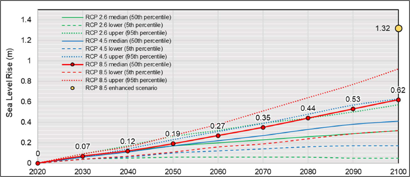
Figure 61: Projected sea level rise for Placentia.
Text Version
A line graph showing projected sea level rise for Placentia, Newfoundland and Labrador, from 2020 to 2100 under three greenhouse gas emissions scenarios: Representative Concentration Pathway (RCP) 2.6, RCP 4.5, and RCP 8.5. For each scenario, the graph shows median (50th percentile), lower (5th percentile), and upper (95th percentile) projections. An RCP 8.5 enhanced scenario is shown as a separate point estimate for the year 2100.
The horizontal axis represents years from 2020 to 2100. The vertical axis represents sea level rise in metres and ranges from 0.0 to approximately 1.5 metres.
RCP 2.6 is shown in green, RCP 4.5 in blue, and RCP 8.5 in red. For each scenario, the median projection is shown as a solid line, the lower projection as a dashed line, and the upper projection as a dotted line. The RCP 8.5 enhanced scenario is represented by a circular yellow marker at 2100.
All projections begin near 0.0 metres in 2020 and increase through time. The separation between the scenarios and their uncertainty bounds increases toward the end of the century.
The median RCP 8.5 projection is highlighted with circular red markers and numerical labels at each decade. The labelled values are approximately 0.07 metres in 2030, 0.12 metres in 2040, 0.19 metres in 2050, 0.27 metres in 2060, 0.35 metres in 2070, 0.44 metres in 2080, 0.53 metres in 2090, and 0.62 metres in 2100.
By 2100, the median RCP 2.6 projection reaches approximately 0.32 metres, the median RCP 4.5 projection reaches approximately 0.41 metres, and the median RCP 8.5 projection reaches approximately 0.62 metres.
At 2100, the RCP 2.6 uncertainty range extends from approximately 0.04 metres at the lower bound to approximately 0.60 metres at the upper-bound. The RCP 4.5 uncertainty range extends from approximately 0.16 metres to approximately 0.63 metres. The RCP 8.5 uncertainty range extends from approximately 0.32 metres to approximately 0.92 metres.
The RCP 8.5 enhanced scenario is shown as a yellow marker at the year 2100 with a labelled value of 1.32 metres.
A legend in the upper-left corner identifies the median, lower, and upper projections for each emissions scenario and the RCP 8.5 enhanced scenario. Gridlines are displayed across the graph to assist with reading values from the axes.
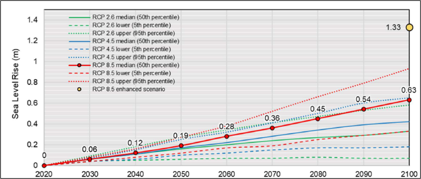
Figure 62: Projected sea level rise for the Carbonear area.
Text Version
A line graph showing projected sea level rise for the Carbonear area, Newfoundland and Labrador, from 2020 to 2100 under three Representative Concentration Pathway (RCP) greenhouse gas emissions scenarios: RCP 2.6, RCP 4.5, and RCP 8.5. For each scenario, the graph shows median (50th percentile), lower (5th percentile), and upper (95th percentile) projections. An RCP 8.5 enhanced scenario is shown as a separate point estimate for the year 2100.
The horizontal axis represents years from 2020 to 2100. The vertical axis represents sea level rise in metres and ranges from 0.0 to approximately 1.5 metres.
RCP 2.6 is shown in green, RCP 4.5 in blue, and RCP 8.5 in red. For each scenario, the median projection is shown as a solid line, the lower projection as a dashed line, and the upper projection as a dotted line. The RCP 8.5 enhanced scenario is represented by a circular yellow marker at 2100.
All projections begin near 0.0 metres in 2020 and increase through time. The separation between the scenarios and their uncertainty bounds increases toward the end of the century.
The median RCP 8.5 projection is highlighted with circular red markers and numerical labels at each decade. The labelled values are approximately 0.06 metres in 2030, 0.12 metres in 2040, 0.19 metres in 2050, 0.28 metres in 2060, 0.36 metres in 2070, 0.45 metres in 2080, 0.54 metres in 2090, and 0.63 metres in 2100.
By 2100, the median RCP 2.6 projection reaches approximately 0.33 metres, the median RCP 4.5 projection reaches approximately 0.42 metres, and the median RCP 8.5 projection reaches approximately 0.63 metres.
At 2100, the RCP 2.6 uncertainty range extends from approximately 0.07 metres at the lower bound to approximately 0.58 metres at the upper-bound. The RCP 4.5 uncertainty range extends from approximately 0.18 metres to approximately 0.64 metres. The RCP 8.5 uncertainty range extends from approximately 0.33 metres to approximately 0.93 metres.
The RCP 8.5 enhanced scenario is shown as a yellow marker at the year 2100 with a labelled value of 1.33 metres.
A legend in the upper-left corner identifies the median, lower, and upper projections for each emissions scenario and the RCP 8.5 enhanced scenario. Gridlines are displayed across the graph to assist with reading values from the axes.
Flood risk mapping
Flood hazard maps were developed for 1:20 and 1:100 AEP events under current and future climate conditions. Flood risk maps were developed showing depth, velocity, and risk classification. The new maps highlight vulnerable areas to inform flood management and infrastructure planning and were validated with municipal representatives.
Infrastructure vulnerability
The study identified several culverts and bridges as undersized. In Placentia, the flood wall was determined to be sufficient for current conditions but will be overtopped under 100-year climate change scenario. It also found the Victoria wastewater lagoon dike to be adequate but close to ice jam levels.
Conclusion
A regional approach to coastal flood mapping was not suitable for regulatory level flood mapping and a more localized mapping strategy was required. Additionally, both storm surge and wave impacts are significant concerns for coastal communities. Wave-related flooding is more periodic and shorter in duration when compared with storm surge and riverine flooding and was therefore assessed separately in flood mapping studies.
The results from this study show that climate change will significantly elevate flood risks across all communities, underscoring the urgency of proactive planning. By employing an integrated modelling approach, the project generated robust and reliable flood hazard data and mapping that can inform decision-making. To effectively mitigate future risks, it is essential to pursue infrastructure upgrades, implement policy changes that reflect the realities of climate change and continue to update flood hazard mapping studies, and the approaches applied in this study
4.0 References
- Alberta Geological Survey. (2021). Hydrogeological Regions of Alberta (GIS data, polygon features).
- APEGBC. (2017). Flood Mapping in BC. APEGBC Professional Practice Guidelines (V1.0; p. 50).
- Associated Engineering. (2021a). Flood Mitigation Program Schematic Design and Downtown Detailed Design Hydrology and Climate Change Assessment (p. 51) [Prepared for the City of Grand Forks].
- Associated Engineering. (2021b). Investigations in support of flood strategy development in BC: B-1: Impacts of Climate Change (p. 102) (PDF 4.4 MB). Prepared for the Fraser Basin Council.
- BC Ministry of Forests, Lands, Natural Resources Operations and Rural Development. (2018). Flood Hazard Area Land Use Management Guidelines (p. 84) (PDF, 1.98 MB). Province of BC.
- Calvin, K., Dasgupta, D., Krinner, G., Mukherji, A., Thorne, P. W., Trisos, C., Romero, J., Aldunce, P., Barrett, K., Blanco, G., Cheung, W. W. L., Connors, S., Denton, F., Diongue-Niang, A., Dodman, D., Garschagen, M., Geden, O., Hayward, B., Jones, C., … Péan, C. (2023). IPCC, 2023: Climate Change 2023: Synthesis Report. Contribution of Working Groups I, II and III to the Sixth Assessment Report of the Intergovernmental Panel on Climate Change [Core Writing Team, H. Lee and J. Romero (eds.)]. IPCC, Geneva, Switzerland. Intergovernmental Panel on Climate Change.
- Cannon, A. J. (2015). Selecting GCM scenarios that span the range of changes in a multimodel ensemble: Application to CMIP5 climate extremes indices. Journal of Climate, 28(3), 1260–1267.
- Chernos, M., Macdonald, R. J., & Green, K. (2020). The hydrological effect of forest disturbance on the Kettle River Watershed, B.C. (p. 44) [Prepared for the B.C. Ministry of Forests, Lands, Natural Resource Operations, and Rural Development]. MacDonald Hydrology Consultants, Ltd. and Apex Geoscience Consultants, Ltd.
- Clarke, G. K. C., Jarosch, A. H., Anslow, F. S., Radić, V., & Menounos, B. (2015). Projected deglaciation of western Canada in the twenty-first century. Nature Geoscience, 8(5), 372–377.
- Craig, J. R., Brown, G., Chlumsky, R., Jenkinson, W., Jost, G., Lee, K., Mai, J., Serrer, M., Snowdon, A. P., Sgro, N., Snowdon, A., & Tolson, B. A. (2020). Flexible watershed simulation with the Raven hydrological modelling framework. Environmental Modelling & Software, 104728.
- Dibike, Y., Eum, H.-I., Coulibaly, P., & Hartmann, J. (2019). Projected Changes in the Frequency of Peak Flows along the Athabasca River: Sensitivity of Results to Statistical Methods of Analysis. Climate, 7(7), Article 7.
- Ebbwater Consulting, Inc. (2023). Adaptive Flood Management: From Fragility to Flexibility—Final Report (p. 20) (PDF 7.70 MB). Prepared for Environment and Climate Change Canada.
- Eichelberger, S., Mccaa, J., Nijssen, B., & Wood, A. (2008). Climate change effects on wind speed. North American Windpower, 7, 68–72.
- El Adlouni, S., Ouarda, T. B. M. J., Zhang, X., Roy, R., & Bobée, B. (2007). Generalized maximum likelihood estimators for the nonstationary generalized extreme value model. Water Resources Research, 43(3), 1–13.
- Engineers and Geoscientists BC. (2018). Legislated Flood Assessments in a Changing Climate in BC.” Guideline Version 2.1. Professional Practice Guidelines (PDF, 3.2 MB). Engineers & Geoscientists British Columbia.
- Fraser Basin Council & BC Ministry of Water, Land and Air Protection. (2004). Flood Hazard Map User Guide (PDF, 1.22 MB).
- Gilleland, E., & Katz, R. W. (2016). extRemes 2.0: An Extreme Value Analysis Package in R. Journal of Statistical Software, 72(8).
- James, T. S., Henton, J. A., Leonard, L. J., Darlington, A., Forbes, D. L., & Craymer, M. (2014). Relative sea-level projections in Canada and the adjacent mainland United States (No. 7737; p. 7737).
- Khaliq, M. N. (2019). An Inventory of Methods for Estimating Climate Change-Informed Design Water Levels for Floodplain Mapping (p. 119). National Research Council Canada.
- Kharin, V. V., & Zwiers, F. W. (2005). Estimating extremes in transient climate change simulations. Journal of Climate, 18(8), 1156–1173.
- Kharin, V. V., Zwiers, F. W., Zhang, X., & Hegerl, G. C. (2007). Changes in Temperature and Precipitation Extremes in the IPCC Ensemble of Global Coupled Model Simulations. Journal of Climate, 20(8), 1419–1444.
- Kucharski, J., Steinschneider, S., Herman, J., Olszewski, J., Arnold, W., Rahat, S., Maendly, R., & Ray, P. (2024). Bridging the Gap Between Top‐Down and Bottom‐Up Climate Vulnerability Assessments: Process Informed Exploratory Scenarios Identify System‐Based Water Resource Vulnerabilities. Water Resources Research, 60(11), e2023WR036649.
- Marchau, V. A. W. J., Walker, W. E., Bloemen, P. J. T. M., & Popper, S. W. (Eds.). (2019). Decision Making under Deep Uncertainty: From Theory to Practice. Springer International Publishing.
- McCabe, G. J., Clark, M. P., & Hay, L. E. (2007). Rain-on-snow events in the western United States. Bulletin of the American Meteorological Society, 88(3), 319–328.
- Milly, P. C. D., Betancourt, J., Falkenmark, M., Hirsch, R. M., Kundzewicz, Z. W., Lettenmaier, D. P., & Stouffer, R. J. (2008). Climate change: Stationarity is dead: Whither water management? Science, 319 (5863), 573–574.
- Musselman, K. N., Lehner, F., Ikeda, K., Clark, M. P., Prein, A. F., Liu, C., Barlage, M., & Rasmussen, R. (2018). Projected increases and shifts in rain-on-snow flood risk over western North America. Nature Climate Change, 8(9), 808–812.
- Nasirzadehdizaji, R., & Akyuz, D. E. (2022). Predicting the potential impact of forest fires on runoff and sediment loads using a distributed hydrological modeling approach. Ecological Modelling, 468, 109959.
- Natural Resources Canada. (2025a). Federal Flood Mapping Guidelines Series. Natural Resources Canada.
- Natural Resources Canada. (2025b). Geomorphic Considerations in Flood Mapping (No. 159e; Federal Flood Mapping Technical Bulletins Series, p. 62). Natural Resources Canada.
- Natural Resources Canada & Public Safety Canada. (2018). Federal Flood Mapping Framework (No. 112e; version 2.0, p. 112e).
- Northwest Hydraulic Consultants, Ltd. (2021). Bulletin 2020-1-RFFA: British Columbia Extreme Flood Project, Regional Flood Frequency Analysis. Prepared by Northwest Hydraulic Consultants Ltd. For the former BC Ministry of Forests, Lands, Natural Resource Operations and Rural Development.
- Pacific Climate Impacts Consortium. (2020, February). VIC-GL BCCAQ CMIP5 RVIC: Station Hydrologic Model Output.
- Pike et al., R. G. (2010). Chapter 19: Climate Change Effects on Watershed Processes in British Columbia. In Compendium of Forest Hydrology and Geomorphology in British Columbia, Volume 1 (PDF, xxx MB).
- Public Safety Canada. (2018, December 21). Disaster Financial Assistance Arrangements.
- Rhoades, A. M., Jones, A. D., & Srivastava, A. (2020). The Shifting Scales of Western U.S. Landfalling Atmospheric Rivers Under Climate Change.
- Seglenieks, F., & Temgoua, A. (2022). Future water levels of the Great Lakes under 1.5 °C to 3 °C warmer climates. Journal of Great Lakes Research, 48(4), 865–875.
- Shrestha, N. K., Du, X., & Wang, J. (2017). Assessing climate change impacts on fresh water resources of the Athabasca River Basin, Canada. Science of The Total Environment, 601–602, 425–440.
- Town of Oakville. (2014). Climate Change Strategy—Technical Report (V1.1) (PDF 2.8 MB).
- UNDRR. (2015). Sendai Framework for Disaster Risk Reduction 2015–2030 (p. 32). United Nations.
- Vidrio-Sahagún, C. T., He, J., & Pietroniro, A. (2023). Nonstationary hydrological frequency analysis using the Metastatistical extreme value distribution. Advances in Water Resources, 176, 104460.
- Vidrio-Sahagún, C. T., Ruschkowski, J., He, J., & Pietroniro, A. (2024). A practice-oriented framework for stationary and nonstationary flood frequency analysis. Environmental Modelling & Software, 173, 105940.
- Villarini, G., Smith, J. A., Serinaldi, F., Bales, J., Bates, P. D., & Krajewski, W. F. (2009). Flood frequency analysis for nonstationary annual peak records in an urban drainage basin. Advances in Water Resources, 32(8), 1255–1266.
- Watt, E. W., Lathem, K. W., Neill, C. R., Richards, T. L., & Rouselle, J. (1989). Hydrology of floods in Canada—A guide to planning and design (p. 245). National Research Council of Canada.
- Wood. (2018). Review of Future Rainfall Scenarios. Town of Oakville.
- Woolway, R. I., Kraemer, B. M., Lenters, J. D., Merchant, C. J., O’Reilly, C. M., & Sharma, S. (2020). Global lake responses to climate change. Nature Reviews Earth & Environment, 1(8), 388–403.
Appendix A: Recommended Resources
Canada:
- Federal Flood Mapping Guidelines Series
- Federal Flood Mapping Framework
- Federal Guidelines for Flood Hazard Identification and Priority Setting
- CSA W229.1:25 Airborne Lidar Data Acquisition Guideline
- Case Studies on Climate Change in Flood Mapping
- Federal Hydrologic and Hydraulic Procedures for Flood Hazard Delineation
- Coastal Flood Hazard Assessment for Risk-Based Analysis on Canada’s Marine Coasts
- CSA W229.2:25 Geomatics Guidelines for Flood Mapping
- Federal Guidelines for Flood Risk Assessment
- Federal Flood Damage Estimation Guidelines for Buildings and Infrastructure
- Federal Land Use Guide for Flood Risk Areas
- Bibliography of Best Practices and References for Flood Mitigation
- Canadian Climate Data Portal
British Columbia:
- Flood Mapping in BC—Professional Practice Guidelines (PDF, 5.9 MB)
- Legislated Flood Assessments in a Changing Climate in BC—Professional Practice Guidelines (PDF, 3.2 MB).
- Flood Hazard Area Land Use Management Guidelines (PDF 1.92MB)
Newfoundland and Labrador:
- Newfoundland and Labrador Atlas of Storm Surge and Wave Climates
- Technical Guidance for Flood Hazard Mapping Studies
Northwest Territories:
Nova Scotia:
- Minimum Planning Requirements in Nova Scotia: Guidebook on Implementing the “Statements of Provincial Interest” (PDF, 2.04MB)
- Municipal Flood Line Mapping (MFLM) Technical Specifications for Flood Mapping in Nova Scotia (PDF, 1.54 MB)
Ontario:
- Adaptive Management of Stream Corridors (PDF, 87.2 KB)
- Guide for Assessment of Hydrologic Effects of Climate Change in Ontario (PDF, 24.8 MB)
- Ontario Climate Data Portal
- Ontario Climate Change Data Portal
- Ontario Flood Hazard Mapping Program Guide (Ministry of Natural Resources) (PDF, 626 KB)