Appendix 1
GRAPHICAL PRESENTATION OF CLIMATE SCENARIOS
Scatterplots (Figure A-1)
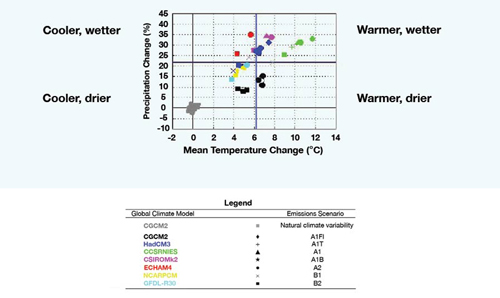
The scatterplots provide a quick visual summary of changes in mean temperature and precipitation averaged over the study region. The number of grid boxes contained within an individual chapter region is GCM-dependent, since the spatial resolution varies between climate models. Each coloured symbol represents a different climate change scenario, identified in the associated legend. Also illustrated on the scatterplots are grey squares that indicate the representation of 'natural' climate variability by the second-generation coupled global climate model (CGCM2) of the Canadian Centre for Climate Modelling and Analysis. This has been derived from a long control run undertaken with this GCM in which there is no change in forcing over time.
Where there is overlap between the coloured symbols and the grey boxes, the scenarios concerned lie within the range of 'natural' climate variability. No overlap indicates that the scenarios lie outside of this range and potentially represent conditions that have not previously been experienced.

FIGURE A-1: Example of a scatterplot and the legend for the scatterplots presented in this report.
The colours represent the global climate model, and the symbols represent the emissions scenarios.
[Figure 1 - text version | larger image]
The blue lines on the scatterplot represent median changes in mean temperature and precipitation, derived from the suite of climate change scenarios illustrated on the scatterplot. These lines effectively divide the plot into four quadrants, allowing the identification of those scenarios that exhibit cooler, warmer, drier or wetter conditions than are indicated by the majority of scenarios. Thus, it also provides a means of identifying those scenarios that exhibit the most 'extreme' changes.
Scenario Maps (Figure A-2)
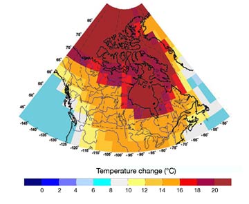
The scenario maps summarize all the GCM-derived scenarios of climate change illustrated on the scatterplots. All scenarios have been interpolated onto the CGCM2 grid and then the minimum, median and maximum changes have been calculated and plotted. Hence, the values in each grid box are not necessarily from the same scenario

FIGURE A-2: Example of a scenario map for an ensemble scenario.
This is the maximum annual temperature change projected for Canada by the 2080s.
[Figure 2 - text version]
Box-and-Whisker Plots (Figure A-3)
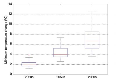
A box-and-whisker plot is a means of providing summary information about a data sample. The box has lines at the lower quartile, median and upper quartile values, and the whiskers are lines extending from each end of the box to show the extent of the rest of the data. The box represents the central 50% of the data sample. The whiskers indicate the maximum and minimum data values if there is a dot located on the lower whisker. If there are outliers in the data, indicated by '+' symbols, then the whisker length is 1.5 times the interquartile range. The box-and-whisker plot illustrated in Figure A-3 indicates that, for the 2050s and 2080s, the whiskers represent the maximum and minimum data values. For the 2020s there is an outlier at the upper end of the data values, indicated by the '+' symbol. In this case, the whisker represents 1.5 times the interquartile range.

FIGURE A-3: Example of a box-and-whisker plot.
[Figure 3 - text version]
Page details
- Date modified: