ARCHIVED - Energy Data Analysis
Information Archived on the Web
Information identified as archived on the Web is for reference, research or recordkeeping purposes. It has not been altered or updated after the date of archiving. Web pages that are archived on the Web are not subject to the Government of Canada Web Standards. As per the Communications Policy of the Government of Canada, you can request alternate formats. Please "contact us" to request a format other than those available.
Overview
The following discusses the analysis of energy data and is a key section of this handbook. Effective data analysis is essential but is often not given appropriate priority. In fact, poor analysis of data can destroy the operation of an EMIS and result in misleading messages.
Energy data includes not only energy usage but key influencing factors as well. Data must be collected at a higher frequency than any variations that are being studied.
The objectives of data analysis are to better understand energy use and costs, calculate performance levels, calculate targets and model energy use. A range of techniques can be utilized, from simple to complex. These should be selected to suit the problems being addressed (rather than selecting an analysis technology and then finding a problem to suit).
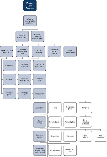
The block diagram shown in Figure 19 summarizes the topics covered in this section.
Figure 19. Block diagram showing elements of energy data analysis
8.1 What Is Energy Data?
Energy data includes
- direct measures of energy use (electricity, gas, steam, etc.)
- measures directly associated with energy use, for example, heat rate, cooling rate or compressed-air flow
- influencing factors measured or recorded variables that may affect energy use
Direct and indirect measures of energy use are essential. Ideally, the energy use of each significant processing area should be measured separately. Such an area can be defined as
- an area where the energy use is largely determined by actions within that area, process or plant item
- one that has a significant level of utilities consumption
- one where there is potential for under-performance or where performance is variable
- an area that is managed by one person or group to whom responsibility for performance can be allocated
Table 5 provides examples of areas that require utility metering.
Area
-
Individual process energy consumptions (steam, electricity, etc.)
-
Energy use by individual unit operations (e.g., dryer, evaporator)
-
Boiler energy use
-
Refrigeration energy use
-
Compressed-air flow
-
Cooling flow (from refrigeration)
-
Energy use by main buildings
It is essential to have data on influencing factors. Without this, analysing energy use is limited to quantifying use and cost and comparing current values with historical values. Relying on this alone will severely limit achievable savings. With data on influencing factors, it is possible to
- understand the causes of variable energy use
- set targets against which current performance can be compared
- model energy use
External disturbances
-
ambient temperature
-
production rate
-
feed conditions
-
selection of plant
-
control settings
-
operating practices
-
repair of faults
8.2 Objectives of Energy Data Analysis
Objectives of an energy data analysis can be defined as follows:
- break down energy use and cost
- calculate performance levels
- understand the reasons for variable energy use and performance
- calculate targets for energy use and efficiency to be used to identify poor performance and track progress
- model energy demands
Techniques for data analysis range from simple to complex. The choice depends on the size and complexity of the operations, available capital and software tools, capabilities and interests of staff, and time available.
8.3 Breakdown of Energy Use and Costs
Dividing the total energy consumption (and cost) of a facility into sub-areas has a number of benefits:
- it allocates costs to relevant departments
- it highlights key areas
- it triggers discussion and ideas
Figure 20. Breakdown of energy use
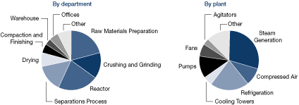
In the examples in Figure 20, utilities (electricity, gas, oil, steam, etc.) have been combined, typically shown on a cost basis.
Charts based on energy use (MJ, kWh, etc.) or CO2-equivalent emissions may also be useful. It can be instructive to show the various utilities use and costs graphically. All of these graphs are essential in energy management and are typically based on a year's worth of data.
Figure 21 shows utilities broken down by energy and cost (cost is shown at right), showing the relatively high cost of electricity and the impact this has on energy use efficiency priorities.
Figure 21. Breakdown of utilities' use and cost

Charts such as these can easily be produced using standard spreadsheet packages or similar software and can be easily published, for example, as part of an energy Web site on the corporate intranet.
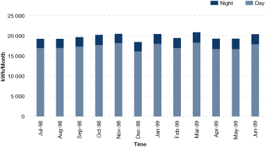
In some cases it can be useful to subdivide energy use by time. For example, determining average energy use during non-productive periods (e.g., nighttime, holiday periods) can be highly informative, revealing poor control of plant operations (e.g., poor isolation of compressed air).
Figure 22. Monthly breakdown of electricity use showing day and nighttime units
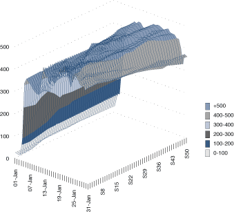
Determining peak demands can also be informative. Where possible, a demand profile should be studied.
Figure 23a. Typical half-hourly demand profiles (as a line graph)
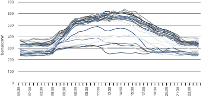
Figure 23b. Typical half-hourly demand profiles (as a contour plot)
8.4 Calculation of Performance Indicators
Energy performance can, in some cases, be a simple measure, such as the energy use of an area or process. However, energy use is often affected significantly by external factors, such as production rate, in which case organizations may use "specific energy use," i.e., energy use divided by the production level.
These and similar measures should be interpreted very carefully! A process that has a high base-load energy demand, for example, will have a lower specific energy use at higher production rates, even if the underlying efficiency of operations remains unchanged.
Other measures of efficiency can be used, such as the efficiency of a boiler or the coefficient of performance (COP) of a refrigeration system. These values would also be expected to vary (boiler efficiency, for example, with steam loading and COP with ambient temperature).
Performance indicators are useful; however, they should be compared with targets, including
- targets derived from a model of operations
- targets based on the achievement of similar plant/processes under similar conditions (either the same plant/process in the past or another process that is very similar)
8.5 Understanding Performance Variability: Simpler Techniques
There are a number of simpler techniques that can be used to understand variability in energy use. Variability can be displayed as a frequency distribution, which shows the average value, spread (or standard deviation) and the shape of the distribution.
Figure 24. Example of frequency distribution
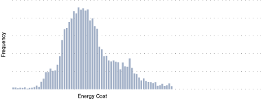
Figure 24 shows a typical example of the specific energy cost of a process operation. There is a significant spread, which an analysis would aim to explain. Is the spread due to external factors or a decision made by operations?
Plotting energy use vs. influencing factors can help to establish relationships. For example, energy use can be plotted against production to reveal a clear relationship (see Figure 25).
Figure 25. Energy use vs. production
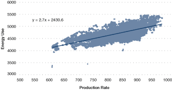
The graph shown in Figure 25 also identifies
- a base load consumption of 2430.6 units
- residual variability – the production rate does not fully describe the variations in energy use (in fact, there is a significant residual variability)
A linear regression analysis can capture the relationship as an equation of the form:
x = production level
m = gradient of the line
c = intercept
This approach can be extended to three dimensions (see Figure 26).
Figure 26. Example of three-dimensional plot, showing energy use vs. production and feed quality
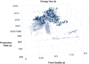
Multiple regression techniques can produce extended equations to describe the relations.
Software tools are readily available to facilitate these graphs and calculations; commonly available spreadsheet programs have most or all of the capabilities needed.
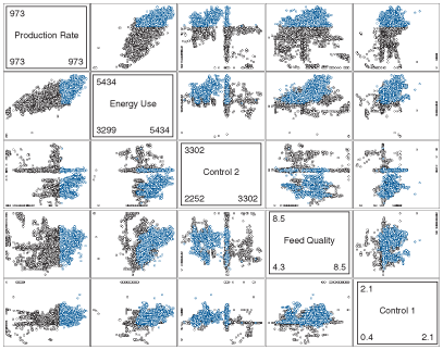
Trying to decipher patterns from numerous single plots of many variables can be very cumbersome. Multiple two-dimensional scatter plots offer a means of finding relationships between multiple variables (matrix plots) by illustrating, at a glance, the patterns that are inherent in the data. In Figure 27, the shaded cells identify the axis labels for each variable that is plotted. The first non-shaded cell in the top row plots production rate on the y-axis vs. energy use on the x-axis. The first cell on the bottom row plots the controllable value "Control 1" on the y-axis vs. "production rate." High-energy-use data is coloured light blue. As an example of the patterns that may be spotted in this multiple two-dimensional scatter plot, the relationships between energy use and feed quality are clear. Another example of high energy use is associated with lower values of the controllable value "Control 2."
Figure 27. Multiple scatter plot
8.6 Understanding Performance Variability: Data Mining
In some circumstances, a more detailed analysis is appropriate
- for major energy users
- where energy is a complex issue affected by multiple influencing factors
- where there is access to substantial historical data, for example from a data historian
Data mining has the following characteristics:
- it handles massive databases
- it finds patterns automatically
- it expresses the patterns as a set of rules
The decision tree shown in Figure 28 represents a set of rules generated in a data-mining analysis. The rules identify the key driver for the energy use of a refrigeration system and quantify the impact of that driver. The highlighted "route" through the tree is characterized by the following rule:
If the solvent temperature is > 223°C and < 214°C
Based on the 86.67 percent probability that is identified under "Attributes" on the right-hand side of Figure 28, the energy use is determined by the analysis to be 67 167 units under these conditions.
Rules are generated automatically in such an analysis. The user defines only the objectives and influencing factors. The process essentially subdivides historical operations into modes; where energy use is different, the modes are characterized by rules.
Figure 28. Simple decision tree

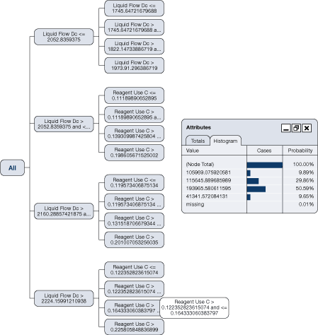
A real analysis will create substantially more complex decision trees (there are more complex rules), such as the one illustrated in Figure 29. Such a tree will
- identify key drivers
- quantify the impact on energy use
- identify the best operating modes
Figure 29 identifies a node path for the liquid flow and reagent use that determines a 50.59 percent probability that energy consumption will be 193 965 units under these conditions.
Figure 29. Complex decision tree
Data-mining tools are readily available and widely used. Figure 30 shows the typical stages of such an analysis.
Figure 30. Stages of an initial data-mining analysis
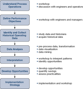
These stages apply to any comprehensive data analysis project.
Example 2: High-Pressure Boiler Plant Performance
An analysis of the efficiency of a high-pressure boiler plant was completed. The plant houses three boilers, two of which are normally in service at any one time. The boilers are capable of dual-fuel firing on natural gas or oil and generate steam at a maximum pressure of 1600 psig (11 Mpa) to supply steam turbines and other loads at reduced pressure.
Data was collected from the plant following modification of the site-monitoring systems and mined, with operating cost per unit of steam being the main focus.
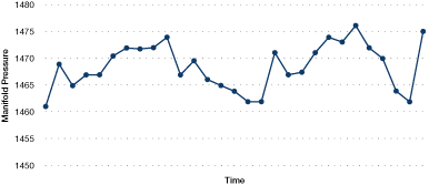
Figure 31. Boiler manifold steam pressure
Attributes included the selection of boilers into the operating sequence, loads, pressures, temperatures and turbine bleed steam flows.
Figure 31 illustrates the boiler manifold steam pressure over a half-hour period.
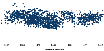
The impact of manifold header pressure (mpress) on the operating cost is illustrated in the decision tree that is partially illustrated in Figure 32. In this case, a higher steam pressure reduces the operating cost per unit of steam produced. In comparison, Figure 33 illustrates that simply relying on plots of cost vs. manifold steam pressure would not clearly show the influence of manifold steam pressure. This is due to the changes within the data set that are happening for many other factors that affect performance.
Figure 32. Impact of manifold pressure on operating cost – partial decision tree
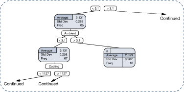
Figure 33. Cost vs. manifold pressure
In total, annual cost avoidances of 4 percent were identified (valued at approximately $500,000), yielding a simple payback period of approximately one year.
8.7 Calculating Targets
Targets are expected performance values that can be compared with actual performance to discover whether a plant or process is performing well or not. Targets take several forms, including the following:
- Historical average performance is a commonly used target. These can be used to alert operations staff when performance is below average.
- The simplest form of such a target is the average energy use during an earlier period, for example, the last year or the last month.
- Often, targets will have some adjustment for external influencing factors, such as production rate or ambient temperature. Typically, this adjustment is based on a regression or multiple-regression analysis.
In some cases, the target is adjusted to reflect a desire to improve. For example, the target may be adjusted to further reduce energy use by 5 percent across the board.
The accuracy and robustness of targets is vitally important. An incorrect target will mislead; improvements may not be reflected in the calculations or poor performance may not be identified. Poor targets result in a loss of confidence in monitoring and ultimately failure to achieve energy savings.
A more sophisticated historical target can be developed using data mining and similar techniques. More data can be analysed, more influencing factors can be accounted for, and non-linear relationships can be handled effectively.
Figure 34. Actual vs. target performance
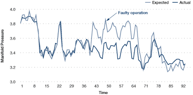
A target produced from a detailed analysis of data collected (for example, hourly or every 15 minutes) can be sufficiently accurate to implement on-line in real time.
The benefits of this include more rapid identification of operating problems. Such an approach should be seriously considered for major energy users.
The historical average performance can be considered a benchmark against which future performance can be compared. It represents what typically would have happened had no changes (improvements) been made.
A best-practice target identifies what a process or plant could achieve if it were operated well. It differs from average historical performance and a desired improvement since it is based on facts about the improvement potential.
Best practice can be calculated from first principles, in which case it represents what theoretically can be achieved. Computer models are applied widely in major processes such as oil refining and petrochemicals and are becoming more common in other sectors. Models of utility systems such as boilers and refrigeration plants are also in use.
Alternatively, best-practice targets can represent the best performance achieved in the past, given the particular (external) conditions. This can be discovered from historical operating data using data mining and similar techniques.
A best-practice target is discovered by identifying periods of operation in the past where external conditions were similar to those currently in place and then selecting the best performing period as the target. Software tools are available to automate this process.
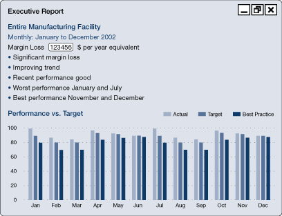
Performance against targets can be represented in a number of ways. Poor performance as compared with the target can be reported as it becomes known and expressed, for example, in terms of the annual cost if the faults are not fixed.
Figure 35a. Performance reporting
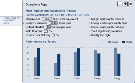
Figure 35b. CUSUM reporting (as a line graph)
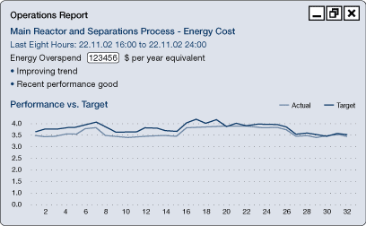
Figure 35c. CUSUM reporting (as monthly, weekly or yearly summaries)
Cumulative sum (CUSUM) techniques show the cumulative savings made over a period. Figure 36, for example, shows cumulative savings over a period of eight weeks.
Figure 36. CUSUM reporting
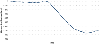
CUSUM figures are calculated by adding the savings of each period to produce a running total. If the process is on target, the savings will on average be zero, and the CUSUM line will be horizontal. Off-target performance will "lose" each period, and the slope of the CUSUM line will be negative. Above-target performance will produce a positive slope. A change of gradient on a CUSUM graph signifies an "event" – a change in the performance of the process.
8.8 Data Modelling and "What If" Analysis
Targets are calculated by producing a model of operations using historical operating data (or a first-principles model).
Other modelling techniques can be considered, including neural networks, case-based reasoning and other statistical and mathematical techniques. These techniques should be applied carefully – modelling process operations requires a good understanding of the relationships between variables on the part of the analyst. Rule induction facilitates that understanding.
In spite of the pitfalls, data modelling can be an effective basis for monitoring control and optimization solutions, and the models can be used to study the impact of altered conditions – a "what if" analysis.
Page details
- Date modified: